❋
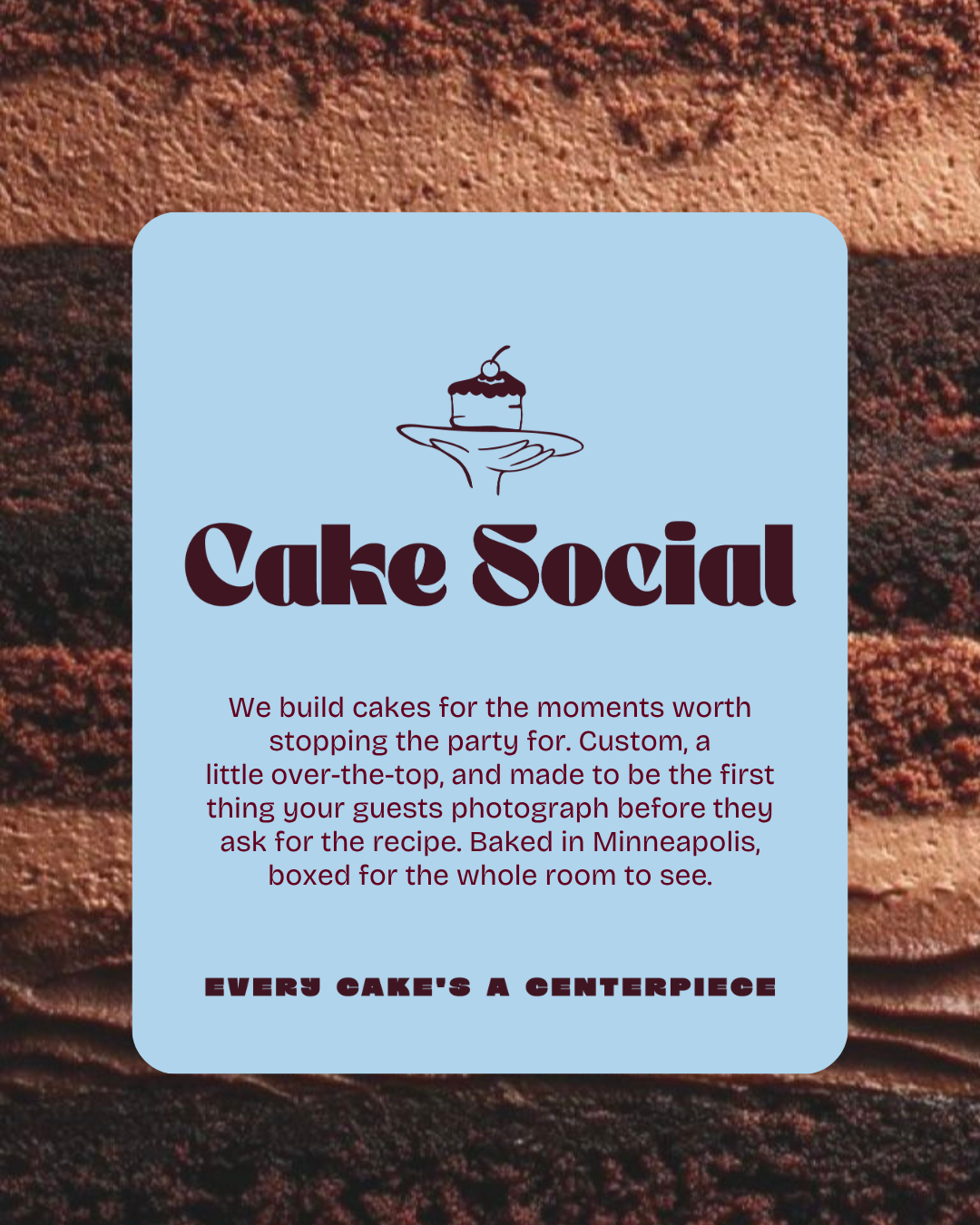
Cake Social • Brand IdentityEvery cake's a centerpiece.
Custom cake is a category full of beautiful cakes and forgettable brands. Look across the studios and past takes on this brief and you get the same blush pinks, the same sugary blues, and the same "made with love" copy, each one reading as the last. Cake Social asked for playful, celebratory, stylish, and social all at once, which left a clear gap: a brand confident enough to be the centerpiece without leaning on the pastel shorthand the category defaults to.
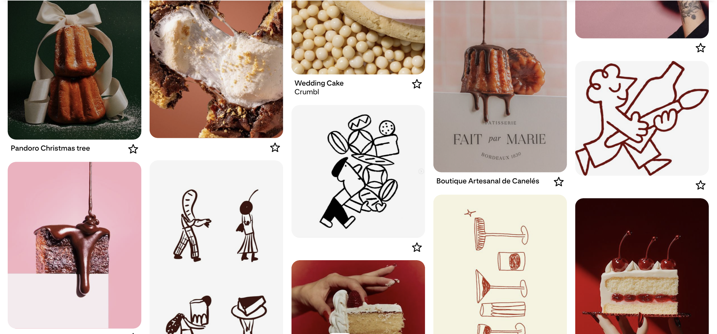
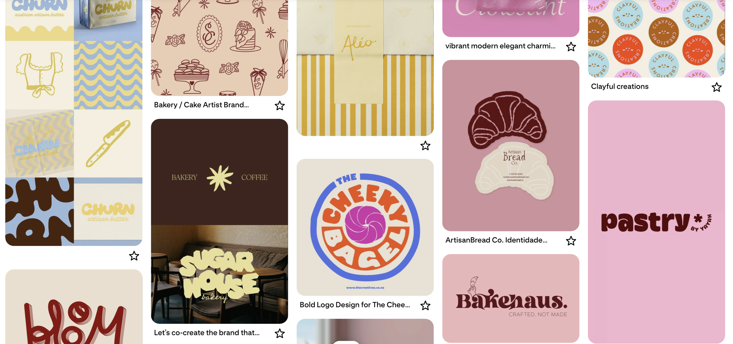
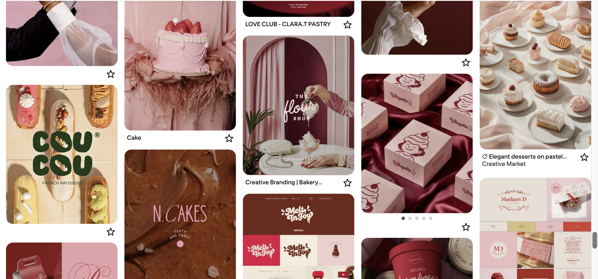
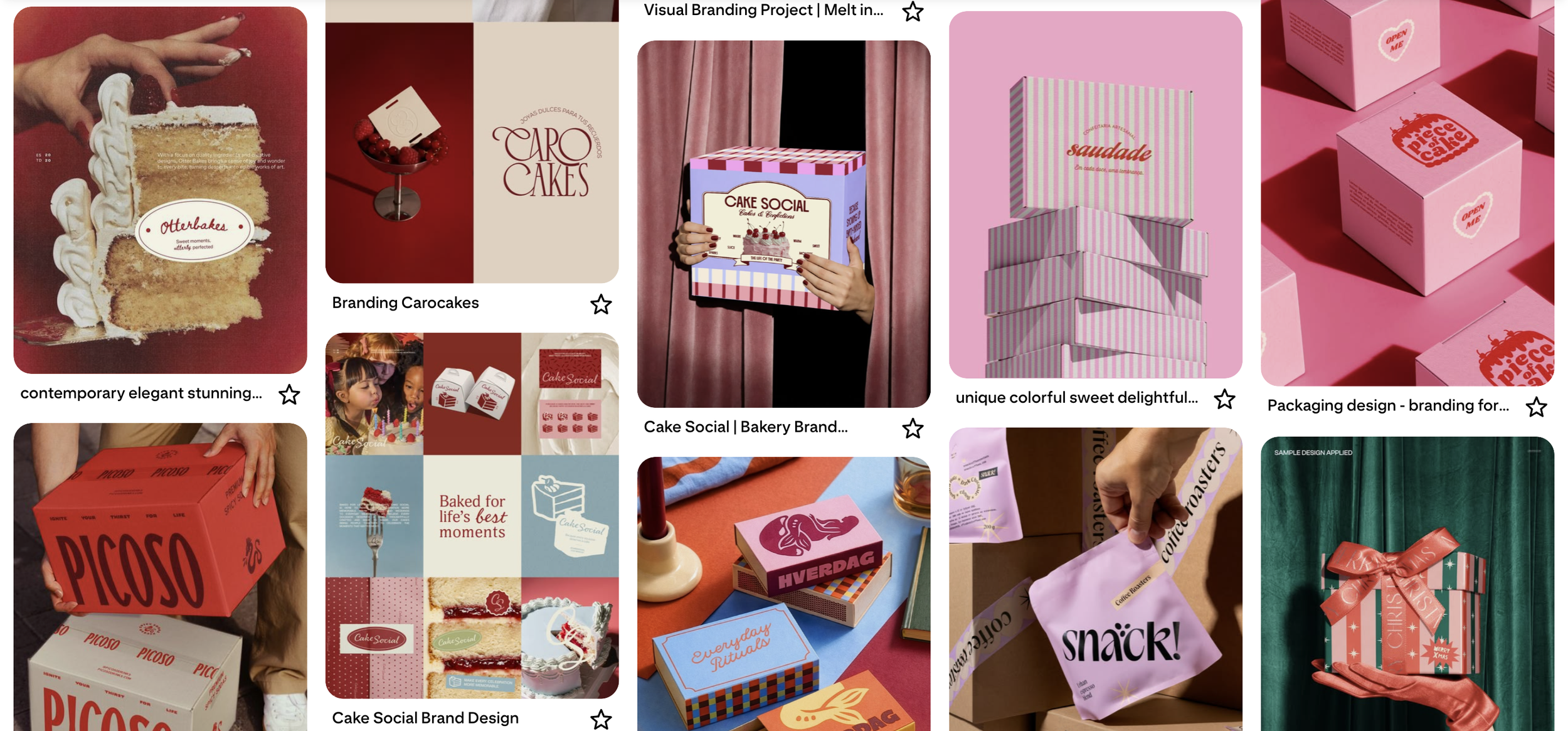
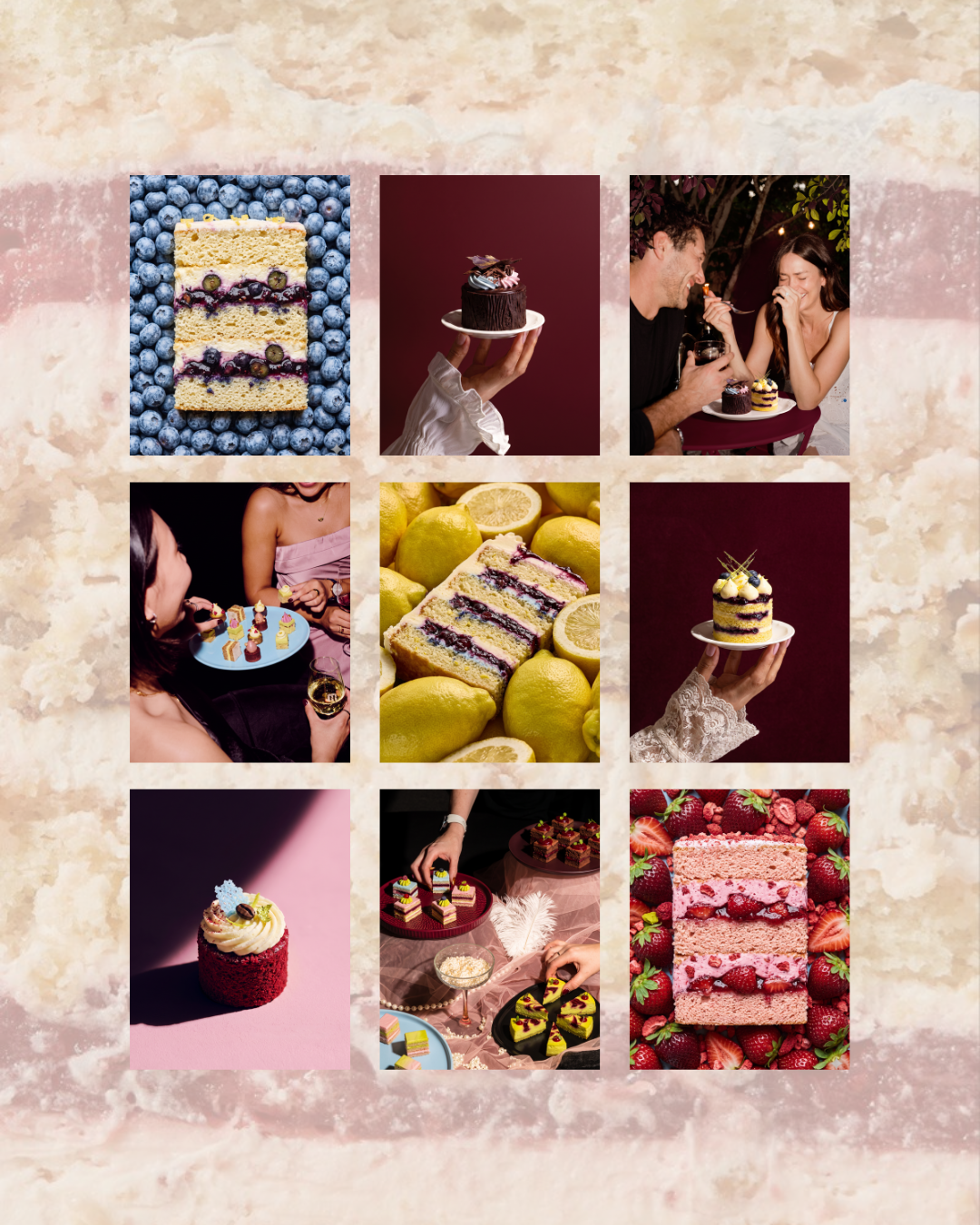
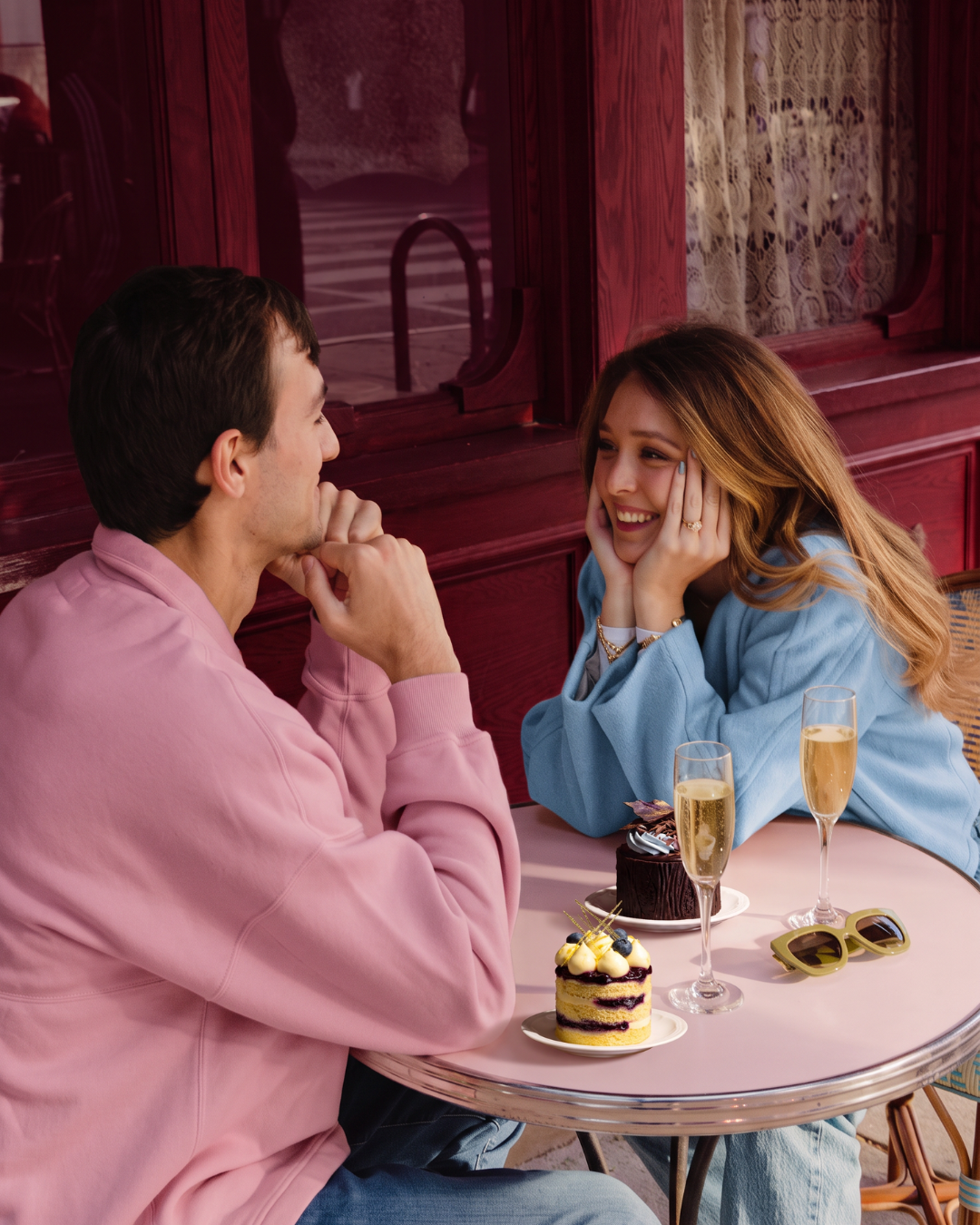
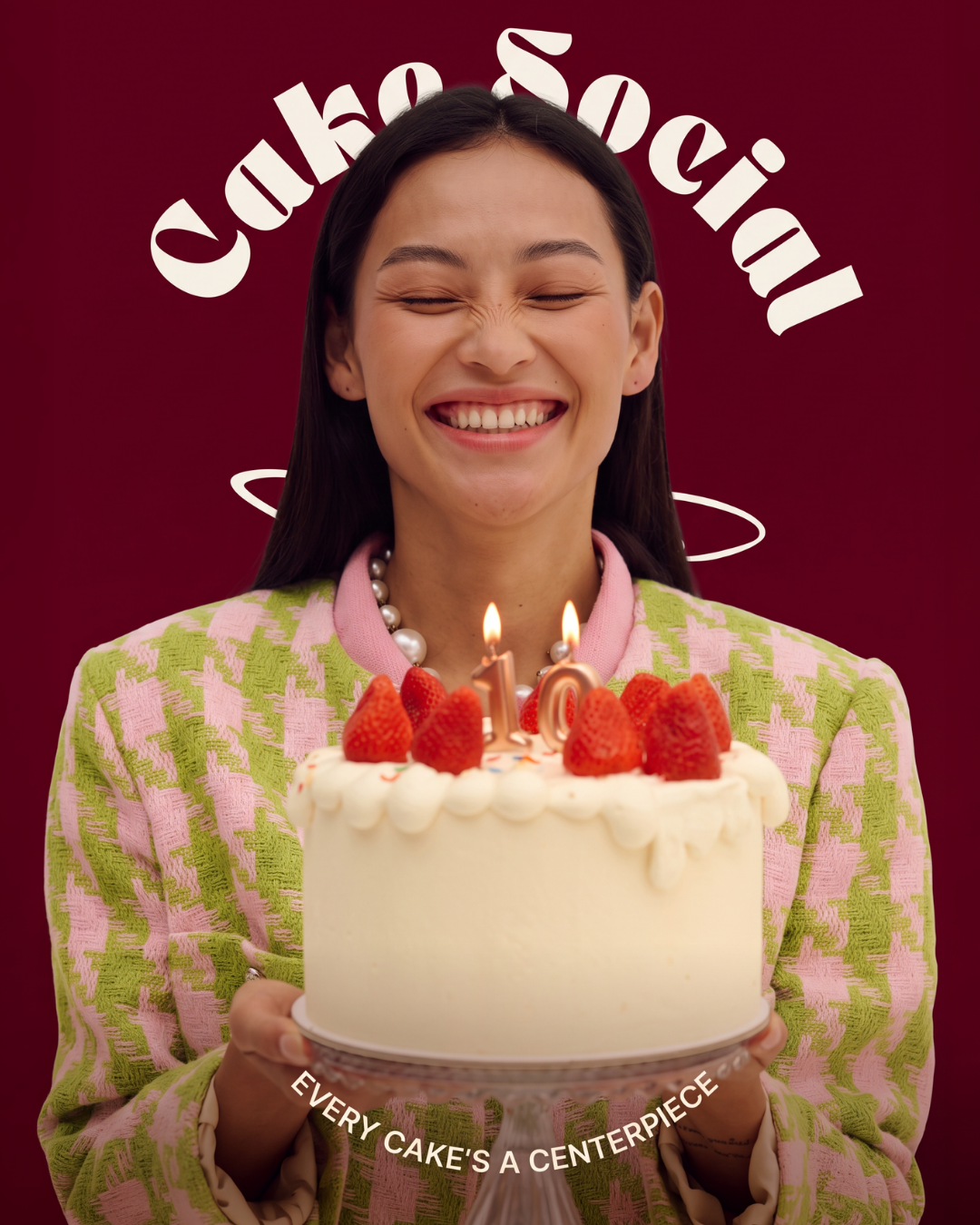
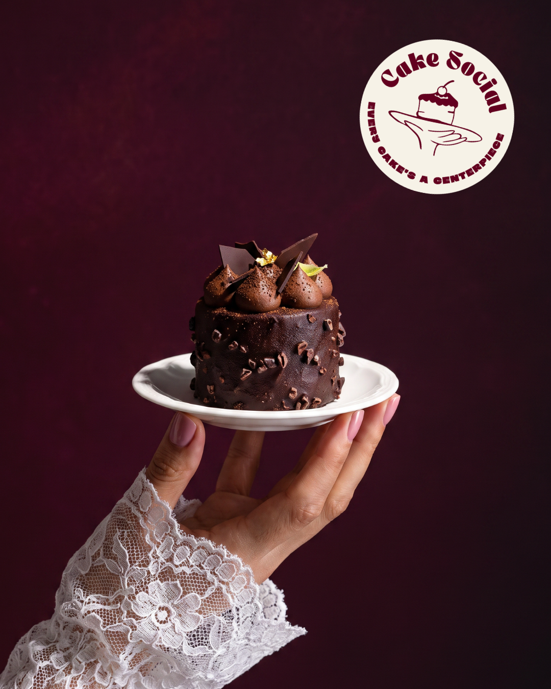
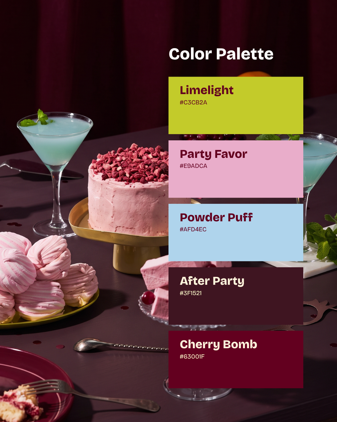
Cake Social is the friend who throws the party everyone talks about for a year, not the formal patisserie. Playful shows up in the hand-drawn line and a chartreuse that has no business being near a cake, and celebratory shows up in scale: the wordmark arrives like a guest of honor. Stylish is the discipline underneath, two deep wine tones that keep everything grown-up, and social is built into the mark itself, which is about handing someone a cake rather than just showing one. The voice follows suit, short and confident with a small wink, closer to "every cake's a centerpiece, act accordingly" than "baked with love."
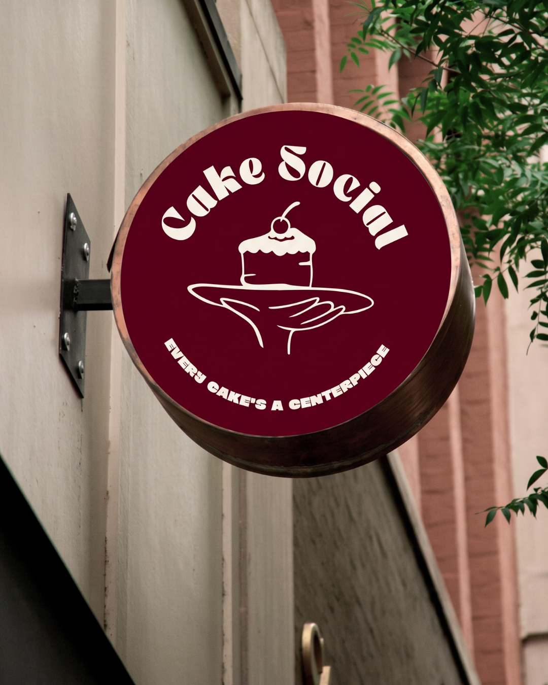
The hardest call was the mark. The clean option was a geometric cake-slice icon, tidy and easy to shrink onto anything, and it would have worked. It would also have looked like the icon every other cake brand reaches for, which is the exact sameness the project was meant to escape. I went with the illustrated badge instead, a hand offering up a cake, because the idea of a social cake brand is that someone is handing you the centerpiece, and a slice icon can't say that. The cost is simplicity: a hand-drawn mark asks more of every small size and every color pairing than a geometric one ever would. I decided the personality was worth the care.