❋
Inner Matter Spa • Brand Identity + Loyalty Card SystemSlow, on purpose
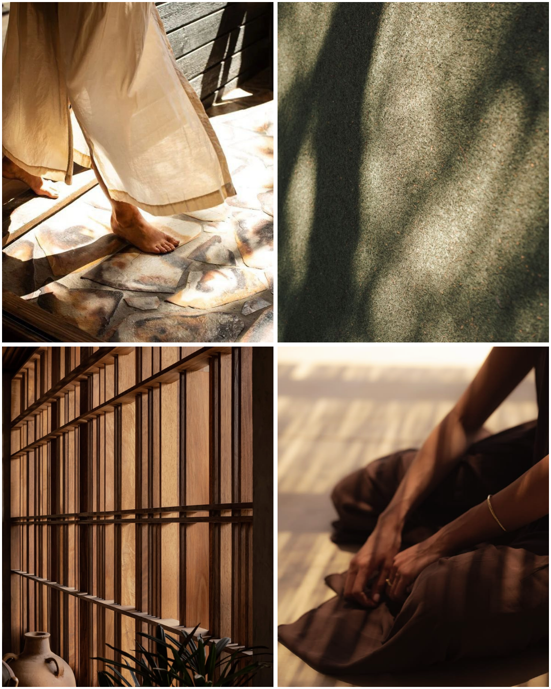
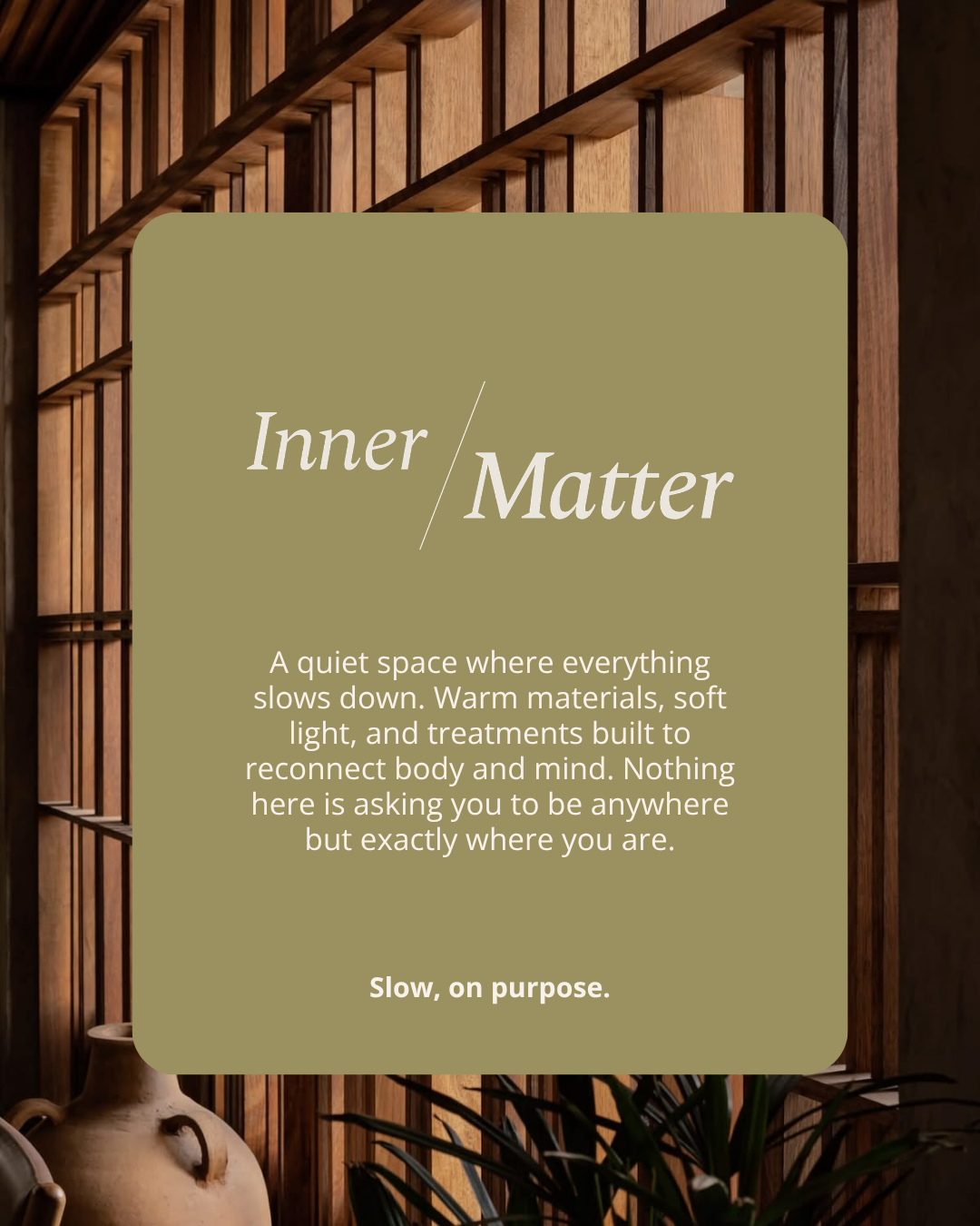
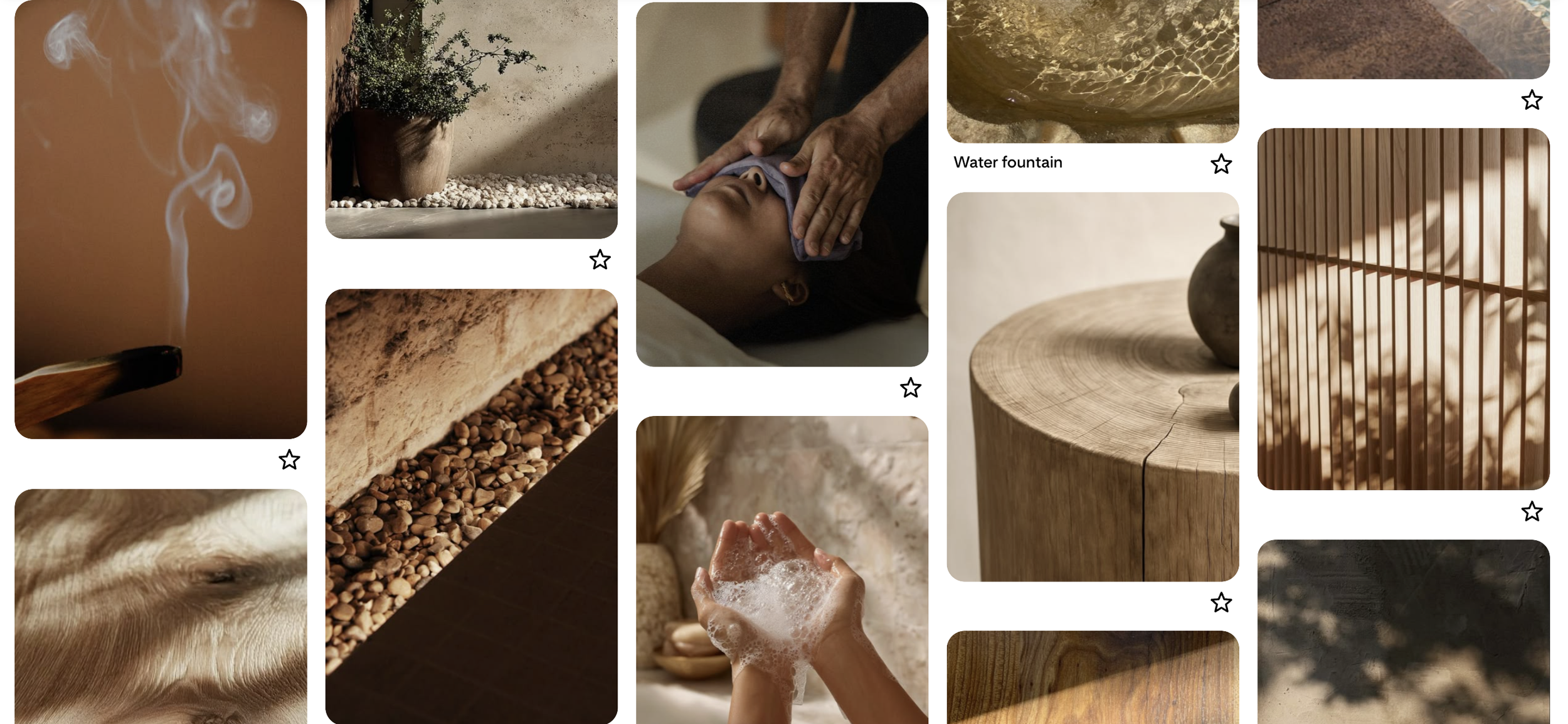
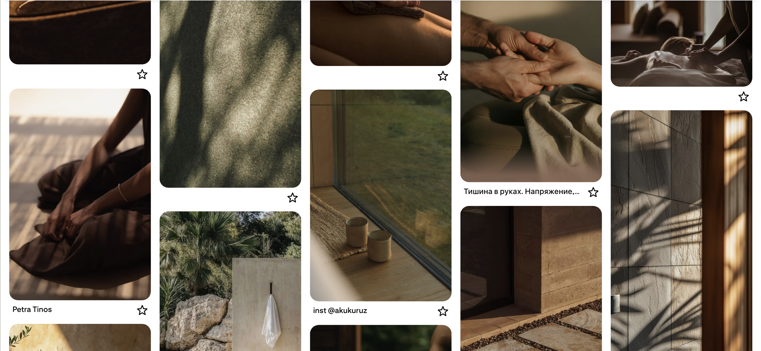
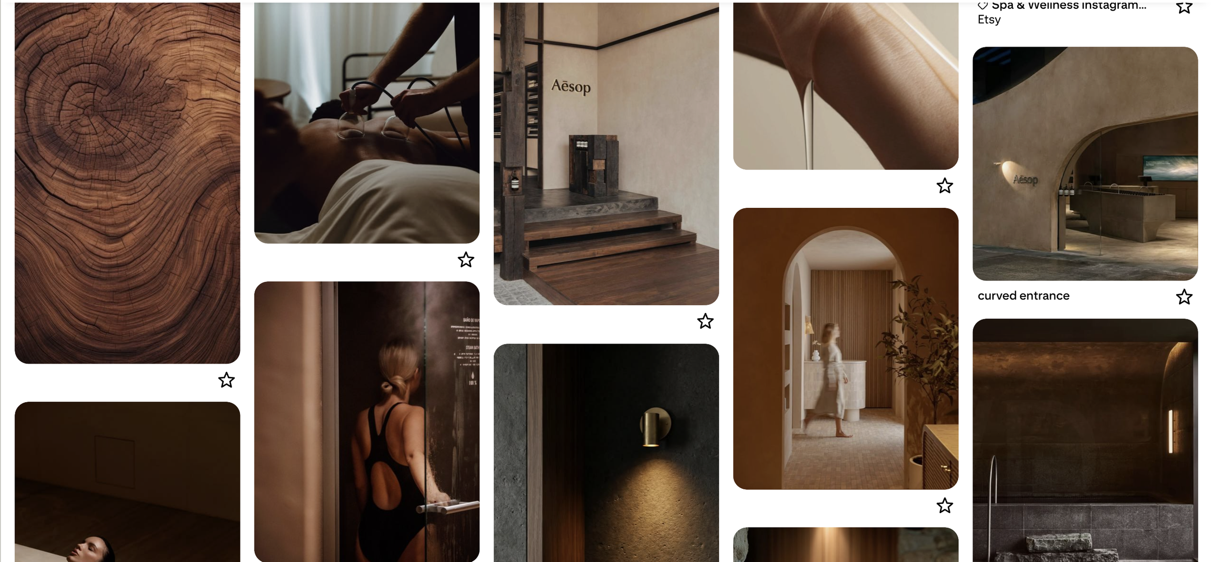
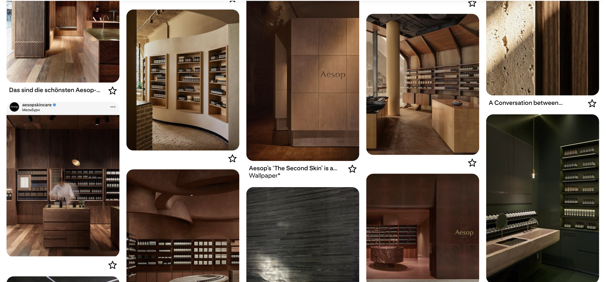
Premium spa branding has a well-worn playbook;' calm, minimal, faintly ethereal, borrowed from the same handful of category leaders. Inner Matter's own name pointed to a way out of it: matter means both what matters and physical matter, meaning and substance held in one word. The white space wasn't in being calmer or more minimal than the category already is, everyone there already is, it was in being grounded, where everyone else reaches for ethereal.
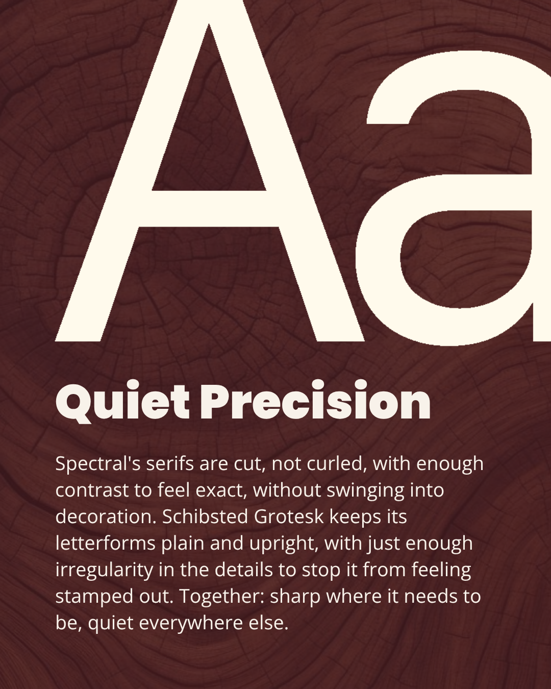
Getting the type system right took longer than anything else in the identity. Fraunces was the first instinct, warm, editorial, close to how Aman and COMO already sound but that was exactly the problem: too close to the category's own voice. Archivo solved for restraint but read as of-the-moment rather than specific to this brand. What stuck was Spectral for headlines and Schibsted Grotesk for body: a serif built for on-screen reading paired with a newspaper's own grotesk, so the brand reads like a quiet publication rather than a logo.
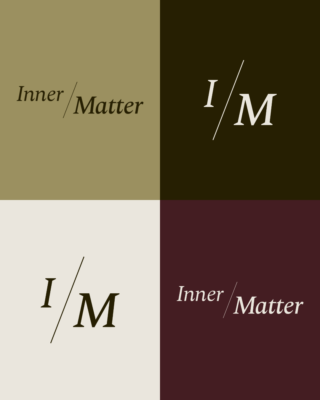
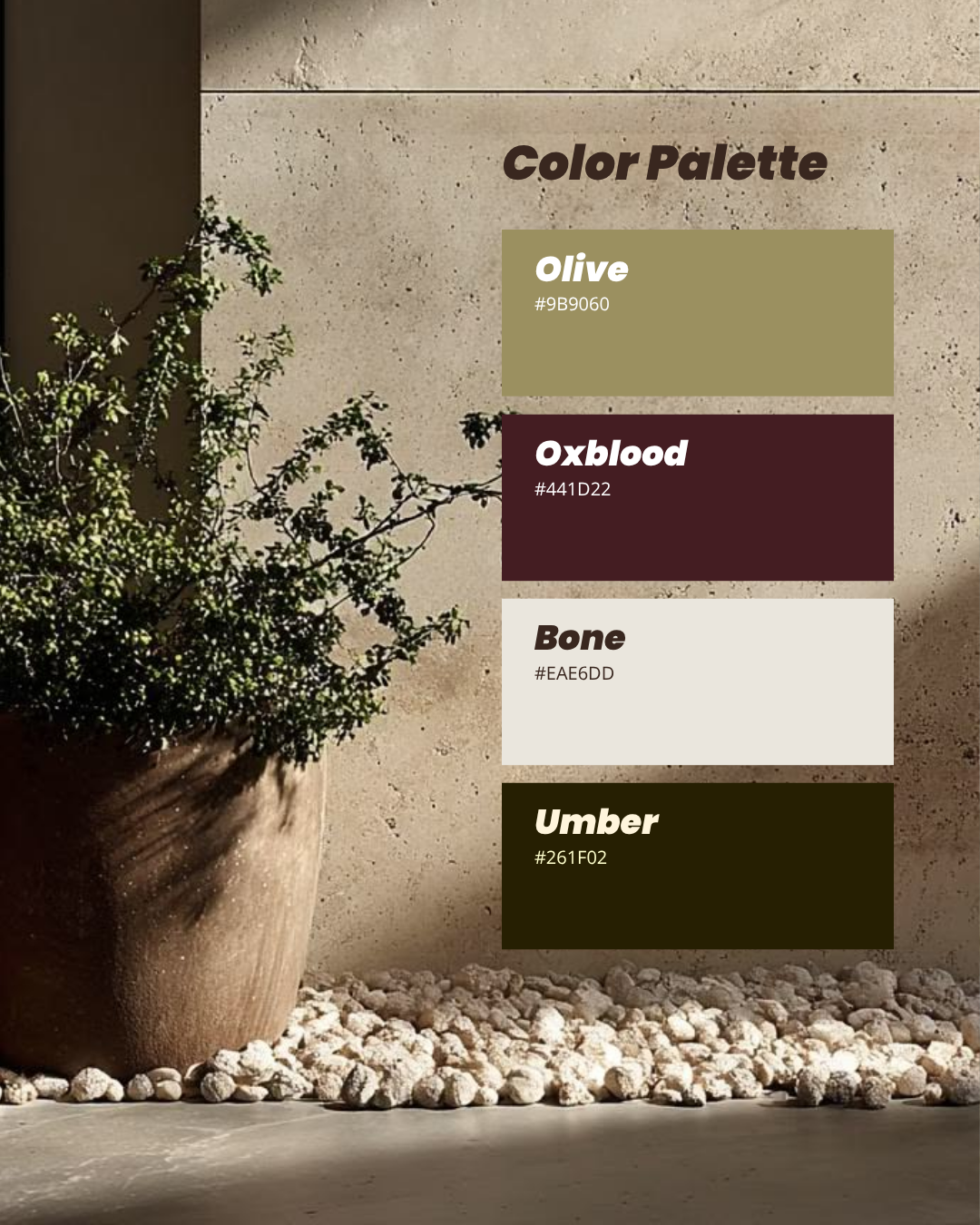
The palette resolved to four colors, each with exactly one job. Bone as the base, Umber for type and structure, Olive and Bordeaux as accents.
The wordmark splits Inner from Matter on a single diagonal line; meaning and substance, made visible instead of only implied. A compressed I/M monogram carries the same device into small spaces: a social avatar, a wallet-pass icon.
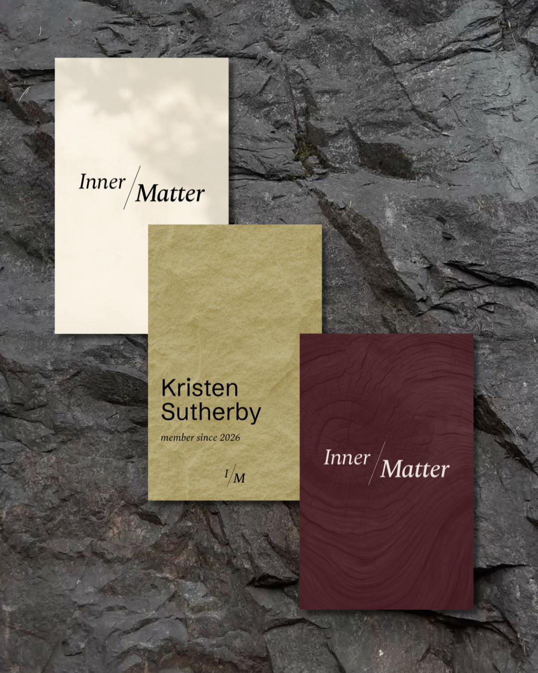
The hardest call was the loyalty card, and it took two passes. The obvious move was a punch card, but luxury loyalty rewards are about belonging, not earning, so points and stamps were out. The harder call came after: even a tiered system risked turning the card into a status object. Instead, it lives in a tap-to-check-in system. Card color: bone, olive, or bordeaux, became a separate, personal choice with zero relationship to membership level. No one's card, including the person holding it, says anything about where they rank.