❋
Week 11 • Casa Coco • Full Brand Identity + Stay awhile.
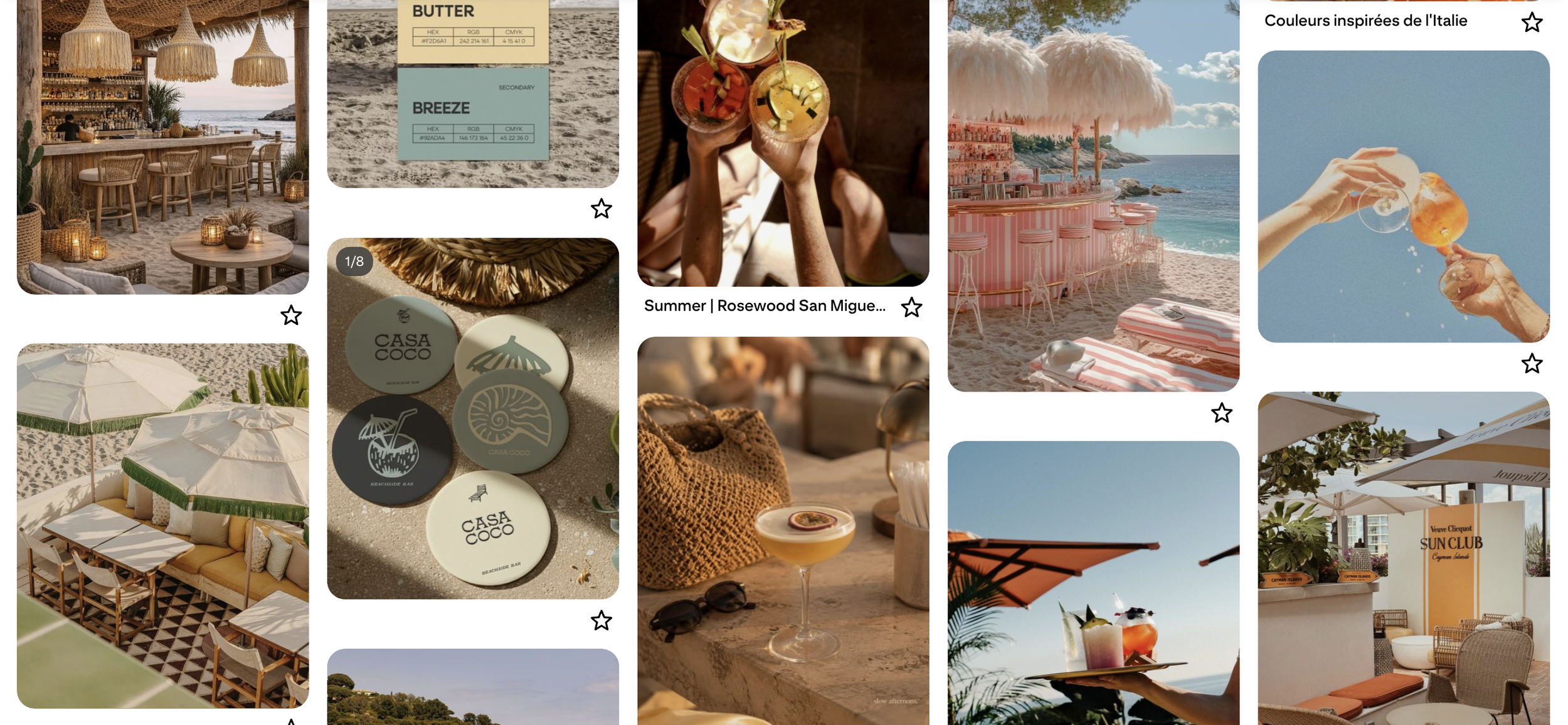
Beachside bar branding tends to split into two exhausted lanes, tiki kitsch or resort-minimal luxury, and neither fits a bar built for regular afternoons rather than vacation fantasy. Casa Coco compounds the problem: it's a recurring design-brief prompt, so the visual space was already crowded before the first sketch. The white space was a warmer, more grounded coastal-minimal, unpretentious enough to feel like an actual neighborhood bar, distinct enough not to read as another palm-tree-and-script rerun.
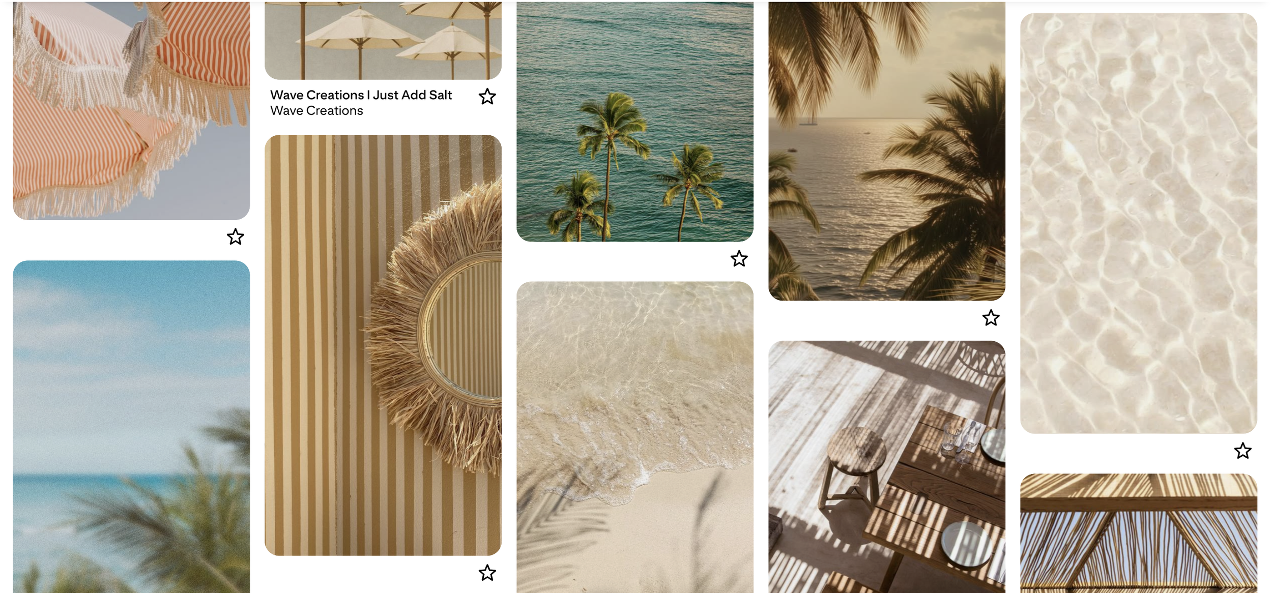
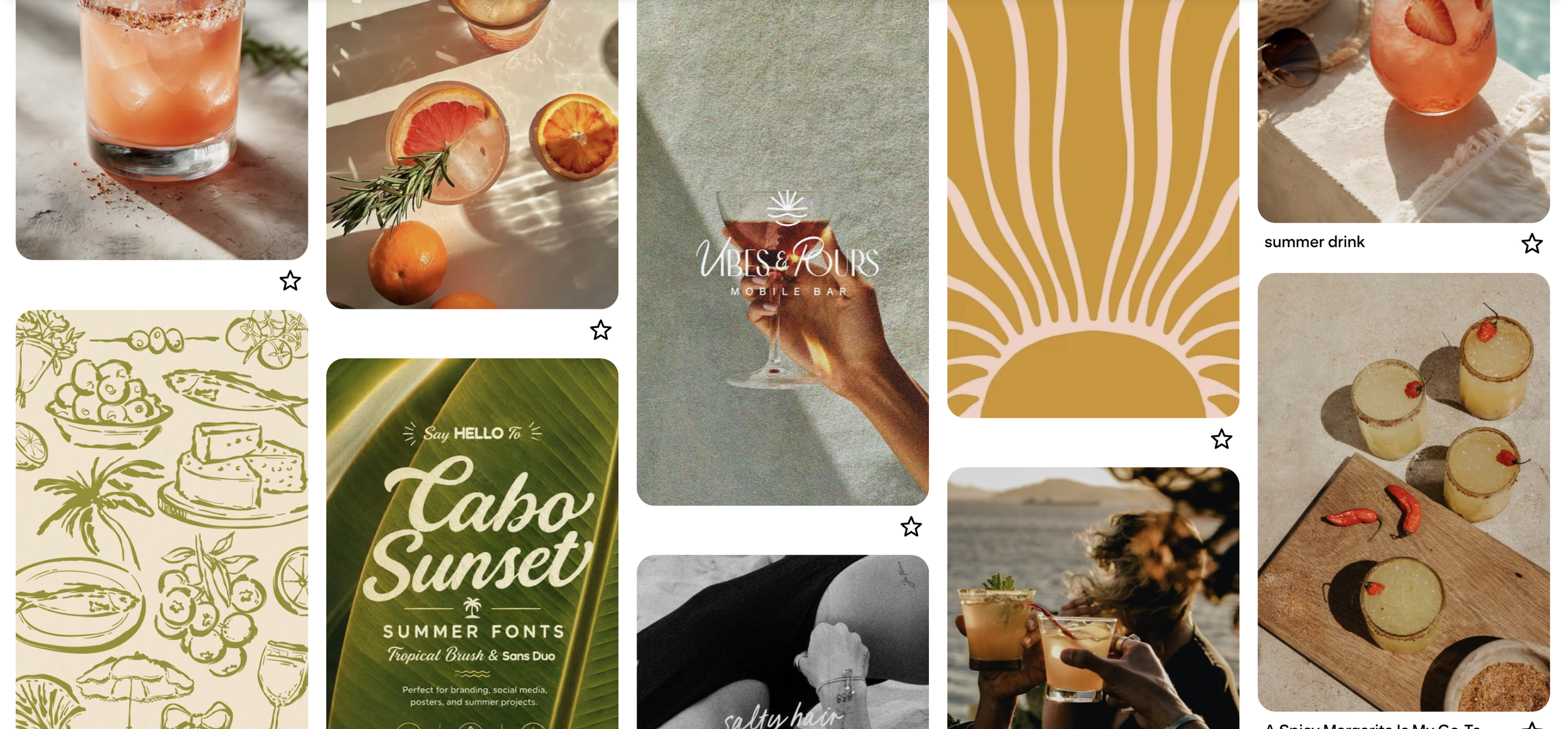
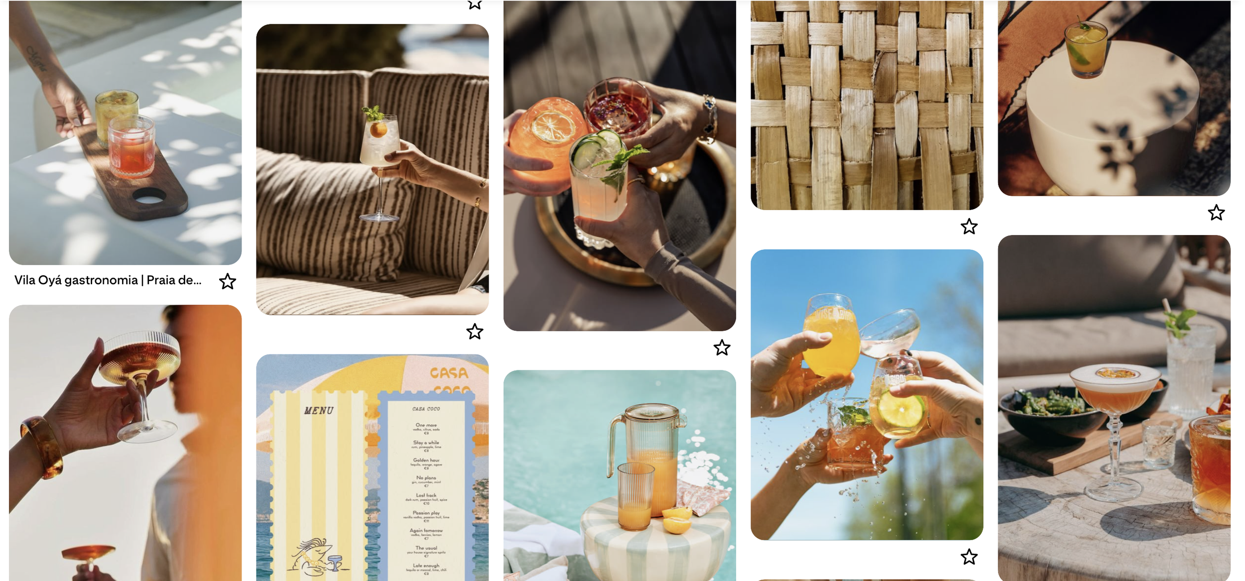
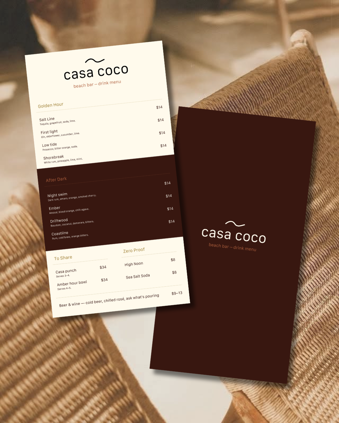
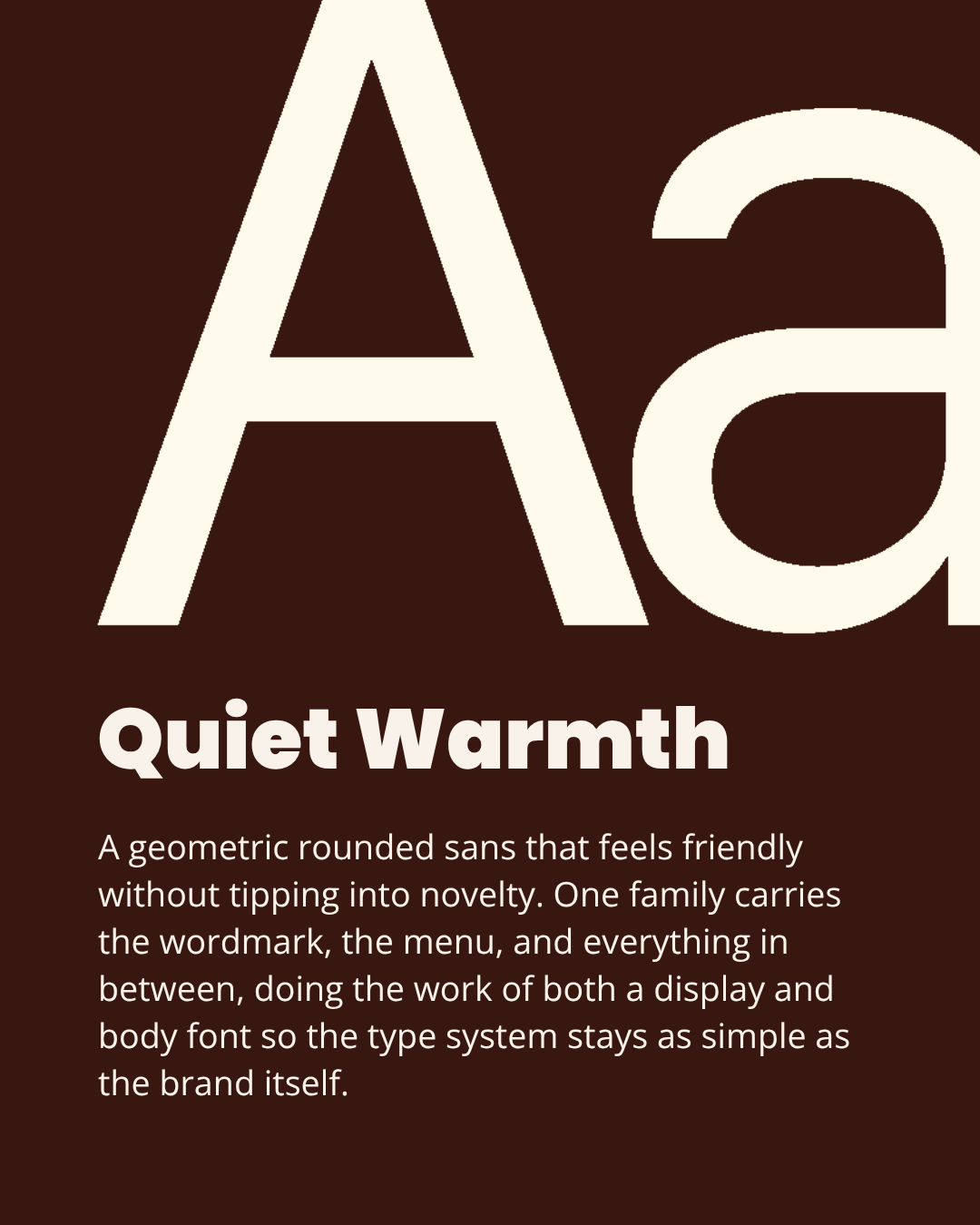
Type went through three rounds: warm editorial serifs first, then bold, rounded display sans that tipped into soda-brand novelty, before landing on Galvji: a geometric, rounded sans with enough warmth to feel social and plain enough to carry both the wordmark and the body copy.
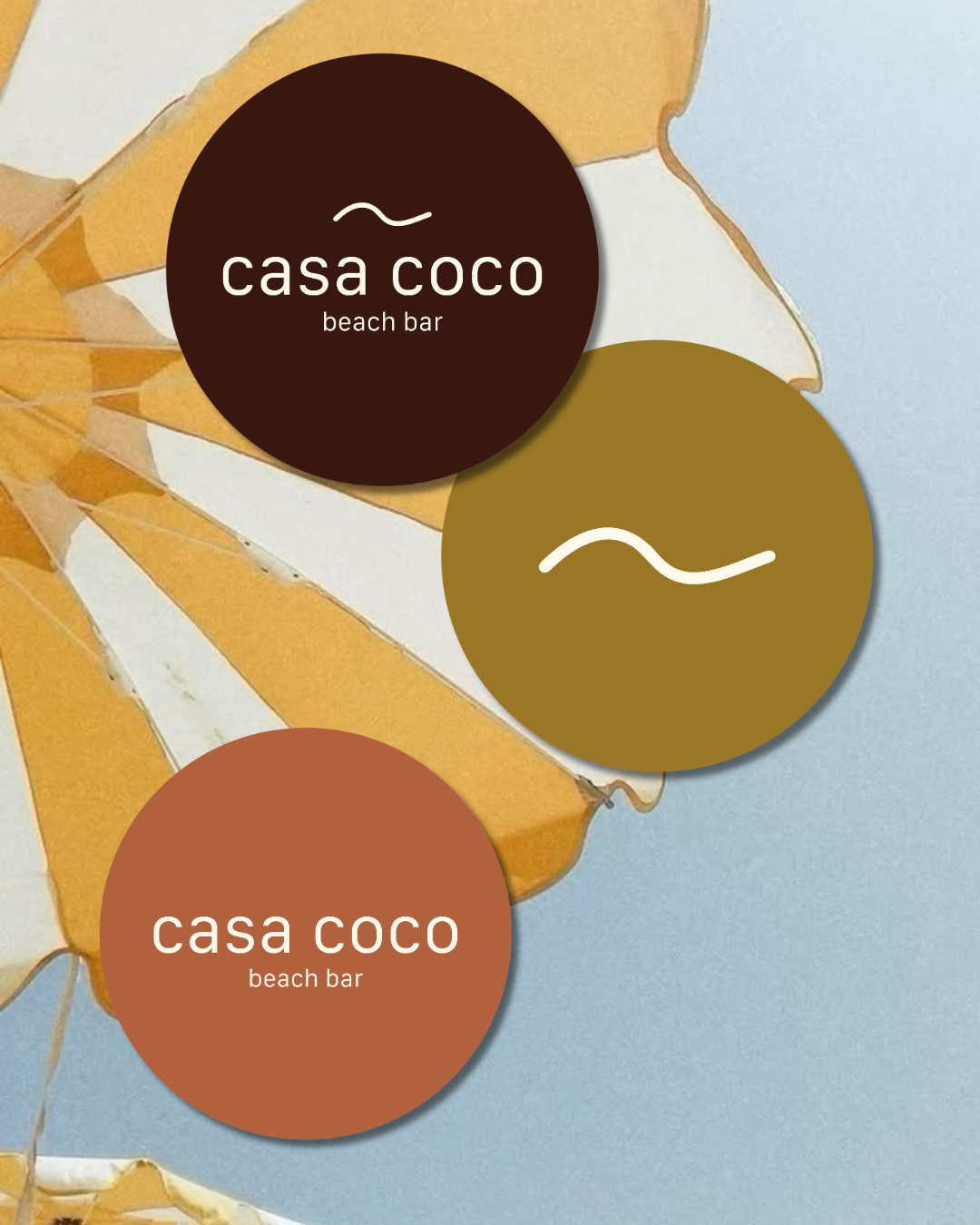
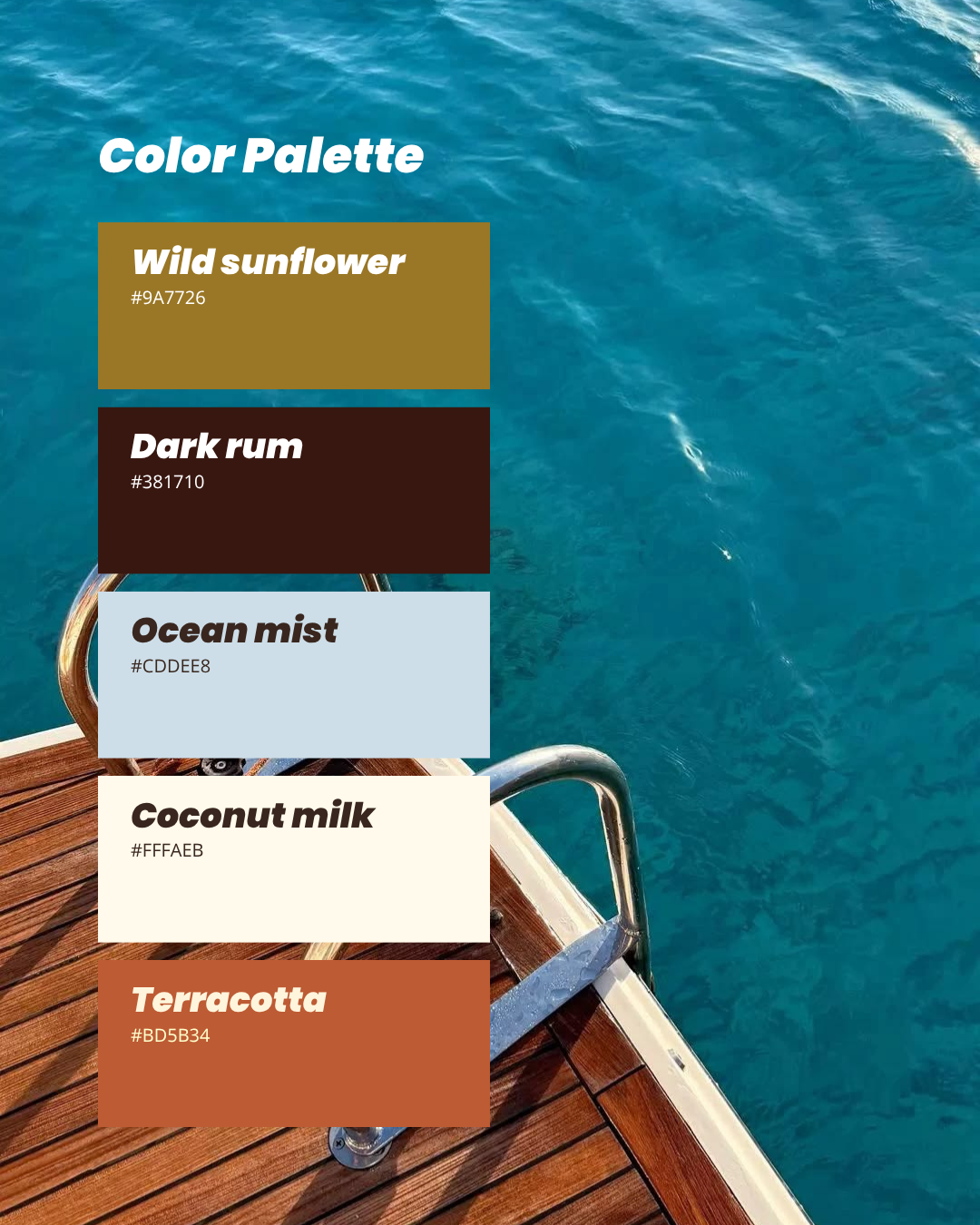
Five colors run from coconut milk and ocean mist at the light end to wild sunflower, terracotta, and dark rum anchoring the warmer, darker half. =
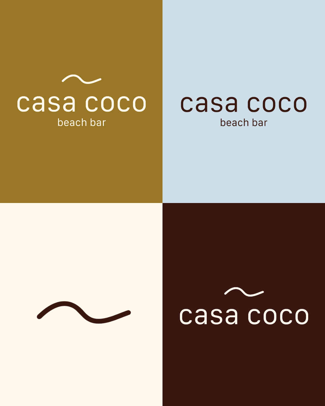
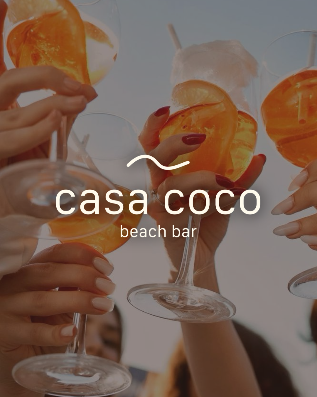
The mark pairs a lowercase wordmark with a tideline monogram, a single asymmetric wave stroke, with "beach bar" set smaller underneath in terracotta.
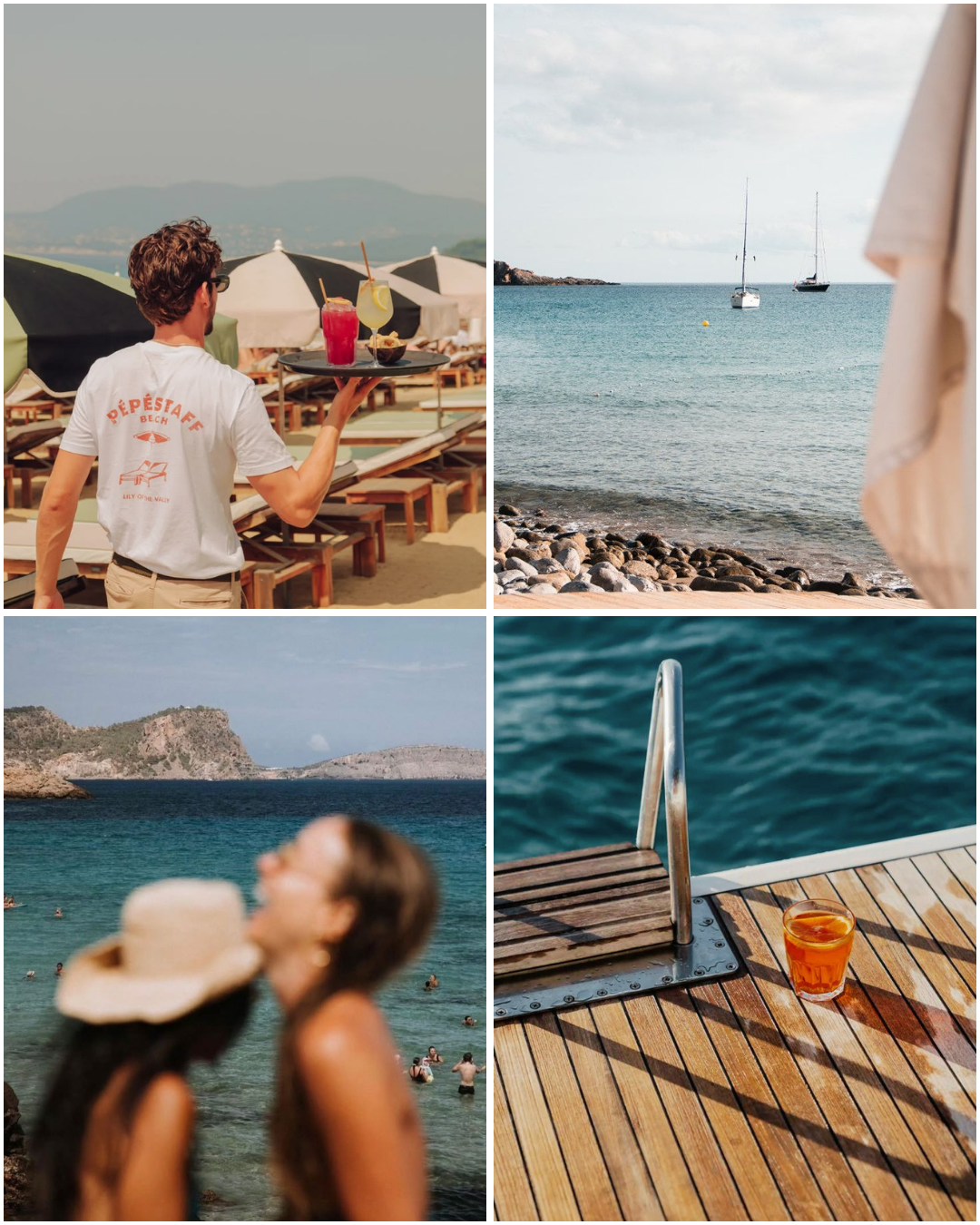
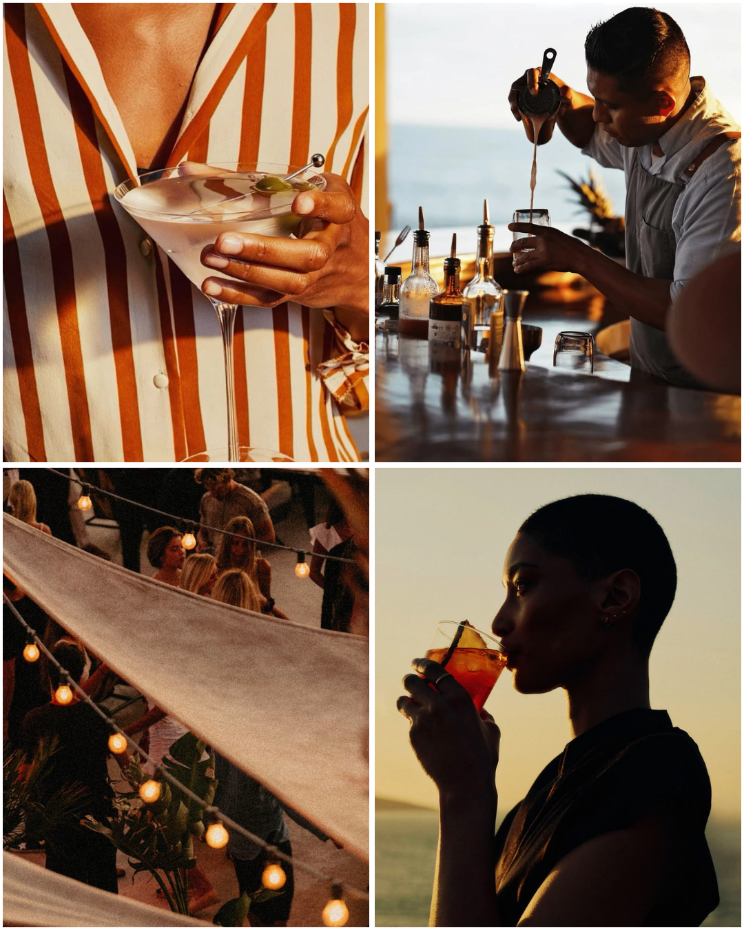
The real call came before any visuals: ruling out tiki and retro-tropical entirely, even though it's the fastest way to signal "beach bar" and the most expected move in the category. The bet was that restraint would read as more confident than the genre's usual shorthand. No palm trees in the mark, no script type, no saturated tropical color, while the brand still had to feel unmistakably beachy without any of those crutches. That tension is what the rest of the system had to resolve.