❋
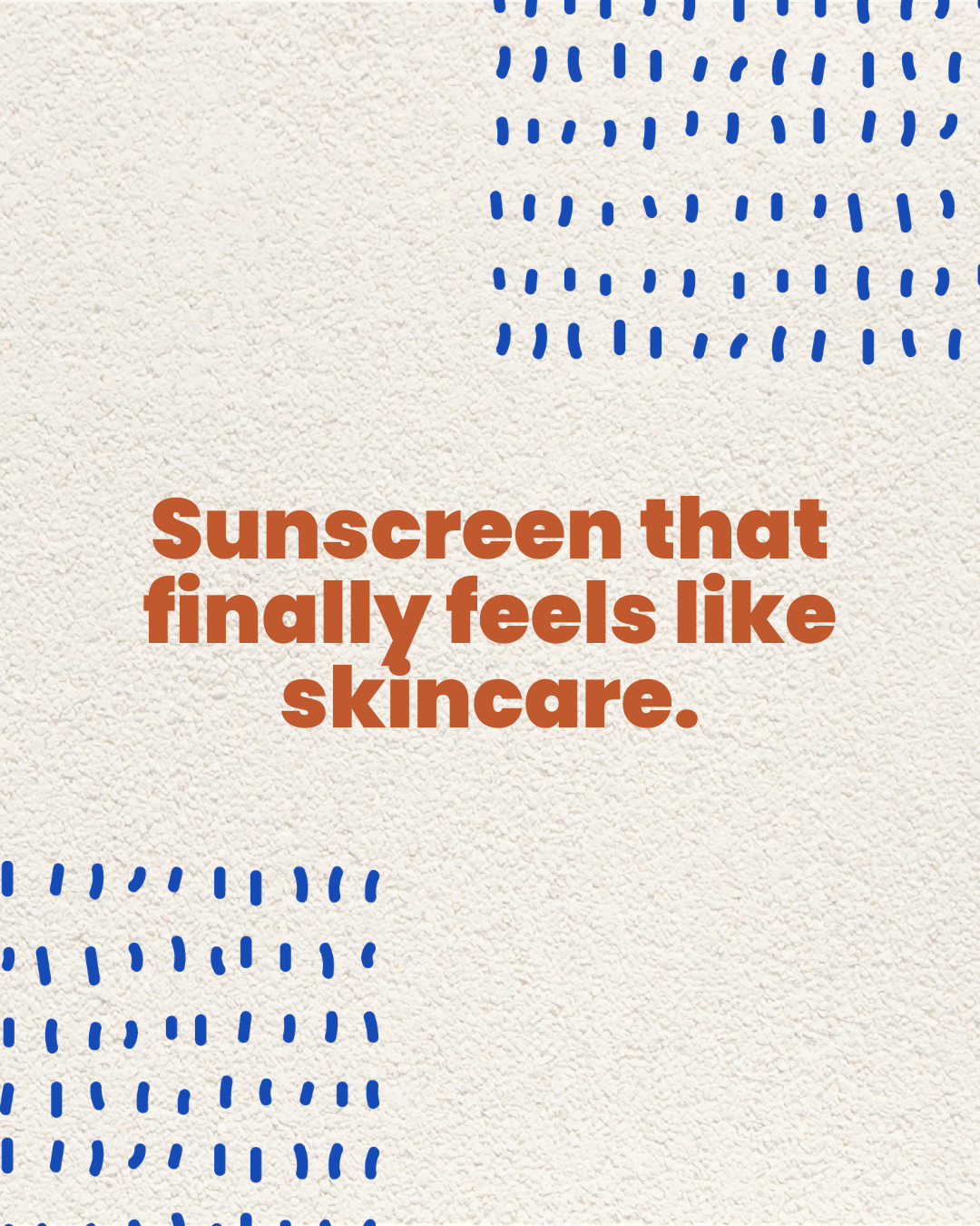
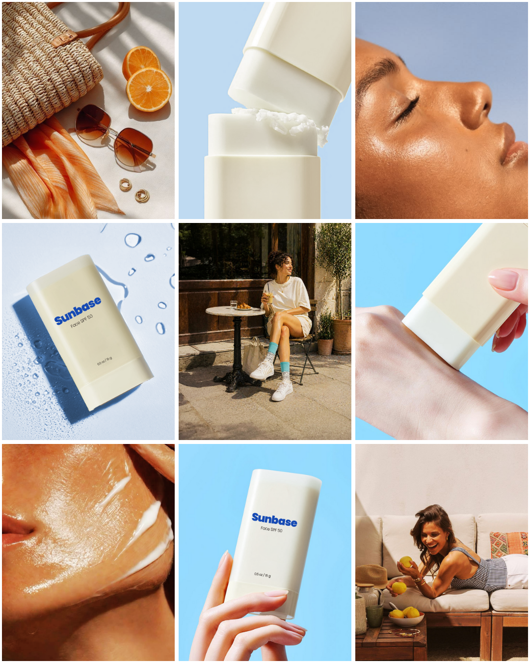
Week 10 • Sunbase Sunscreen • Brand Identity + Packaging DesignSunscreen that finally
feels like skincare.
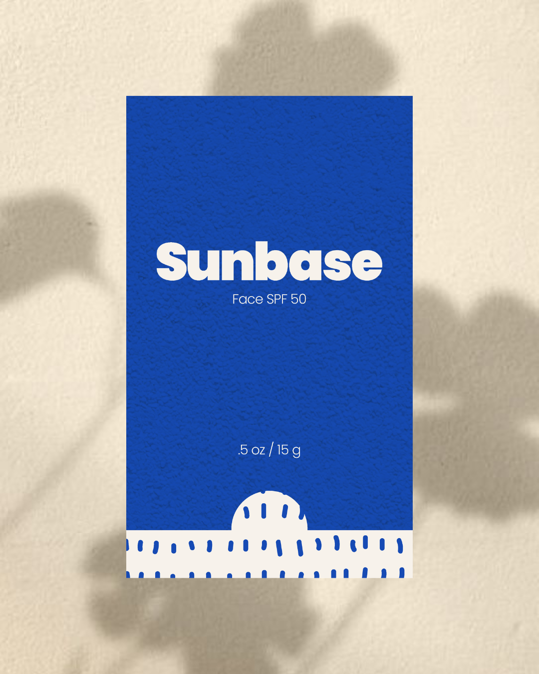
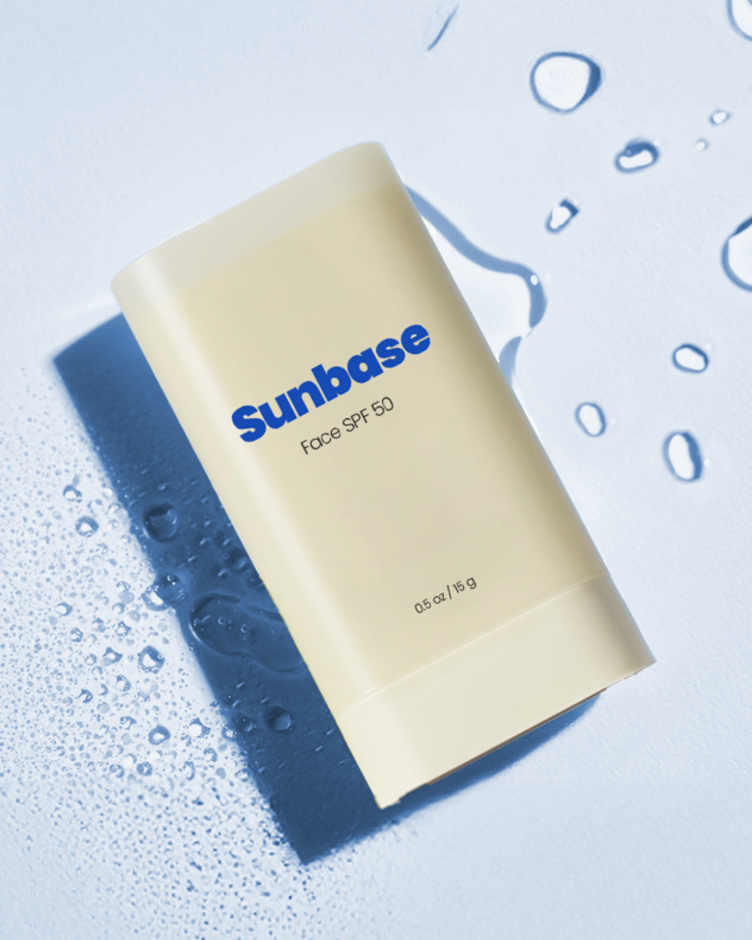
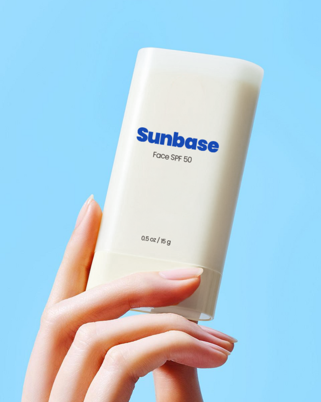
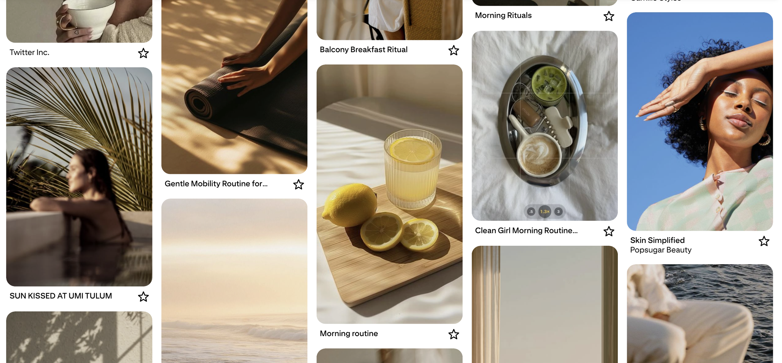
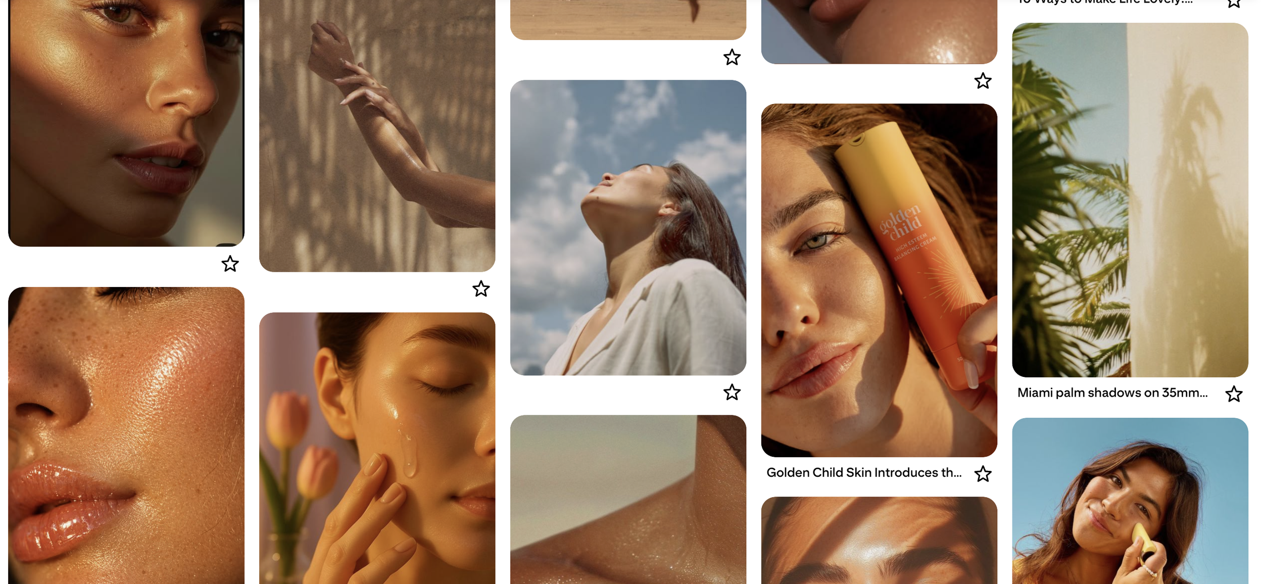
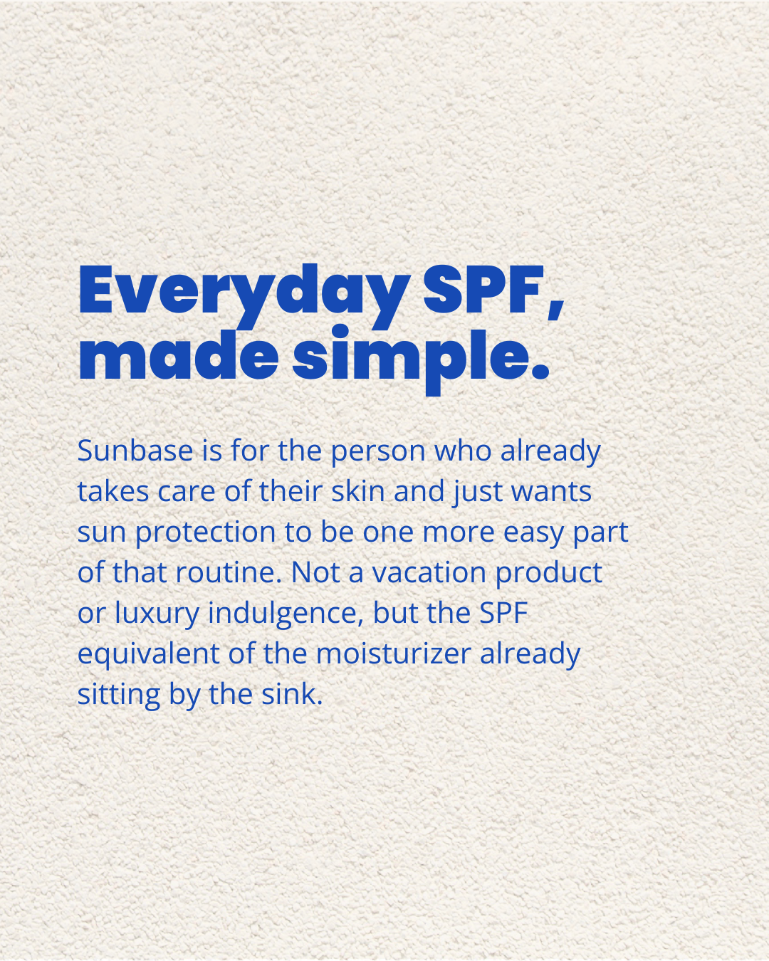
Sunscreen brands tend to split into three camps: beach-nostalgic, clinical, or eco-luxe indulgent. None of which read like something you'd actually reach for on a random Tuesday. Sunbase needed to sit in the gap between those three: modern enough to feel current, warm enough to feel human, and quiet enough to disappear into a skincare routine instead of announcing itself as a summer product.
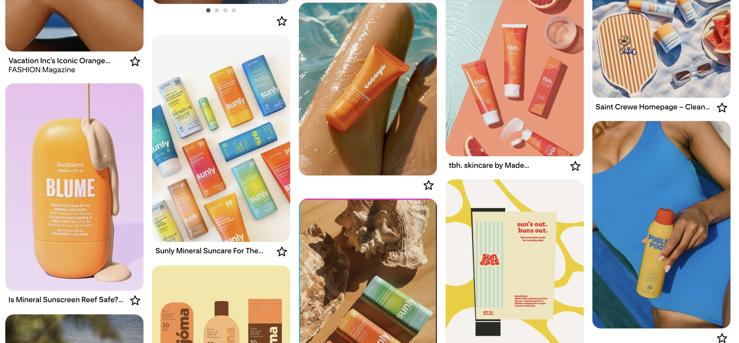
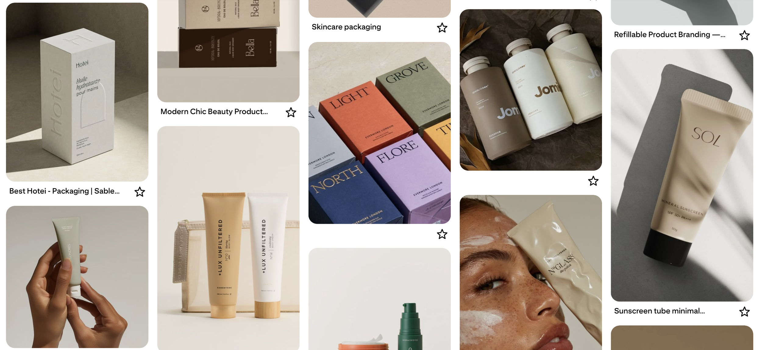
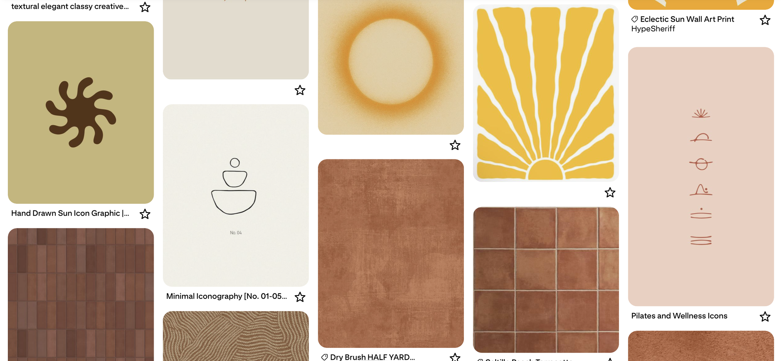
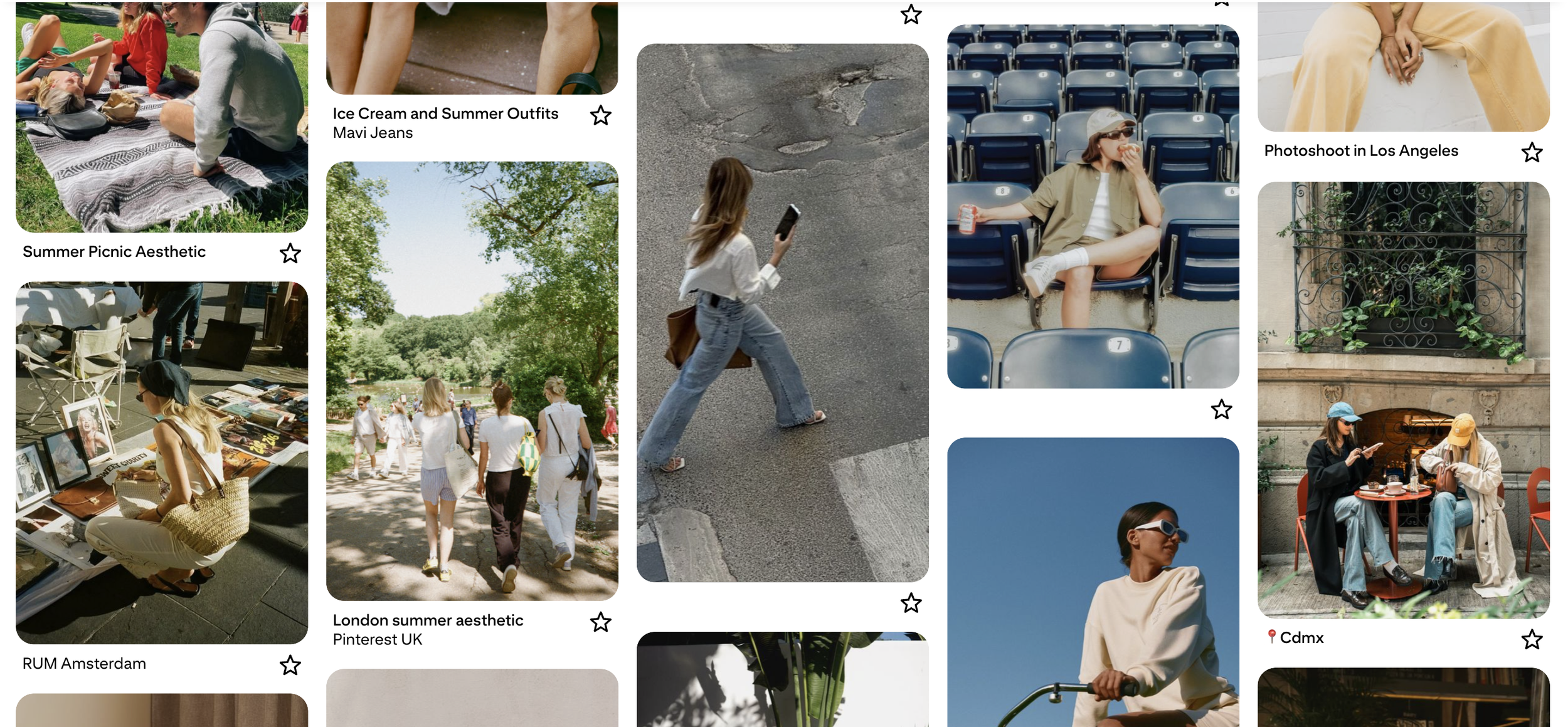
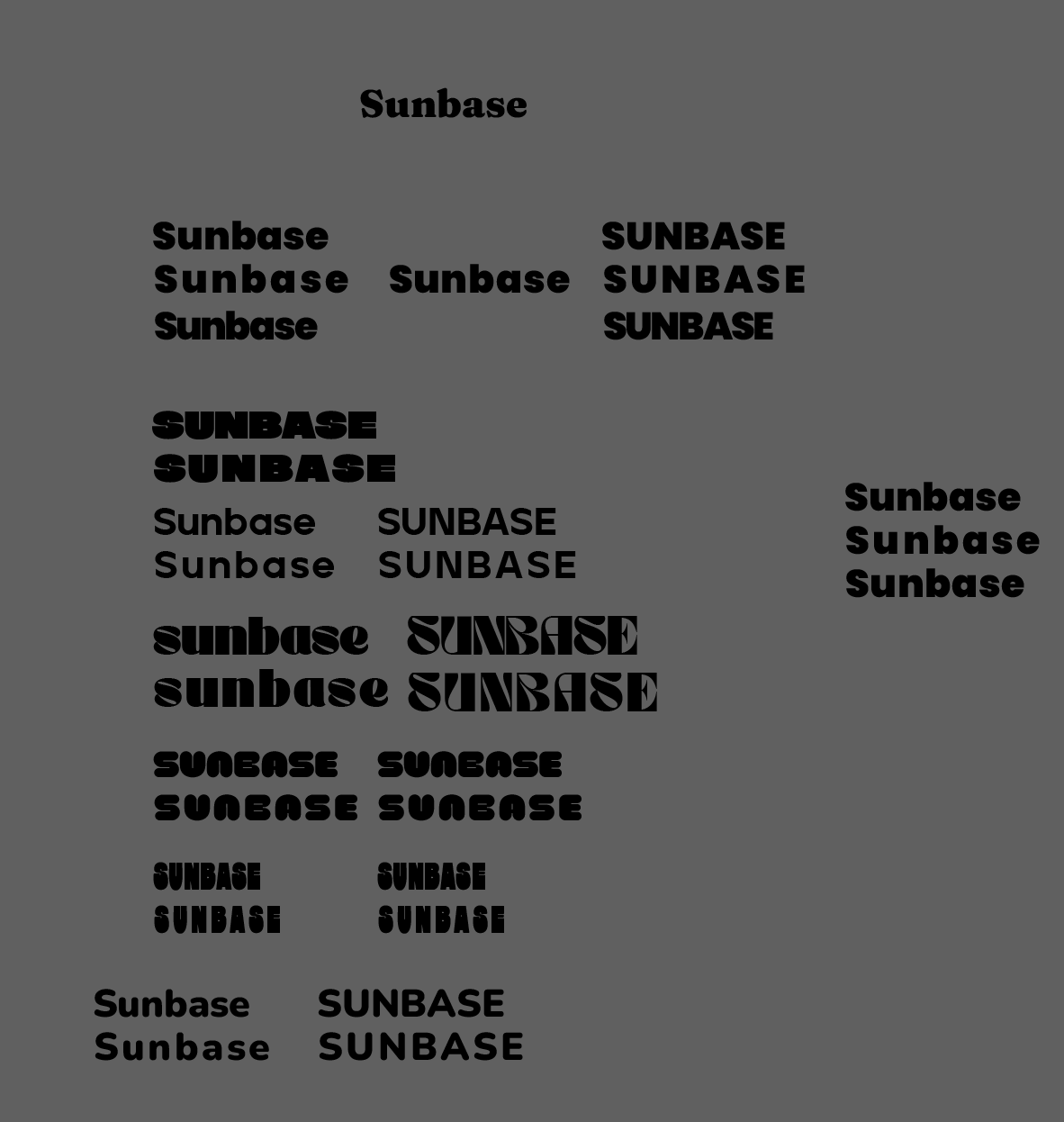
The wordmark went through more rejections than any other decision in the project. A handwritten script felt too precious, a bouncy rounded display read too cutesy, an inflated cartoon face tipped into novelty, and a sharp geometric grotesk landed too cold and sat too close to a direct competitor's existing bold-wordmark territory.
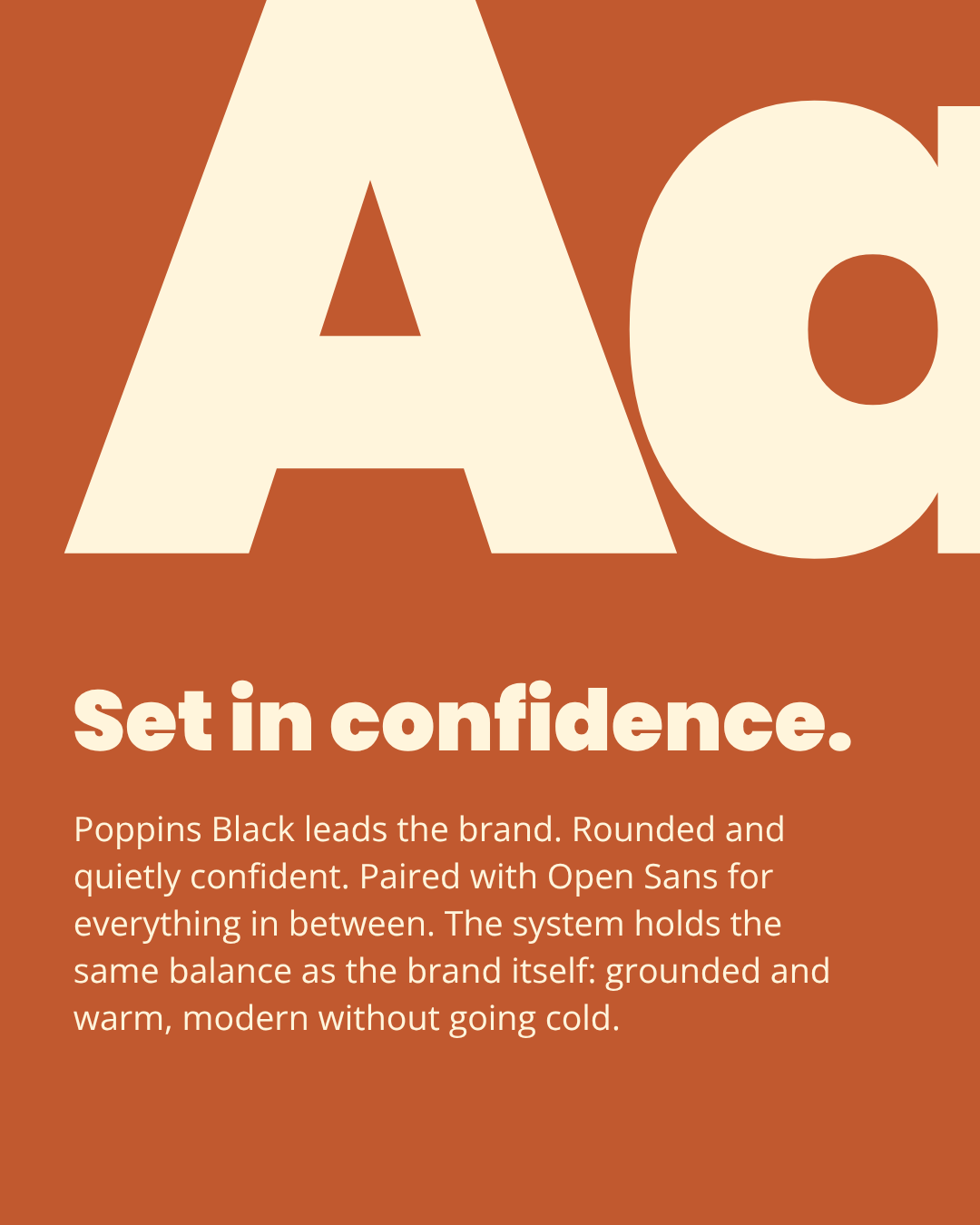
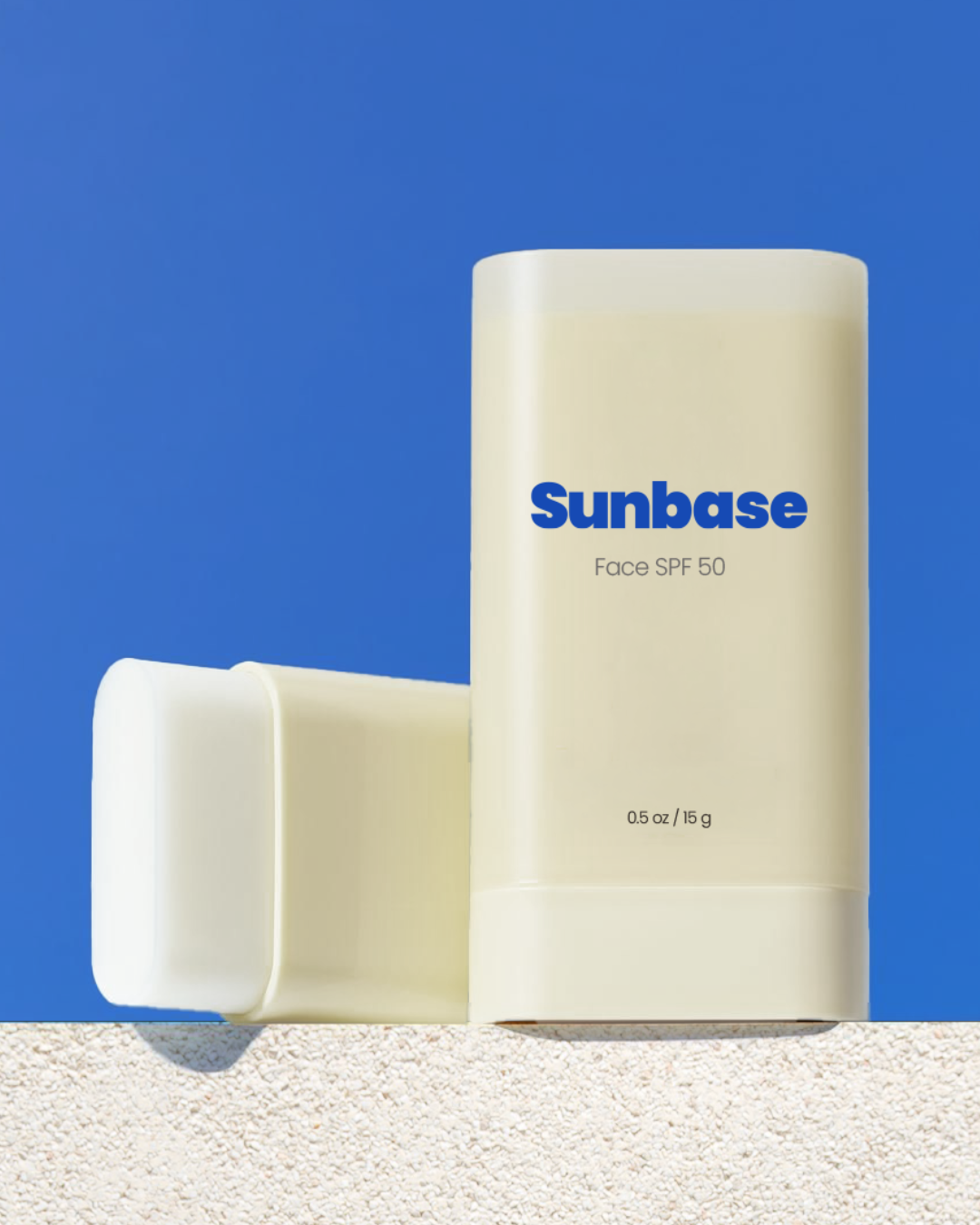
The type that survived: a bold, geometric, rounded sans set entirely in lowercase. It is confident enough to hold its own on a shelf, soft enough around the edges to avoid reading harsh, with tight, custom-kerned tracking so the letters read as one considered shape instead of a typed word.
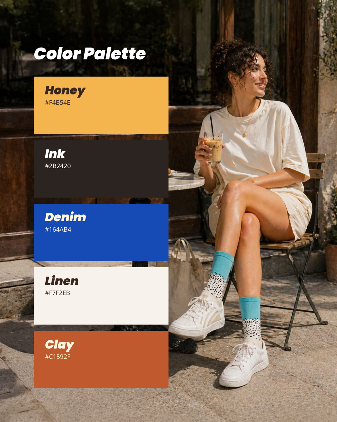
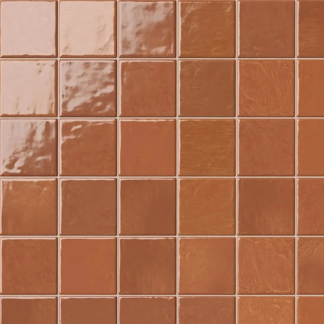
The brief's keywords were everyday, light, modern, and warm. The color doing the most work in the final identity is a genuinely cool, saturated blue. That wasn't an oversight; it was the hardest call of the week. A fully warm palette risked reading as safe, and worse, as indistinct from the eco-luxe and nostalgic-retro competitors already sitting in that exact temperature.
The bet was to keep one deliberately cool, bold accent inside an otherwise warm-led system, tested against real contrast math so it never sits next to the warm tones it would fight, rather than force every color into the same mood just because a keyword said so.