❋
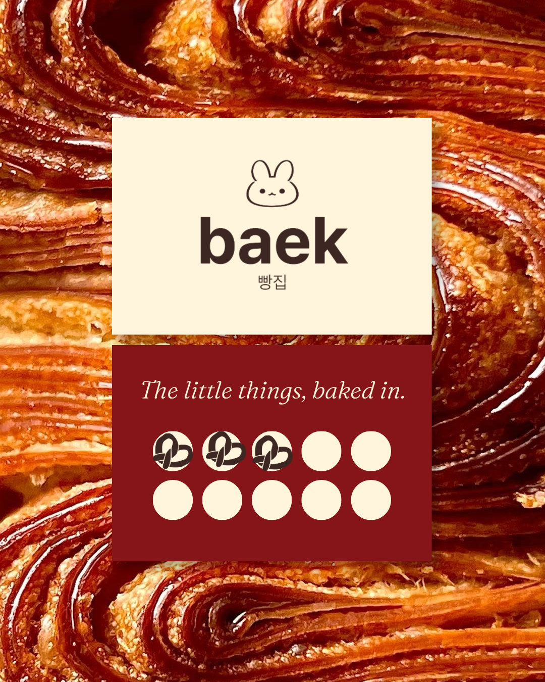
Week 9 • Baek Korean Bakery • Full Brand Identity + Menu DesignThe little things,
baked in.
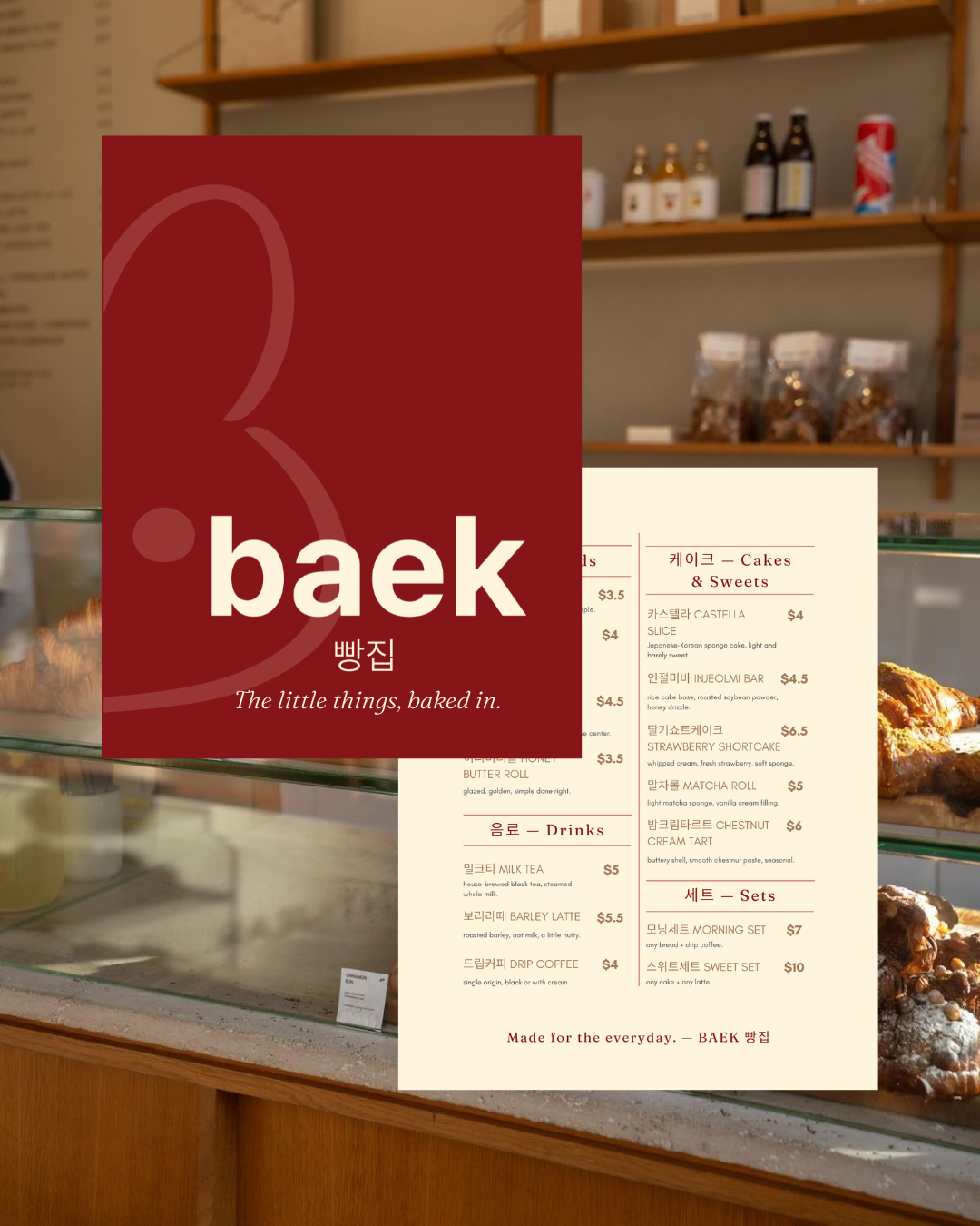
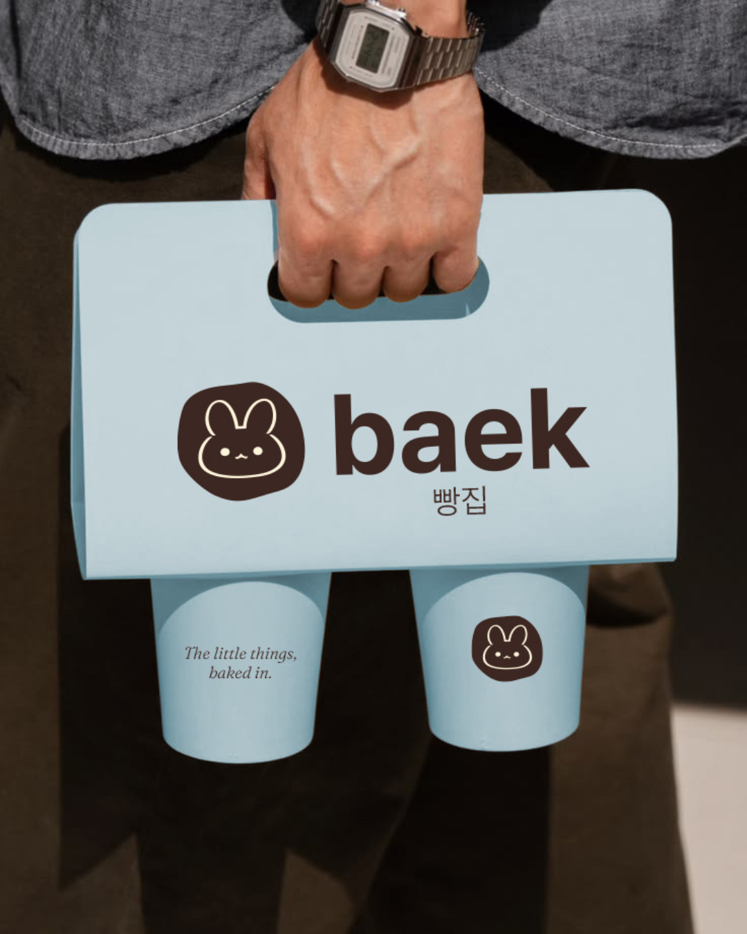
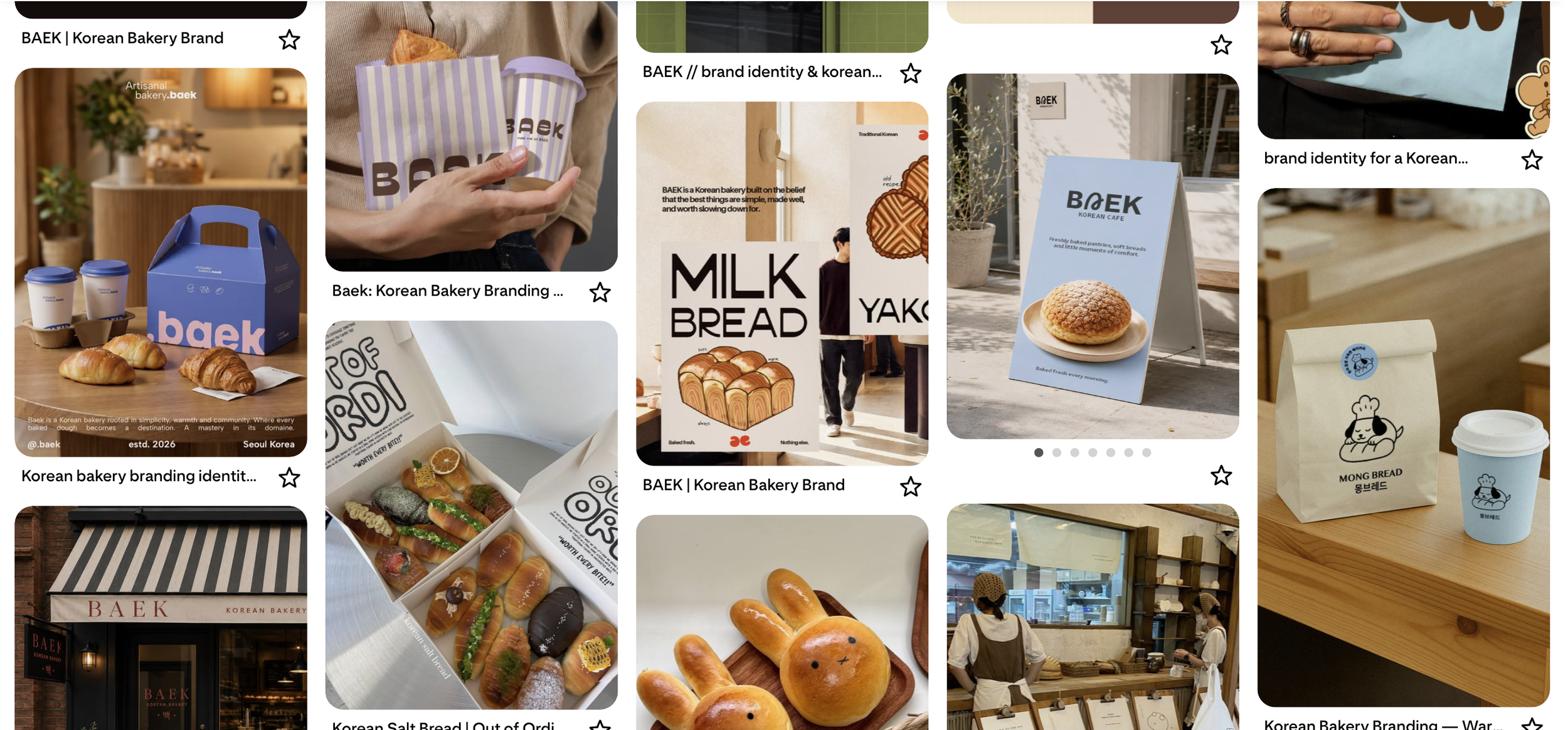
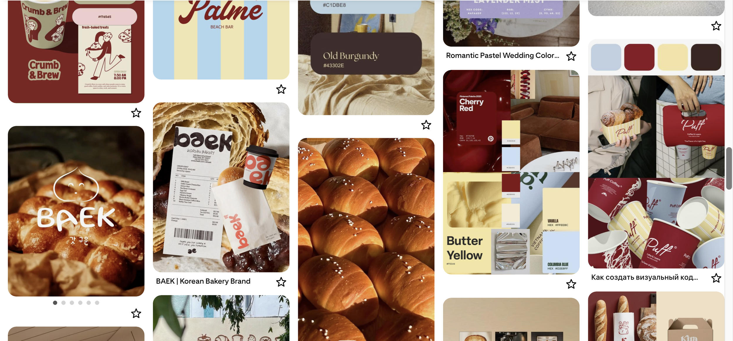
Every Korean bakery brief tends to go one of two ways: French-coded gold and cream, borrowing straight from Paris, or warm and handwritten with a lot of red. Baek leans into that second lane rather than avoiding it, but reworks it: red stays as the dominant note, softened with pops of blue, yellow, and cream instead of the usual heavy gold or all-red palette. Modern and unmistakably Korean, without defaulting to either extreme.
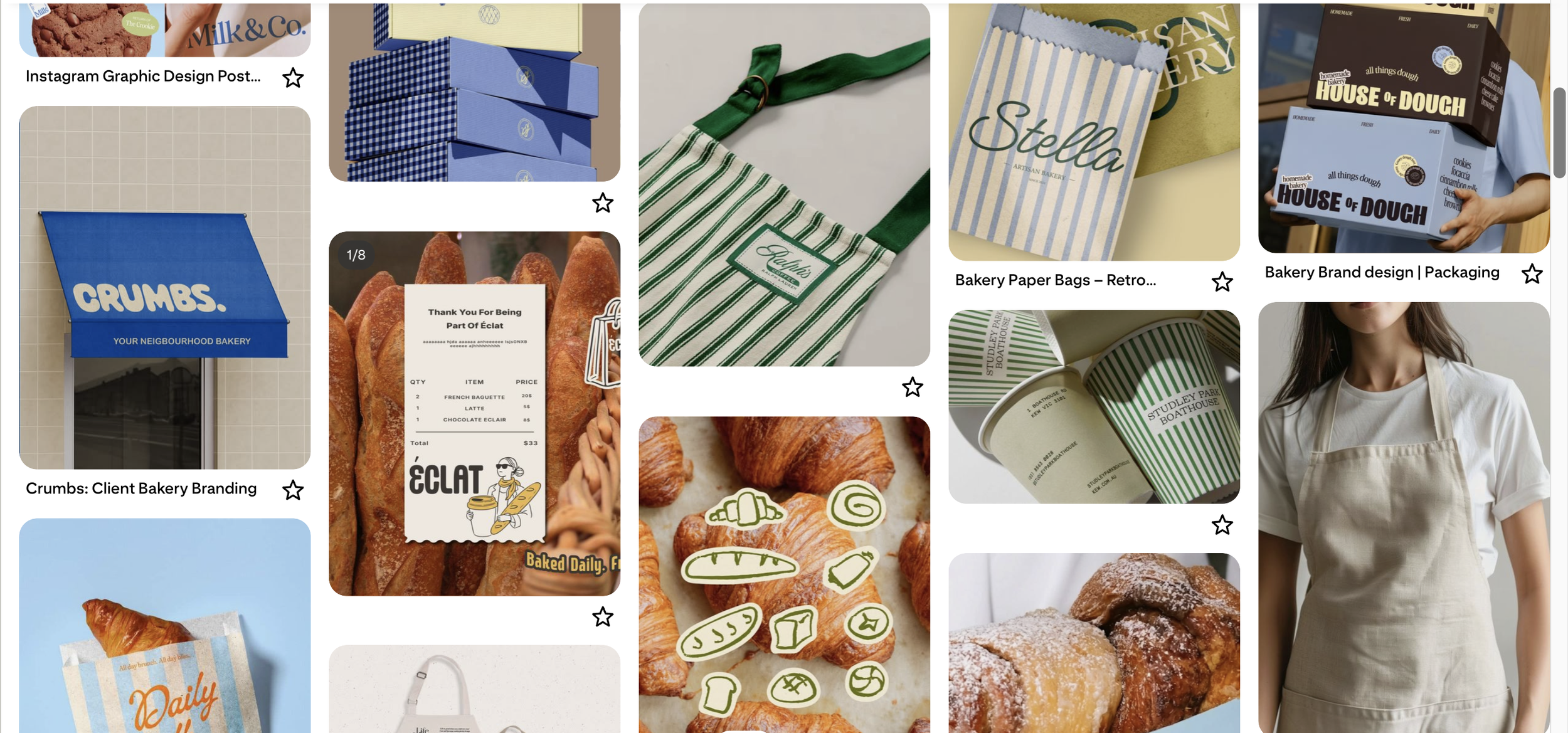
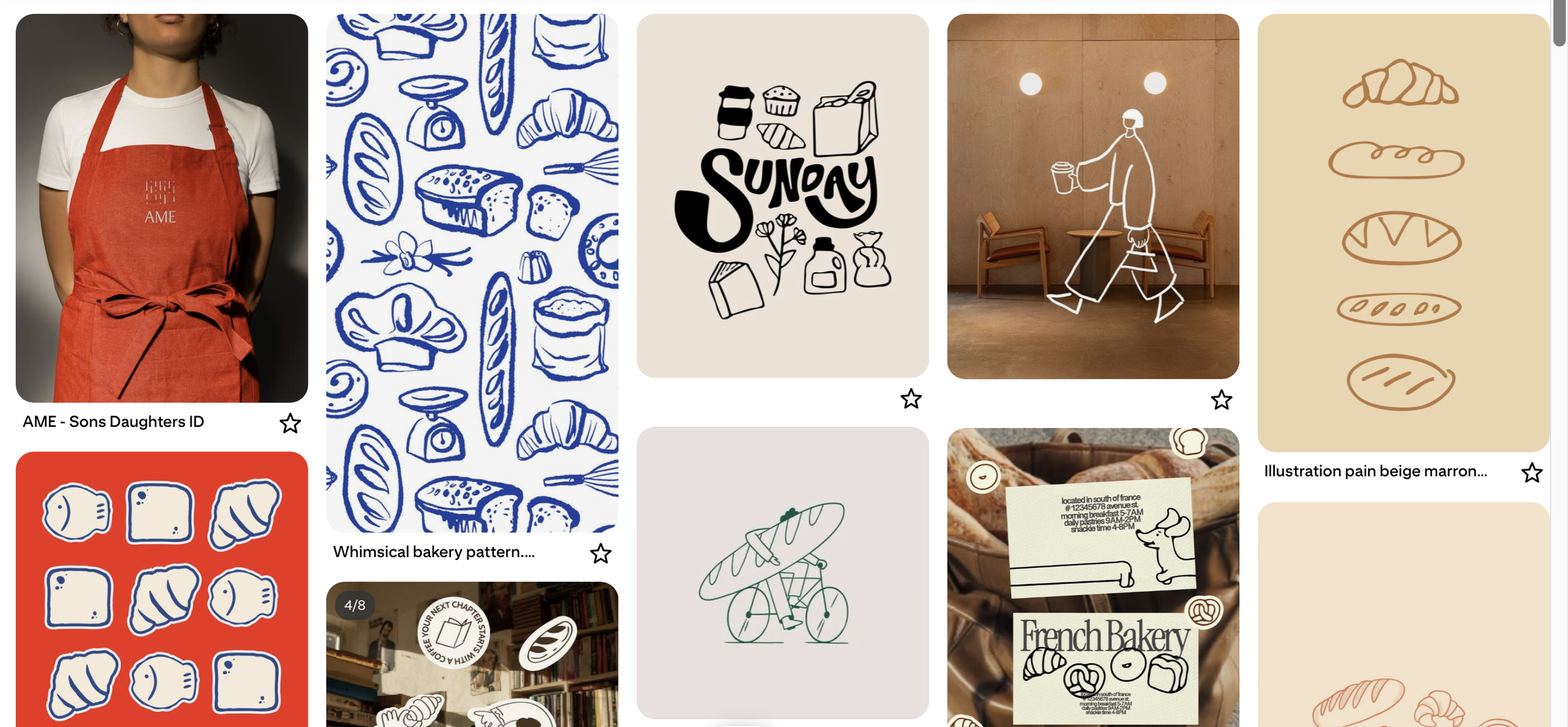
백 (baek) means 100, a direct nod to 백일, the Korean 100-day celebration. The obvious move was building the whole brand around that one milestone. The better move was widening it: not one big day, but all the small ones that don't get marked. "The little things, baked in" became the brand's entire reason for existing, a bakery for the everyday moment, not just the occasion.
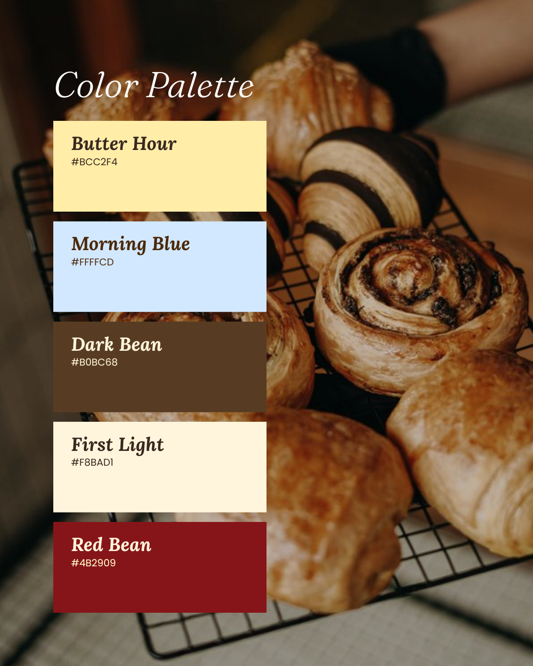
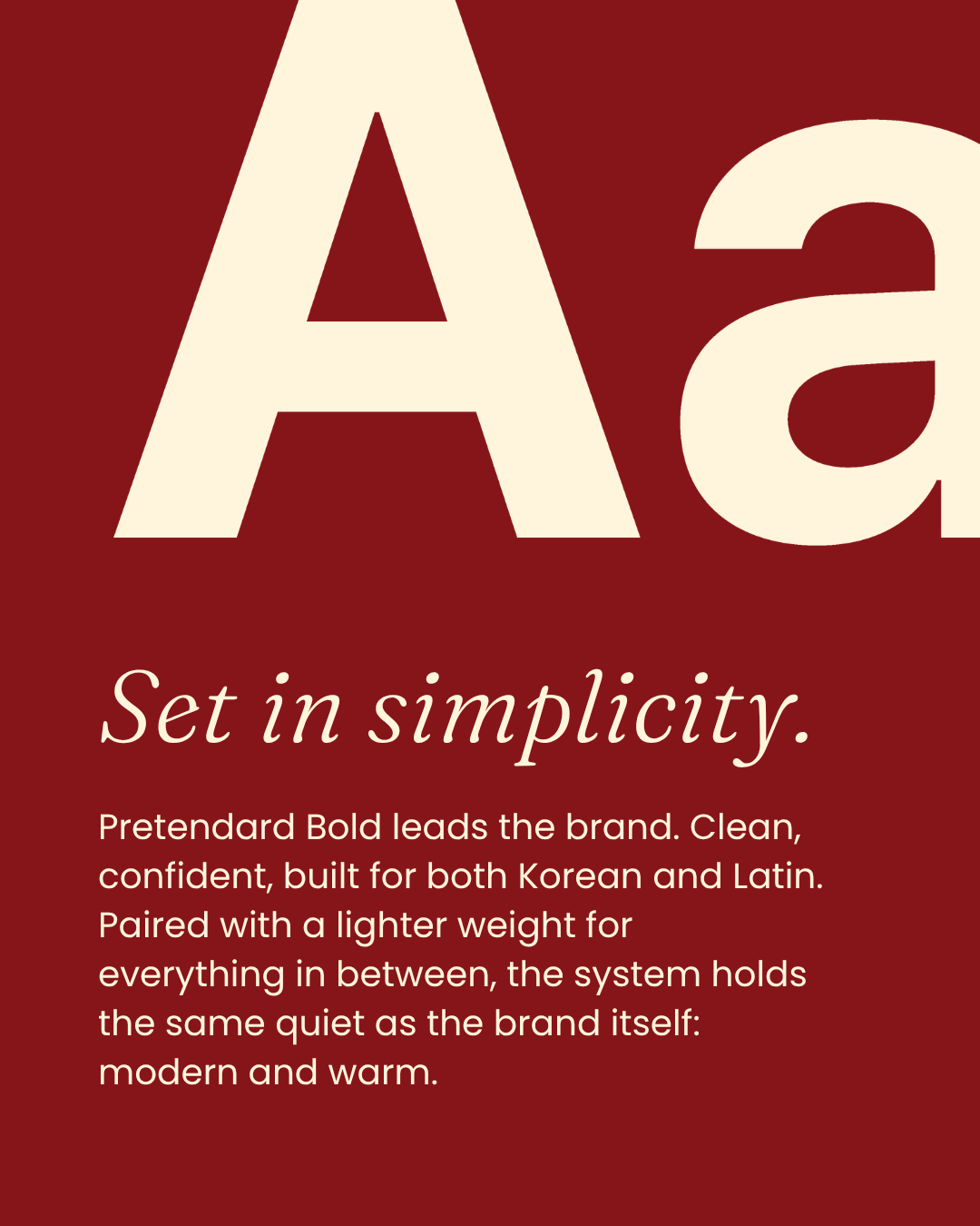
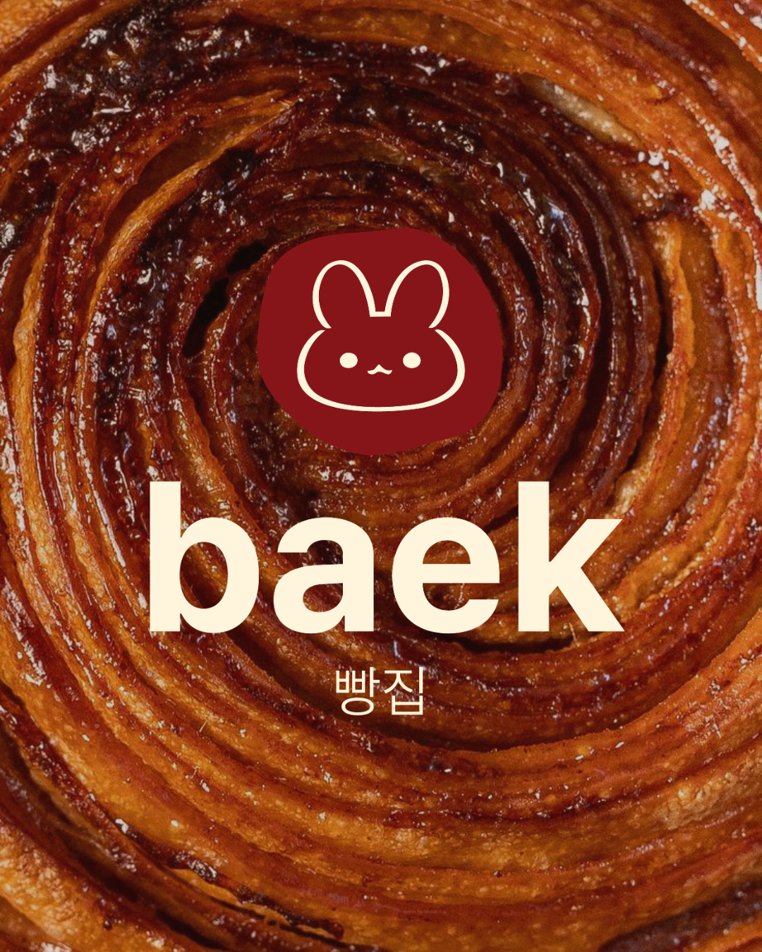
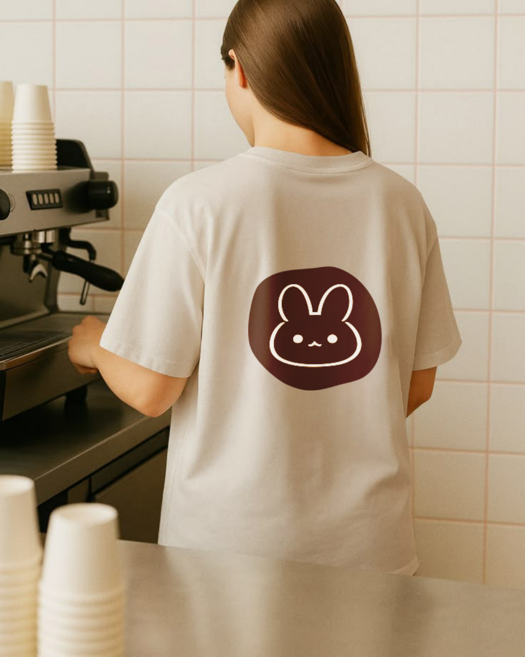
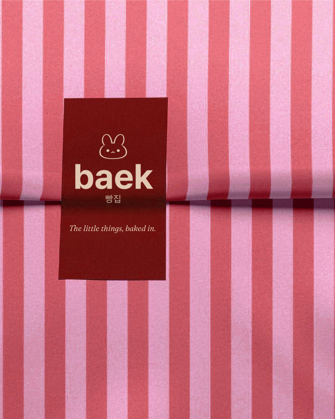
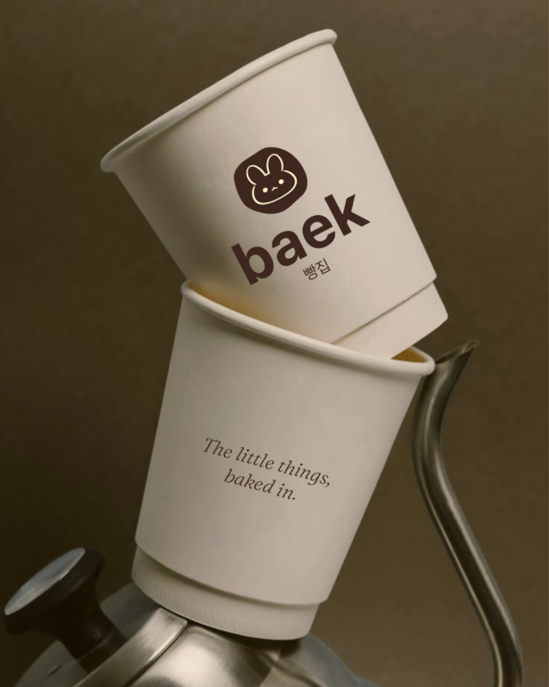
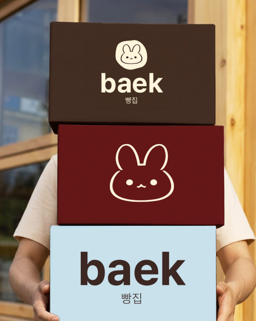
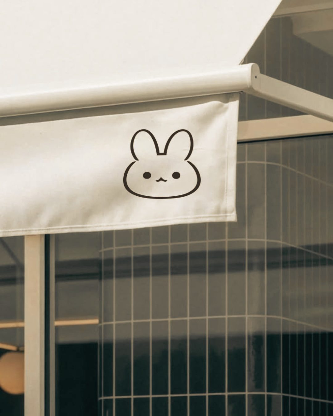
The brand personality was named "Gentle Joy" early on, and the real discipline was keeping it gentle everywhere except one place. Color, type, and layout all stayed calm and minimal; the warmth had to live somewhere, and it went entirely into the mascot instead of getting spread thin across the whole system. One character carrying the personality, rather than every element trying to.