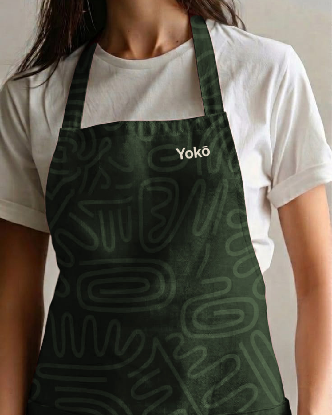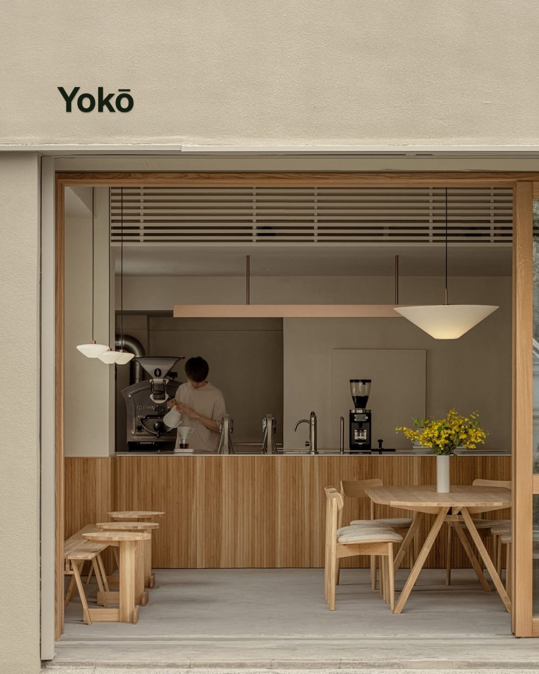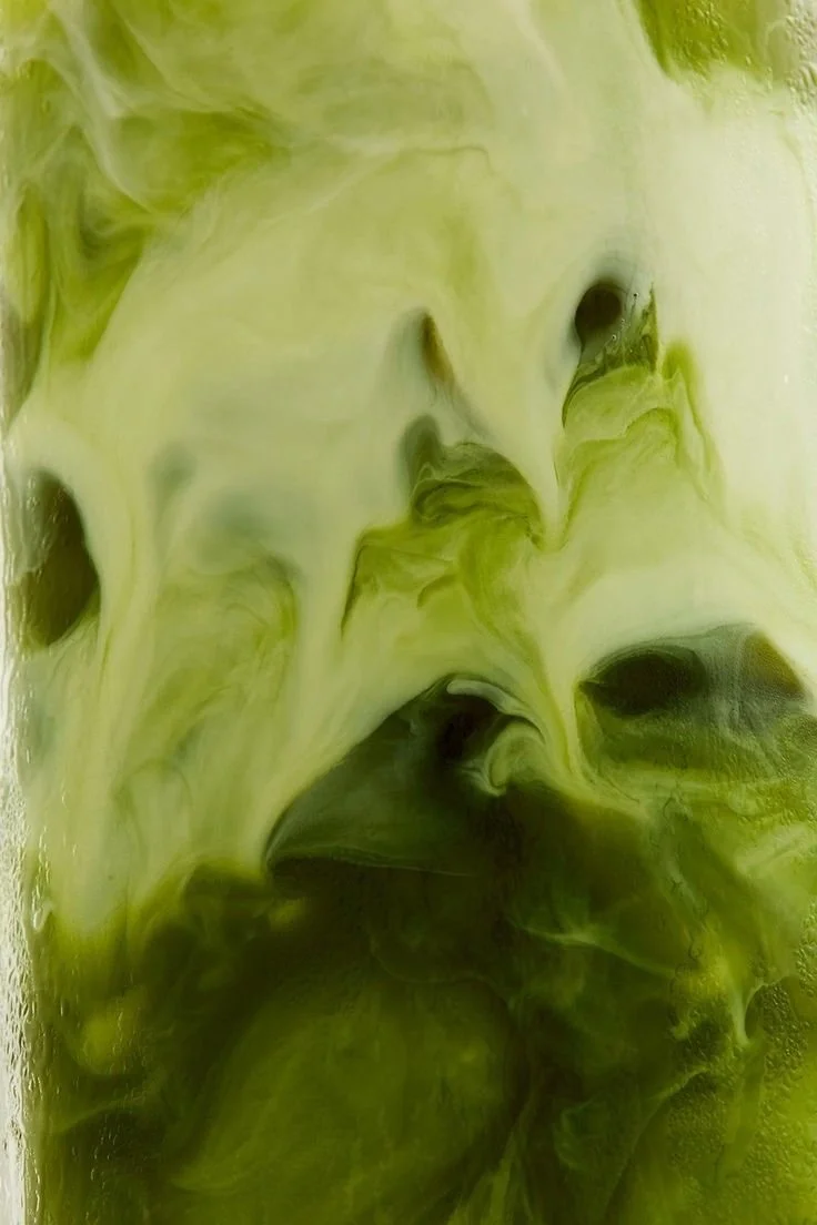
❋
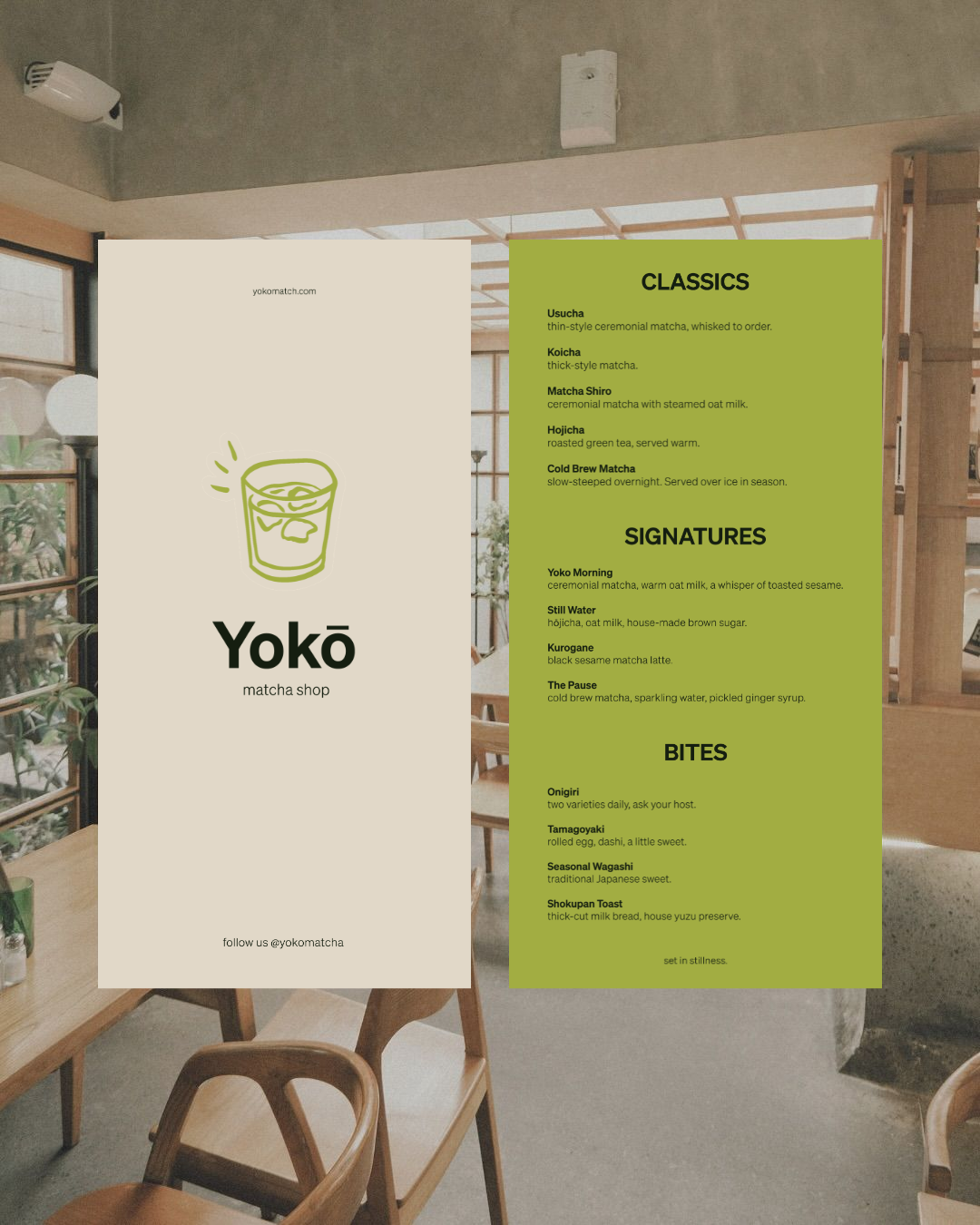
Week 8 • Yokō Matcha Café • Menu card + full brand identityTokyo moves fast.
Yokō doesn't.
Most matcha cafés fall into one of two camps: loud and Instagrammable, or serious and a little cold. One sells fun with no depth, the other sells expertise with no warmth. Yokō needed to be neither — a brand that could hold the speed of the city outside and the stillness of the ritual inside, at the same time, without picking a side.
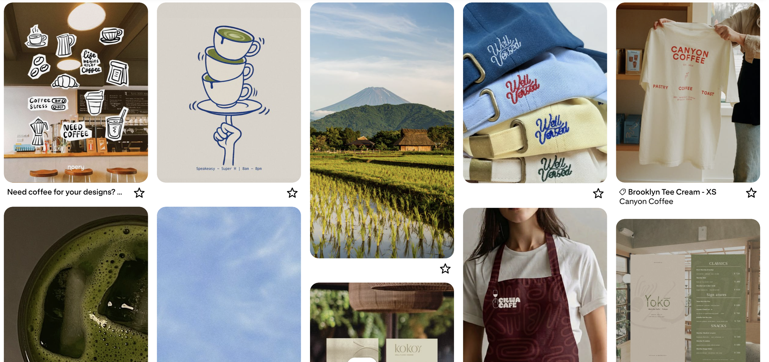
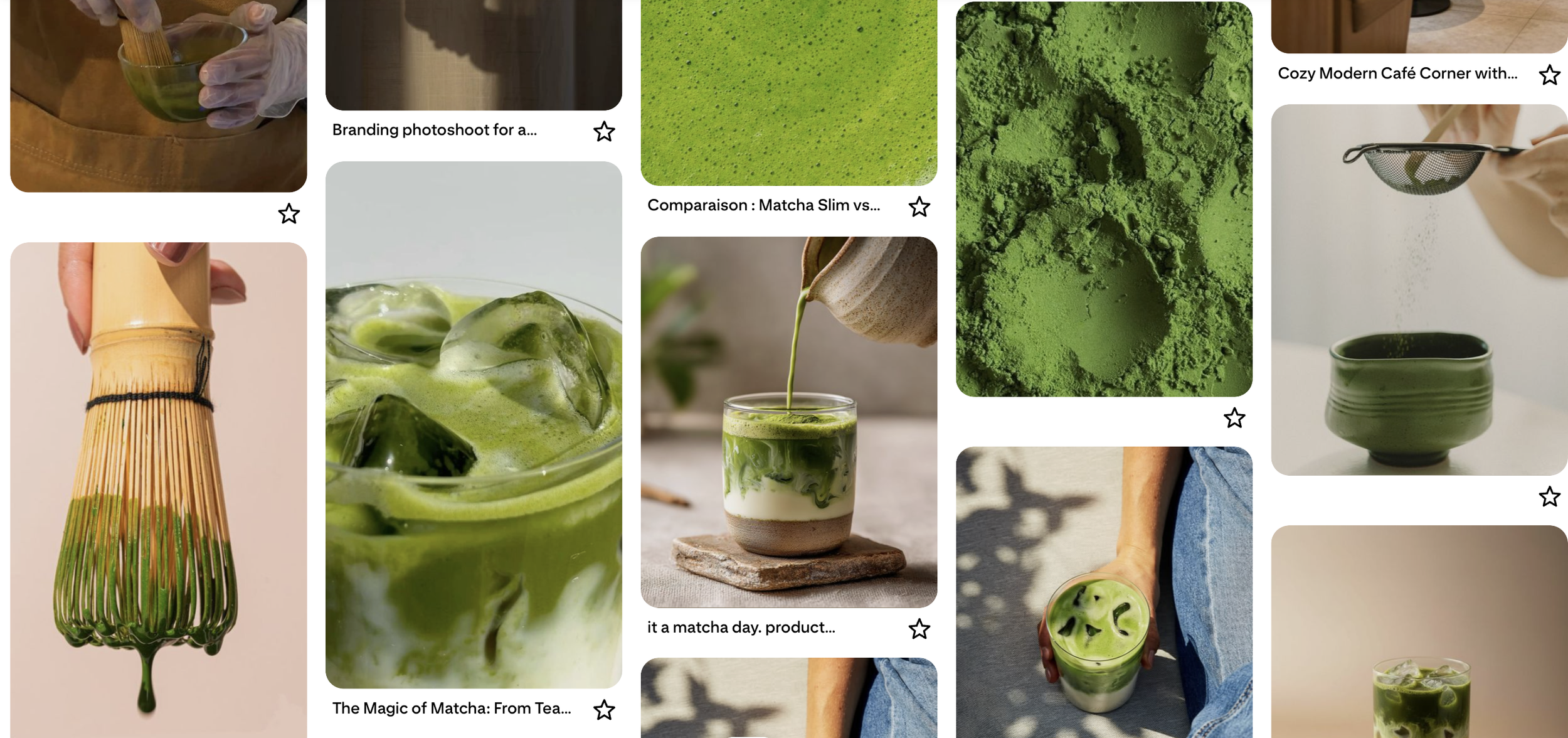
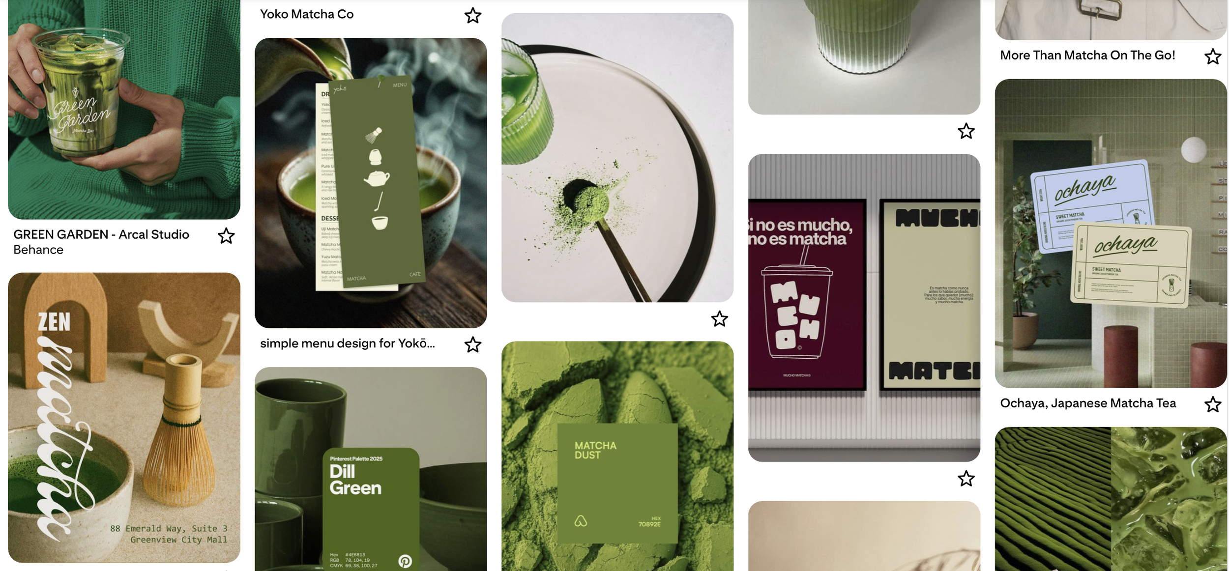
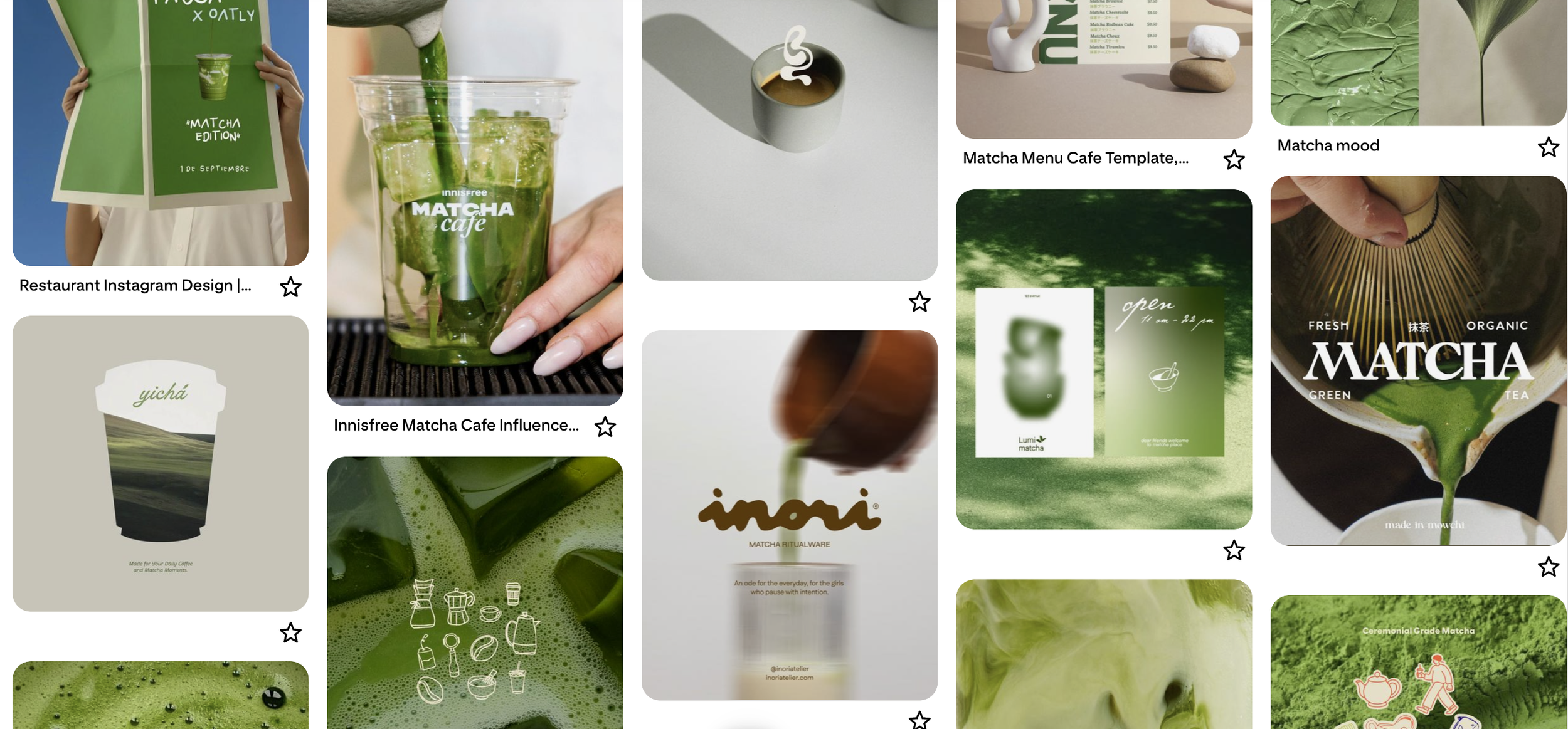
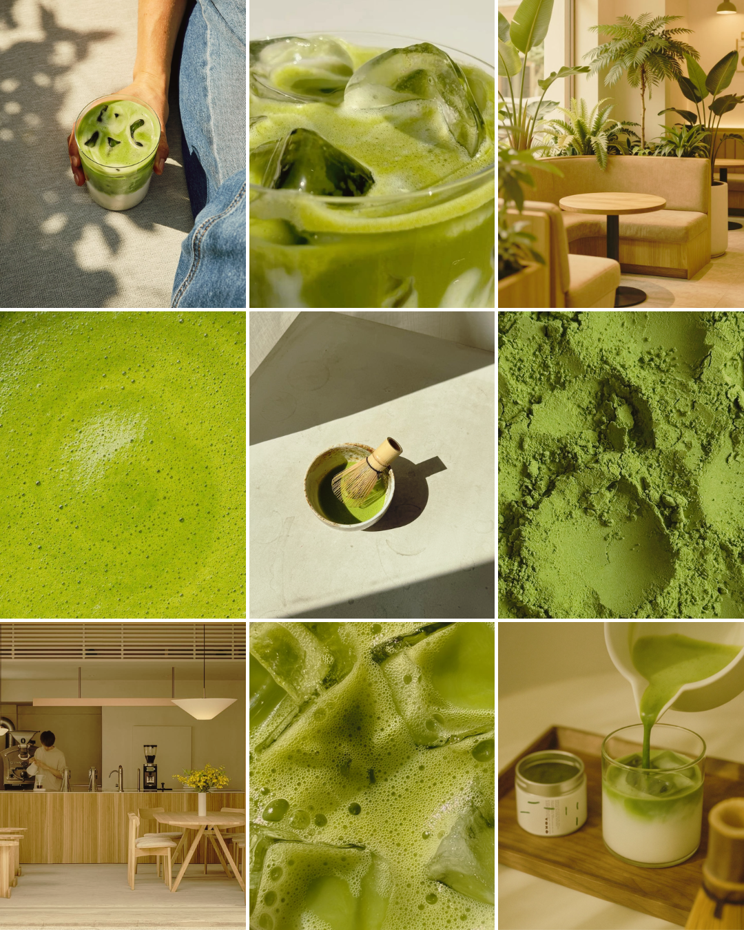
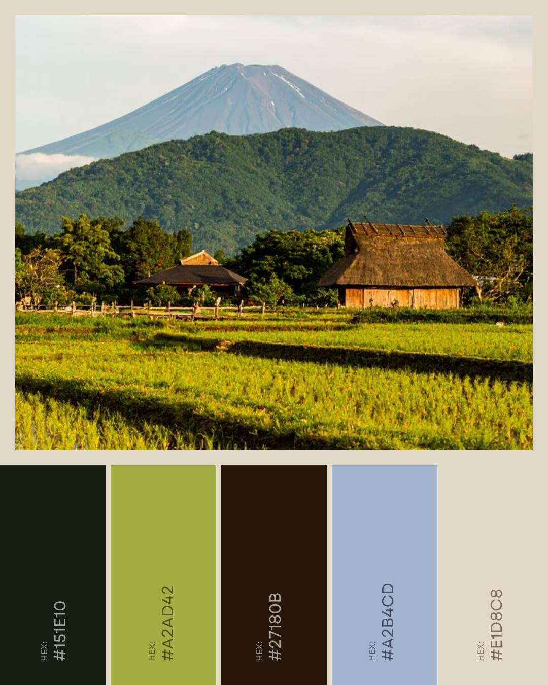
Yokō's palette starts there but doesn't stay there: a deep ceremonial green as the anchor, a brighter shade-grown green for contrast, and a pale blue-grey — Morning Mist — that has no business working in a matcha palette and works anyway. It's the one color choice that makes the brand instantly distinguishable from every other cup of matcha on a shelf.
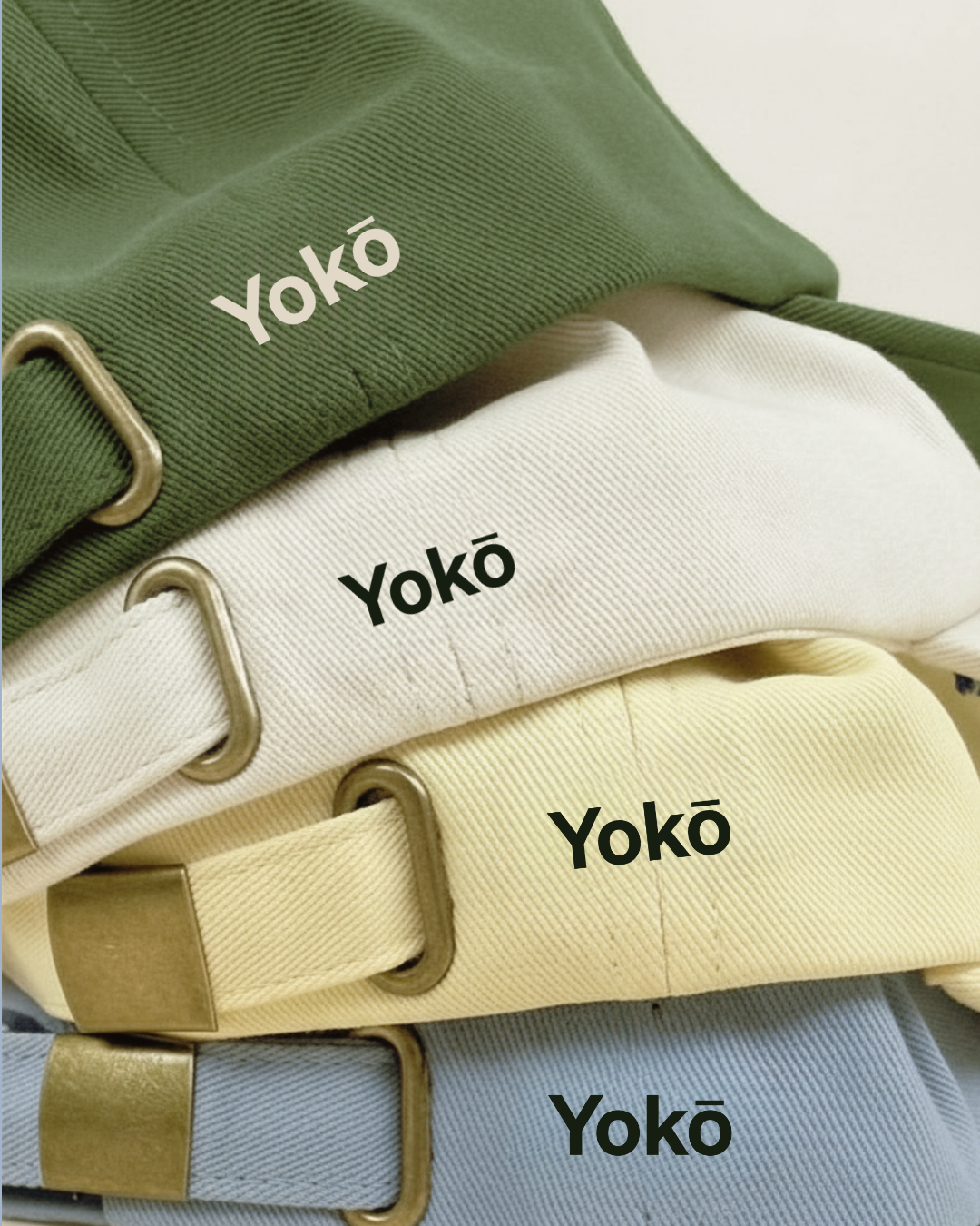
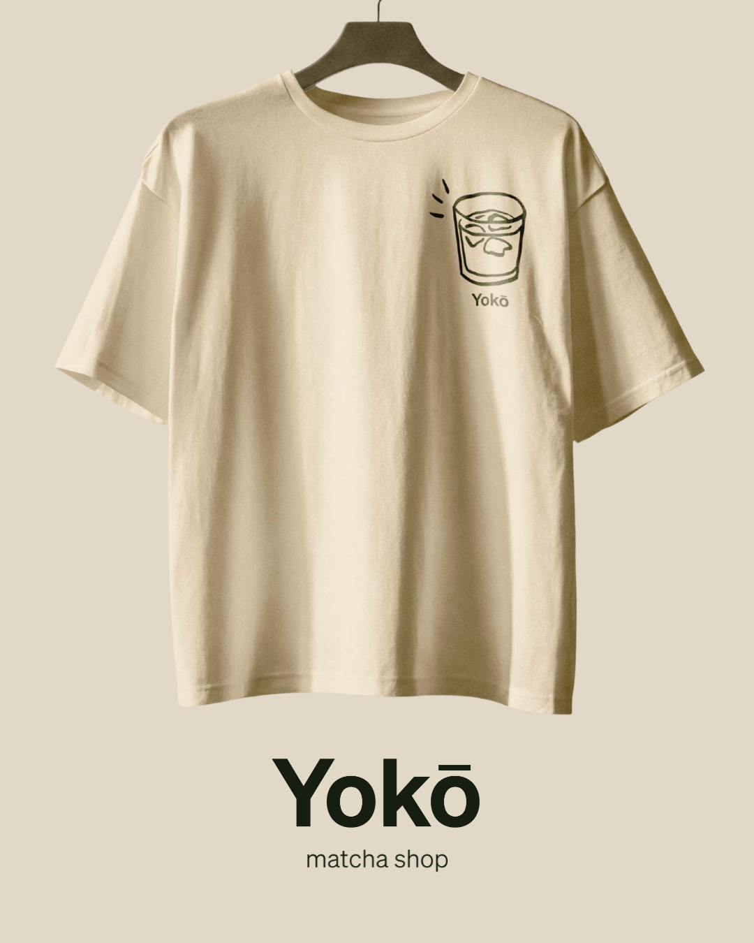
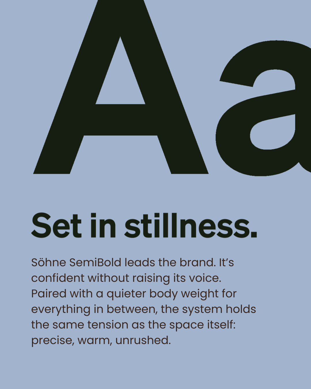
The wordmark went through a few rounds. Freight Display read too editorial, Source Sans too generic, before landing on Söhne SemiBold. It's confident without shouting, exactly the register the brand needed to hold urban and grounded at once.

Early mockups included a to-go cup. It looked fine. But the brand line was already written — Tokyo moves fast. Yokō doesn't. — and you can't sell stillness in a cup someone's drinking on the subway. So the to-go cup was cut.
If you want Yokō, you have to stay for it. It wasn't a limitation. It was the brand becoming honest with itself.