❋
Week 7 • Moonwell • Brand Strategy, Identity System, PackagingThe Morning After Glow.
Every brand in the sleep category leads with the problem. Tired but wired. Moonwell needed to skip that entirely. Not "here's what's wrong with you," but the specific, rare morning where you wake up before your alarm and actually want to be awake. The brief was never about sleep. It was about what good sleep makes possible.



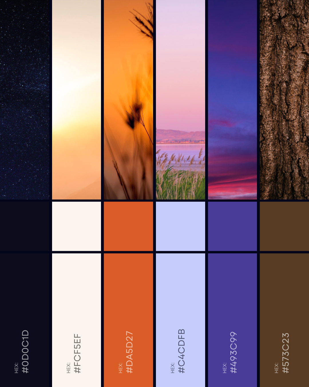
Moonwell's palette moves the way its best mornings do. Deep purple bleeding into burnt orange, the exact gradient of a sky just before sunrise. The sunrise ray mark carries that same idea in a single image: the brand's whole promise, distilled to one shape. The wordmark, set in Rebak Regular, stays soft enough to match the tone without losing the confidence underneath it.