❋
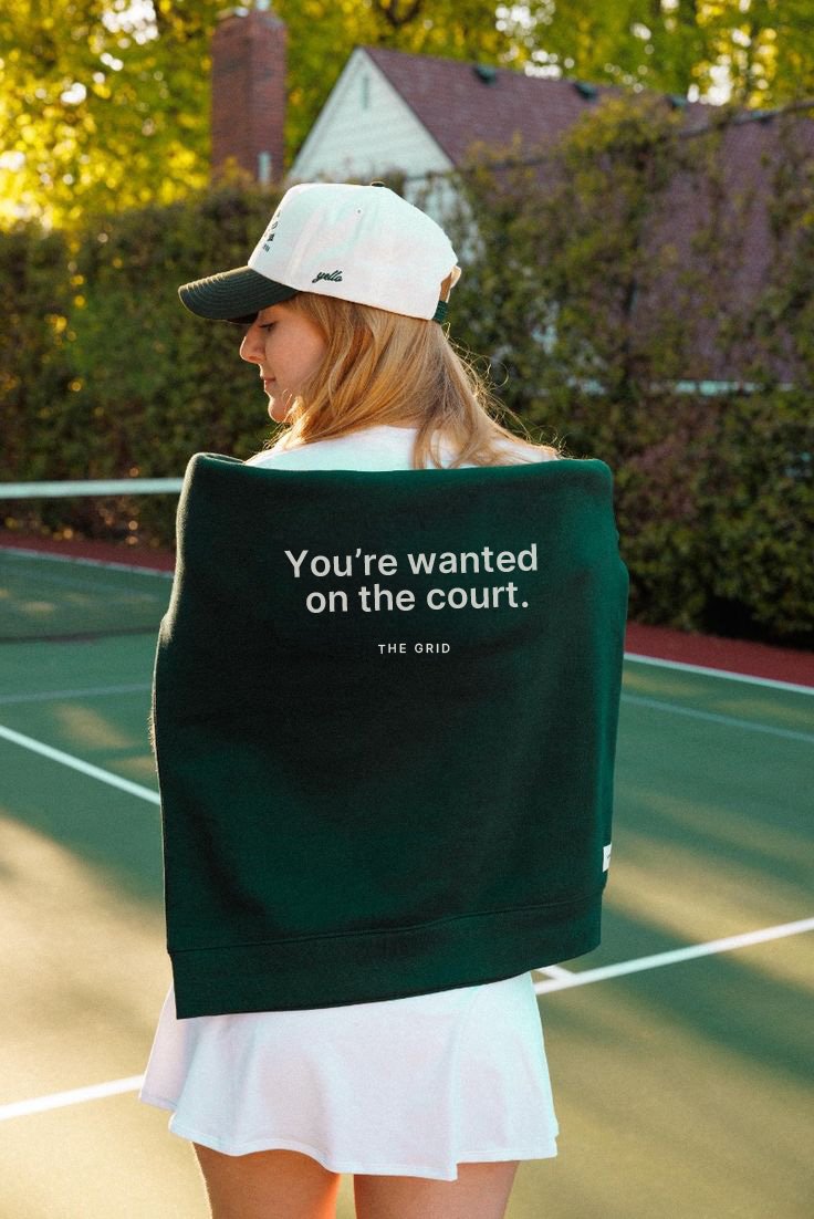
Week 6 • The Grid Tennis Club • Member card + Full Brand IdentityYou’re Wanted
on the Court
Tennis club branding tends to split two ways: heritage clubs lean into crests and serif type and end up feeling exclusionary, or performance clubs go dark and aggressive, chasing "premium" and end up feeling cold. Nobody had built bold and warm as a single brand. That gap, energetic without losing the people in it, became the whole strategy.
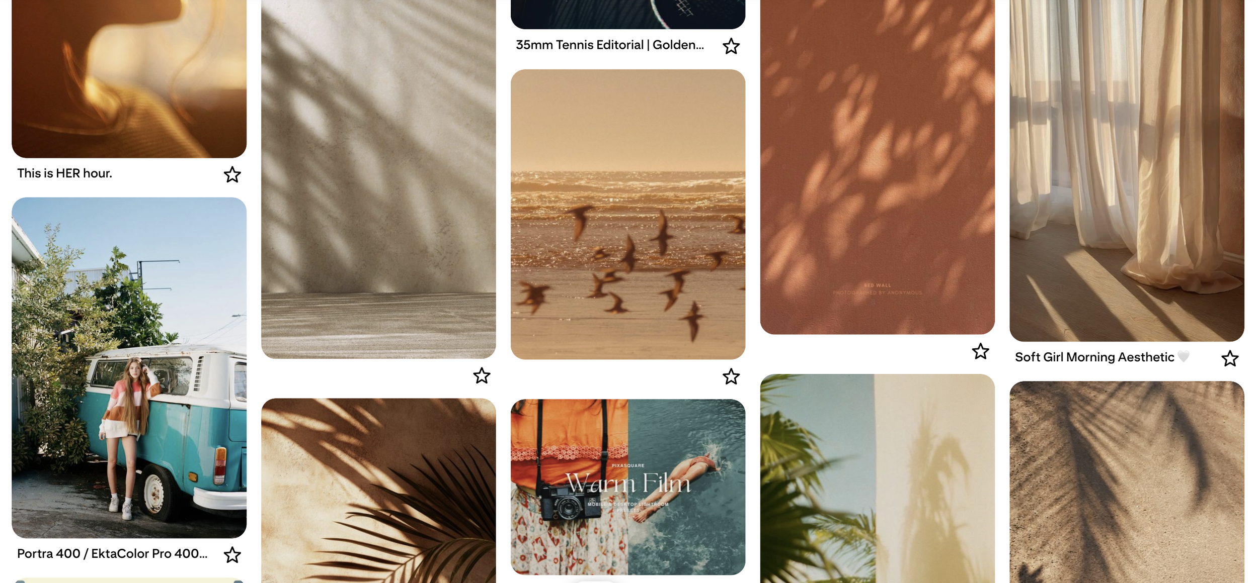
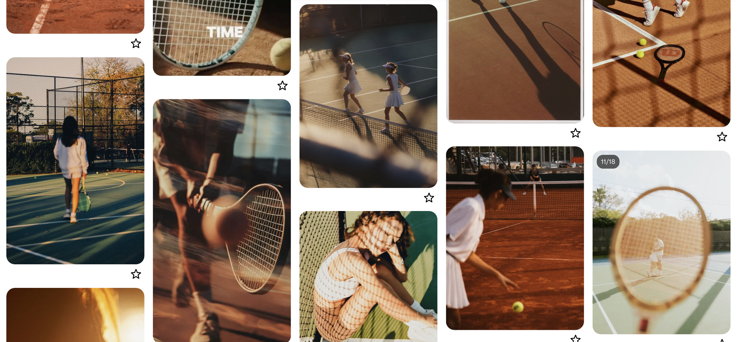
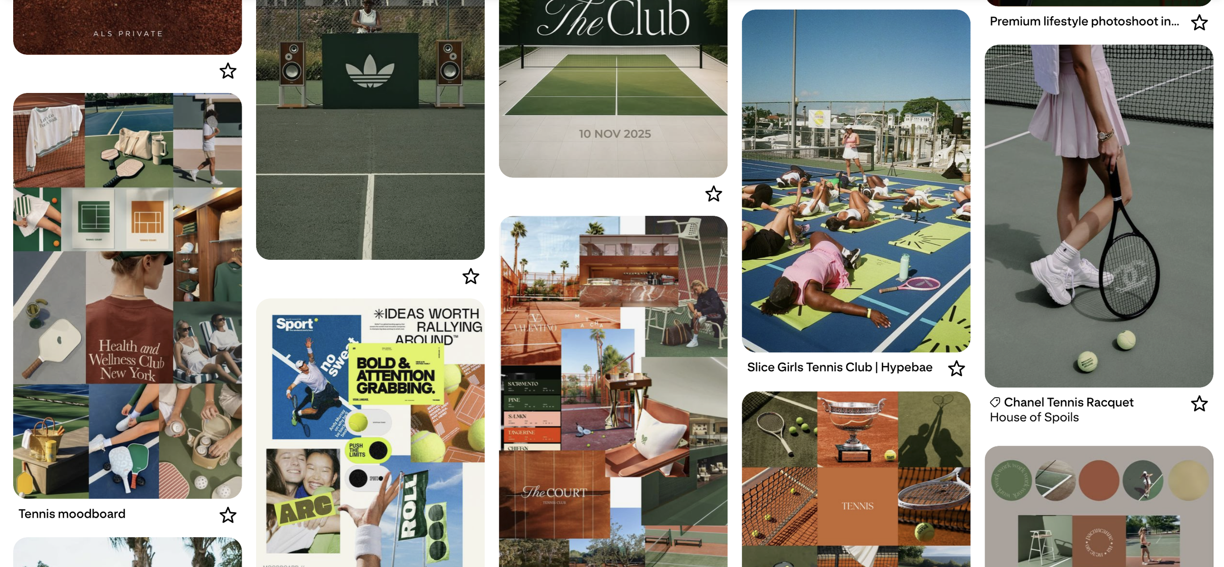
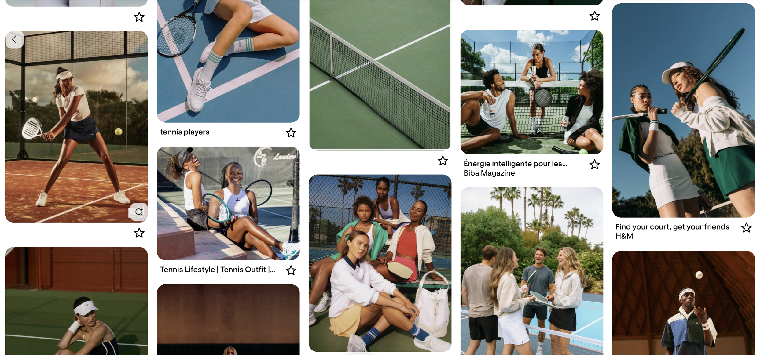
Every competitor in the category picked a side. Courtline Club went sophisticated and ended up cold. Ballers went loud and ended up generic, spread thin across padel and pickleball instead of committing to tennis. Grand Slams owns prestige but has zero warmth, zero membership feel. None of them built a brand you'd actually want to spend a Saturday inside. That gap, energetic without sacrificing warmth, tennis-specific without going stale, was the opening.
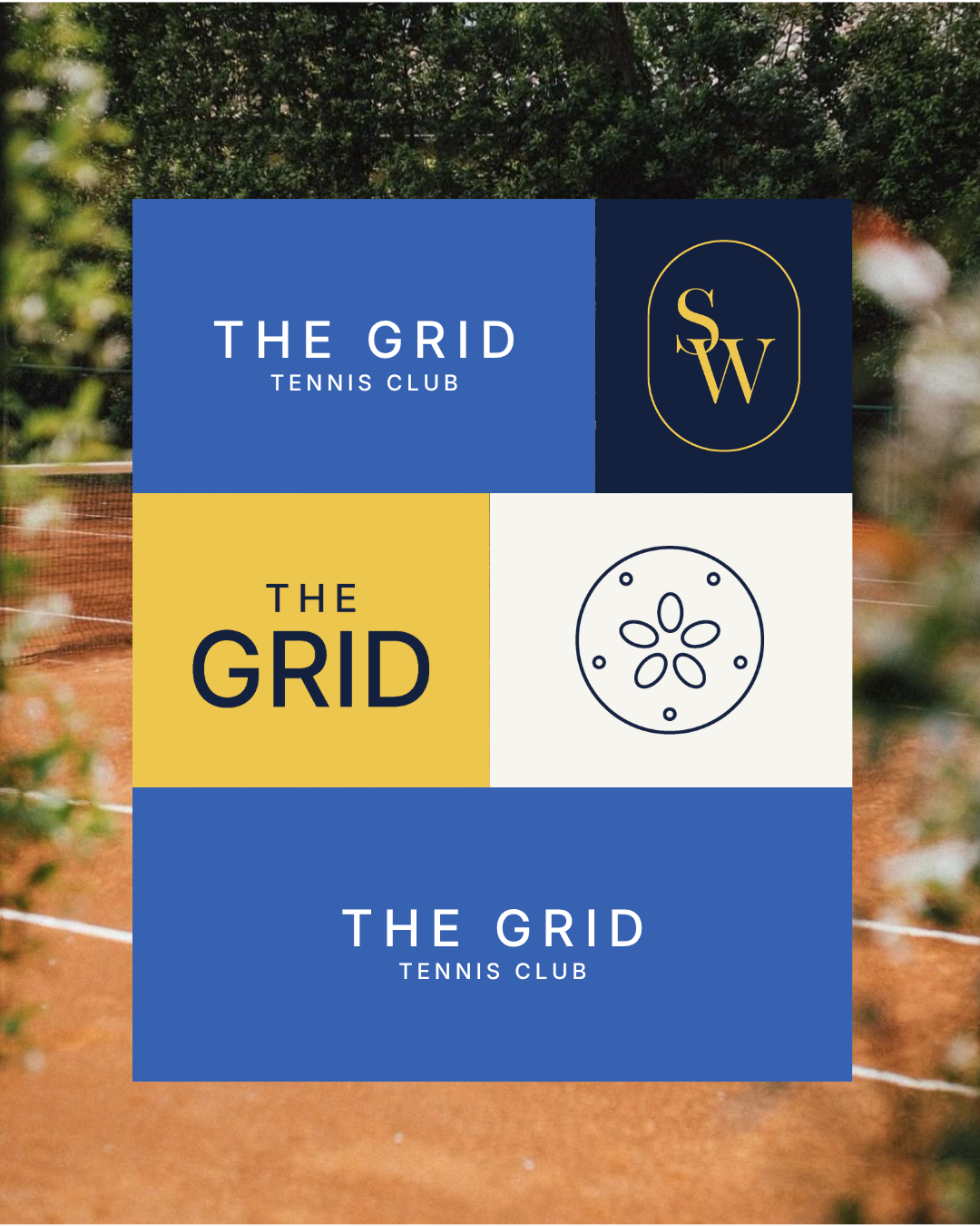
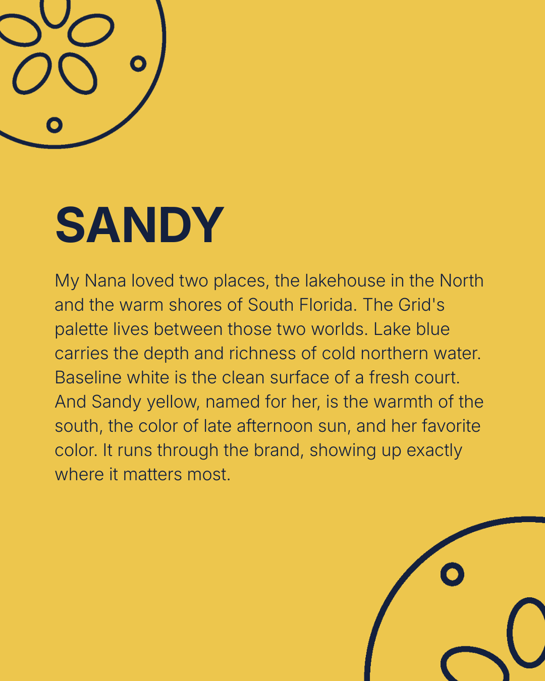
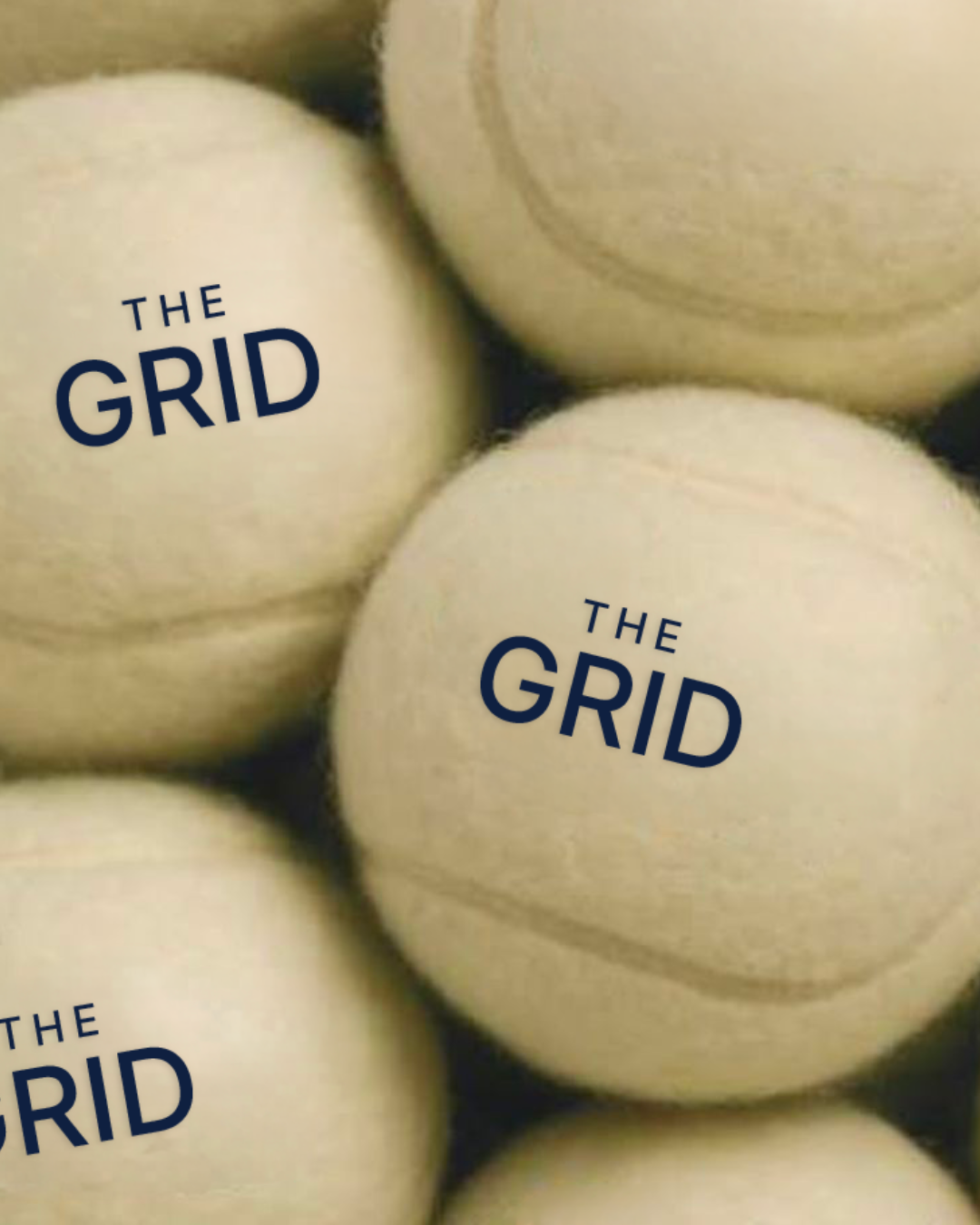
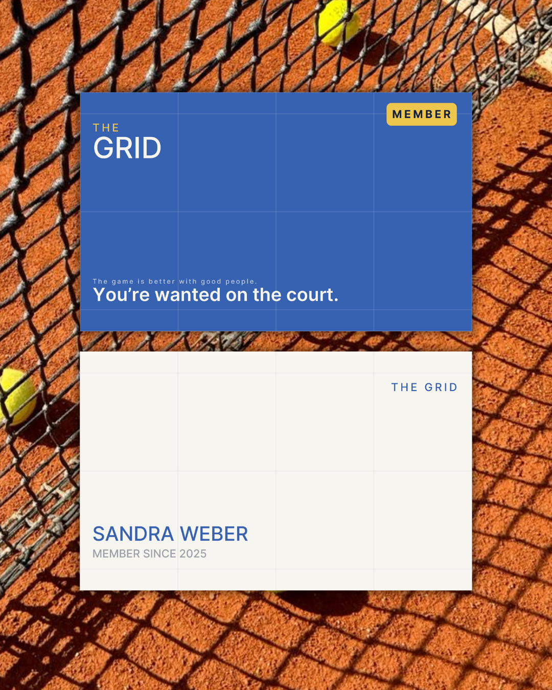
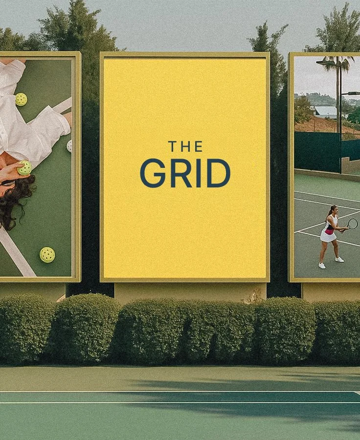
The brief said bold, modern, high-energy, rich. The kind of brief that usually produces something dark and hard-edged. I kept all four words, but decided none of them had to mean cold. The real question was who was actually walking through the door. Not what kind of tennis the club offers, but who's on the other side of the net. That's where "the game is better with good people" came from.