❋
Week 5 • ReVaire Hair Care • Full Identity + PackagingIt Starts at
the Roots
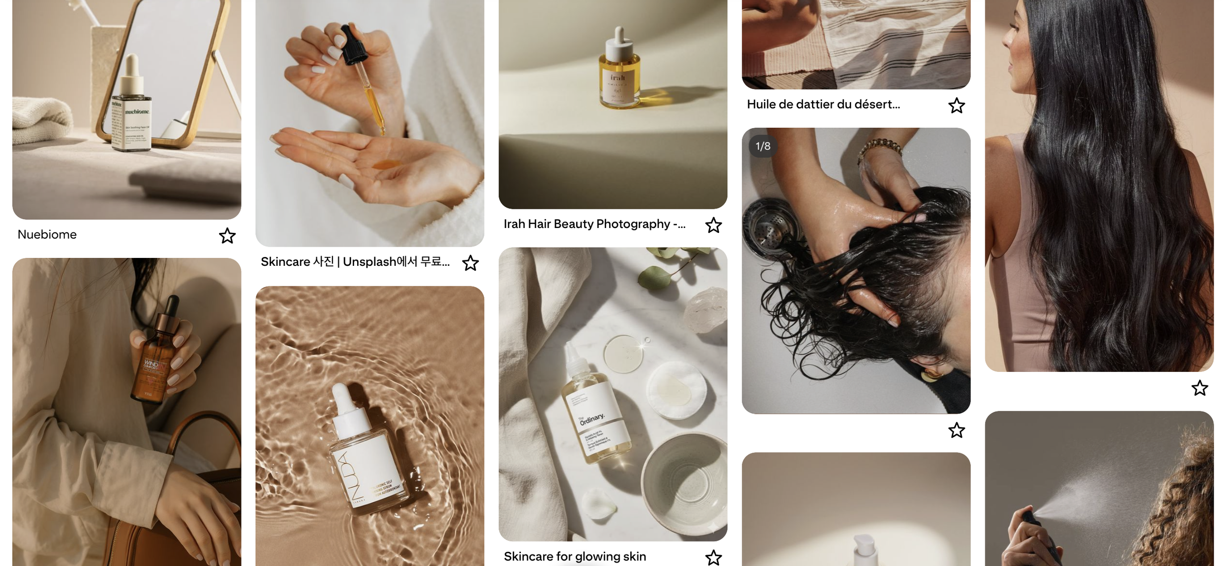
Clean beauty hair care has a sameness problem, sage green, minimalist sans-serifs, "natural" said in a way that no longer means anything. Every brand in the category was reaching for the same visual shorthand to signal the same claim. ReVair needed to feel luxurious and spa-like without borrowing the one color the entire category had already claimed.

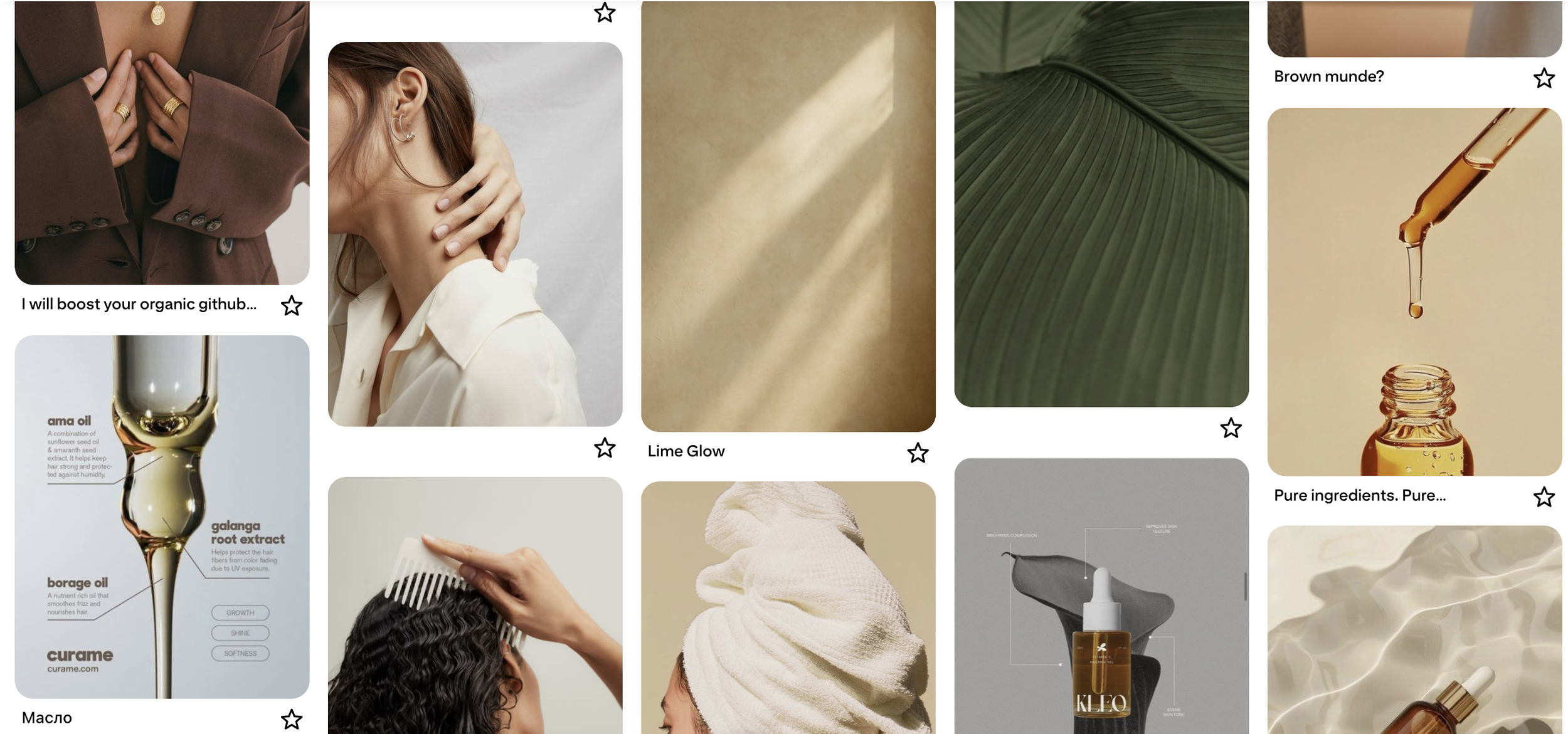

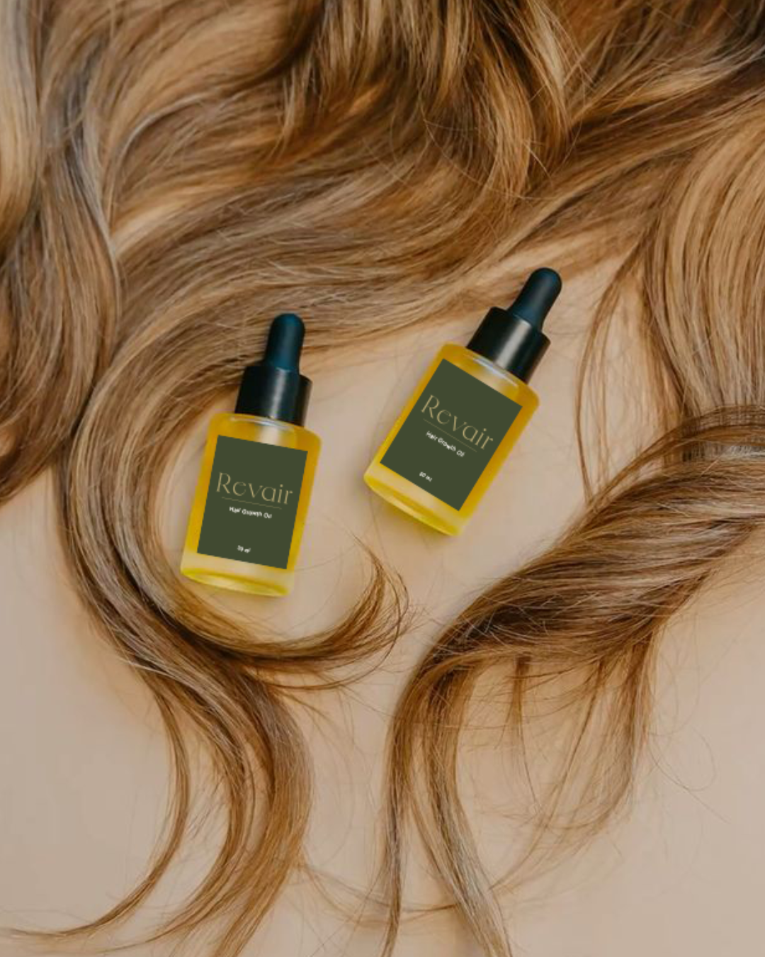
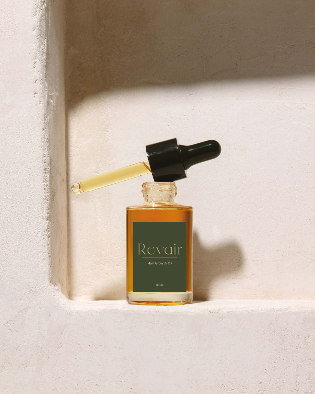
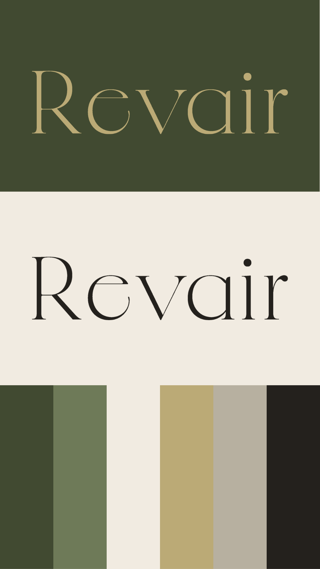
The instinct in this category is always the same green, sage, a little washed out, the fastest way to say "natural" without saying anything specific. ReVair still uses green, but not that green. Reed, something between sage and forest, deeper and more deliberate. Paired with a sparing gold accent and a parchment base rather than stark white, it reads as considered rather than category-default. The same color family everyone else is standing in, just refusing to stand in the same corner of it.




The obvious choice was a pump; faster, more expected, more "functional." The stopper was the harder sell to myself: slower, more fragile-feeling, more of a ritual than a routine. But that's what made it right. Pulling a stopper makes you pause. A brand built around patience, around tending to growth you can't see yet, needed packaging that asked for the same patience back.