❋
Week 4 • Vitame Cold-Pressed Juice • Branding + PackagingPressed From
the Good Stuff
Wellness branding defaults to quiet, muted beige, restrained type, a kind of seriousness that's supposed to read as credible. The risk with Vitame was landing as "healthy juice brand #47," all the right signals and none of the personality. The question that ran under the whole week: Does this feel like a real person made it, or a brand trying to look healthy?
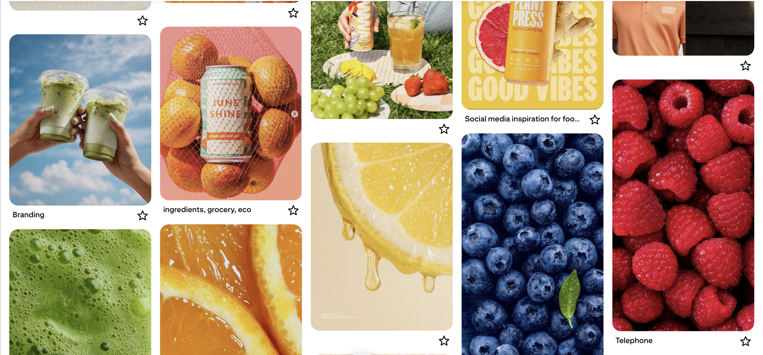
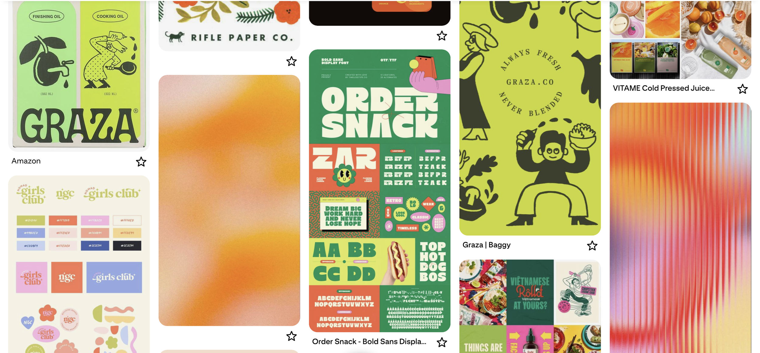
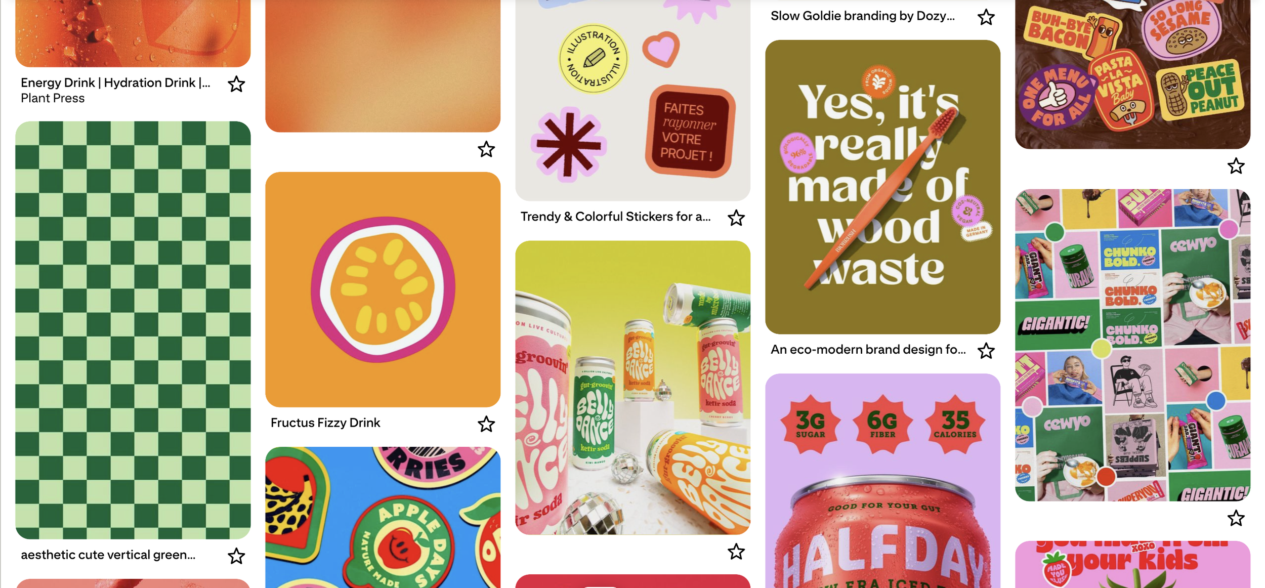
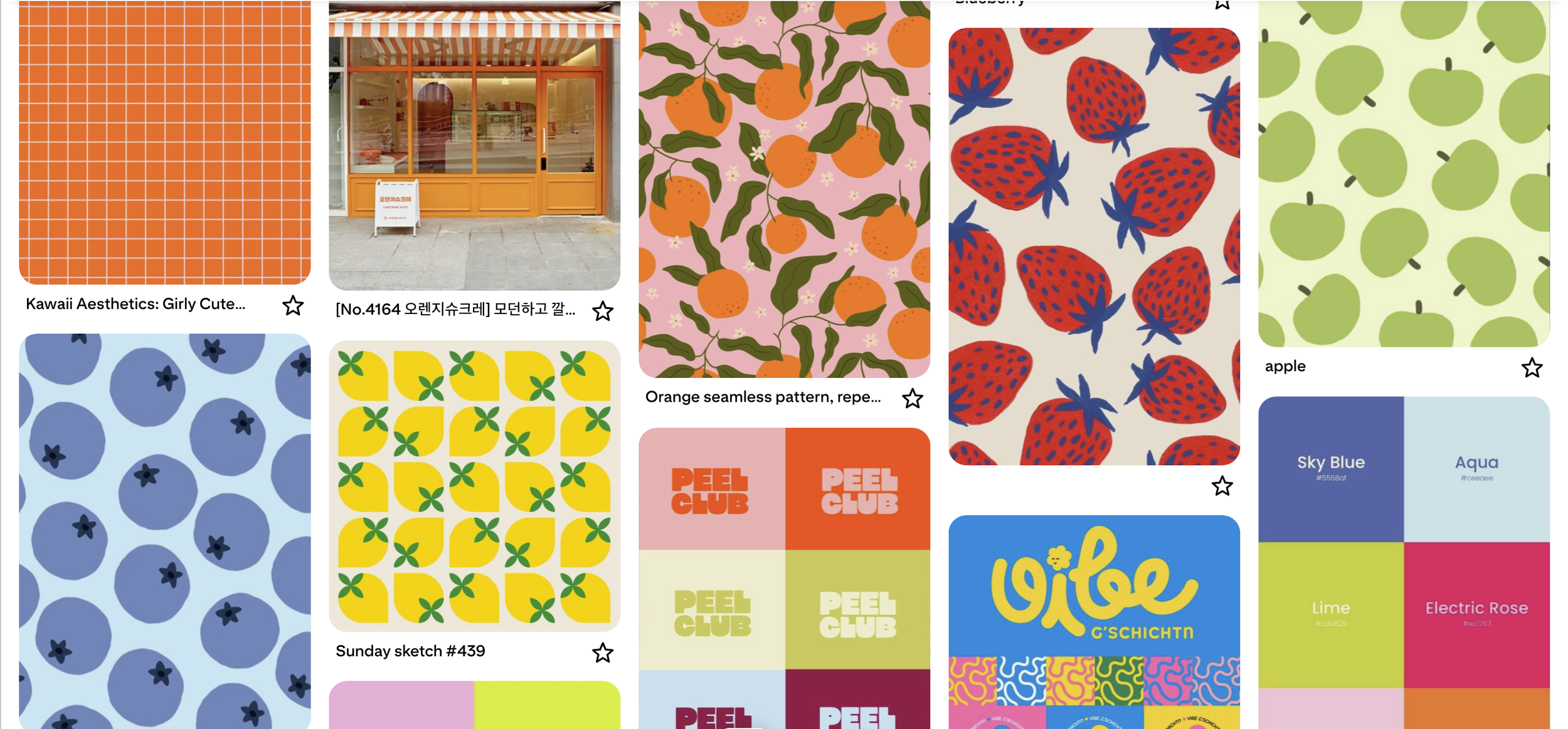
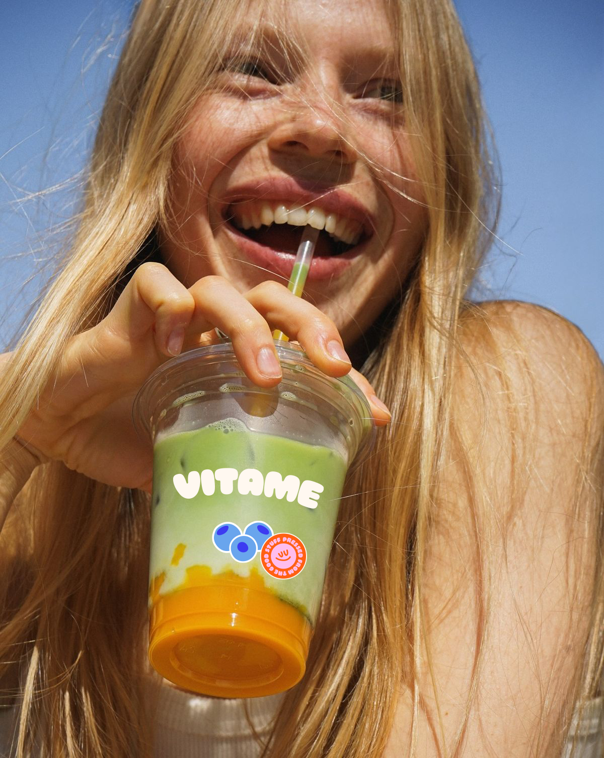
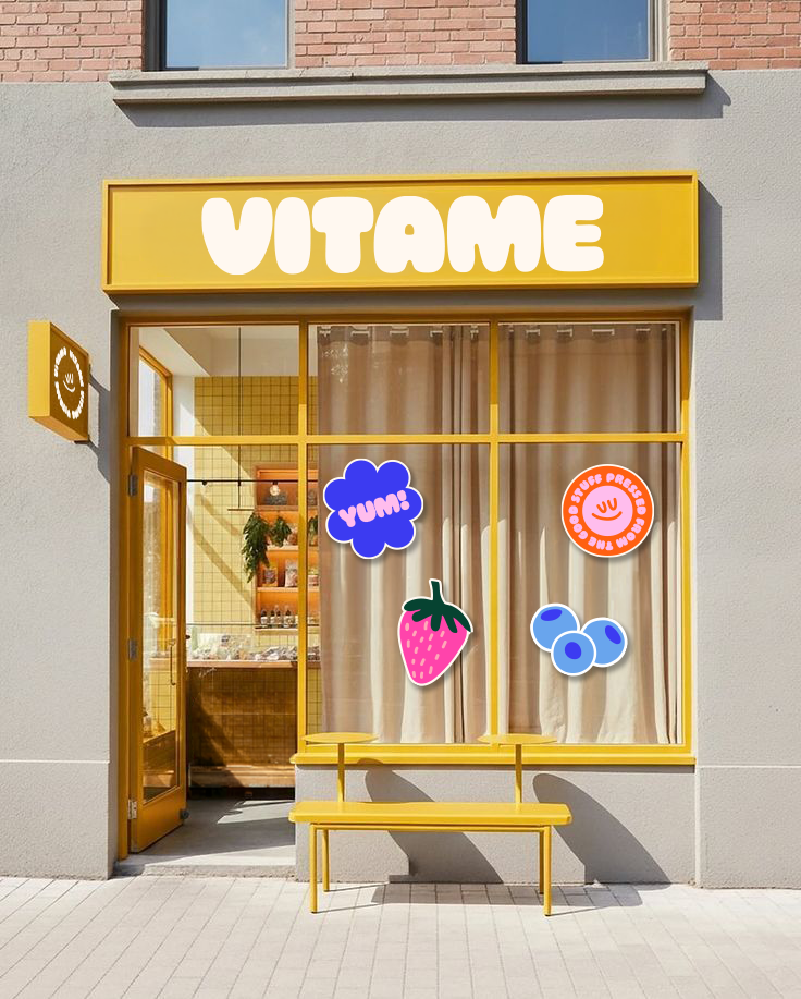
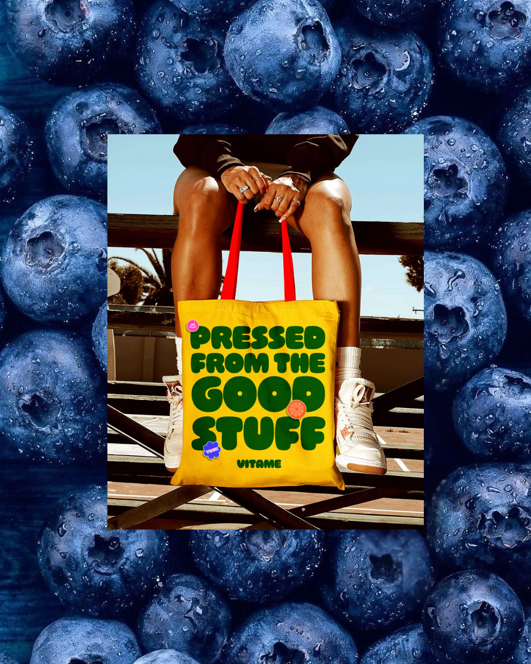
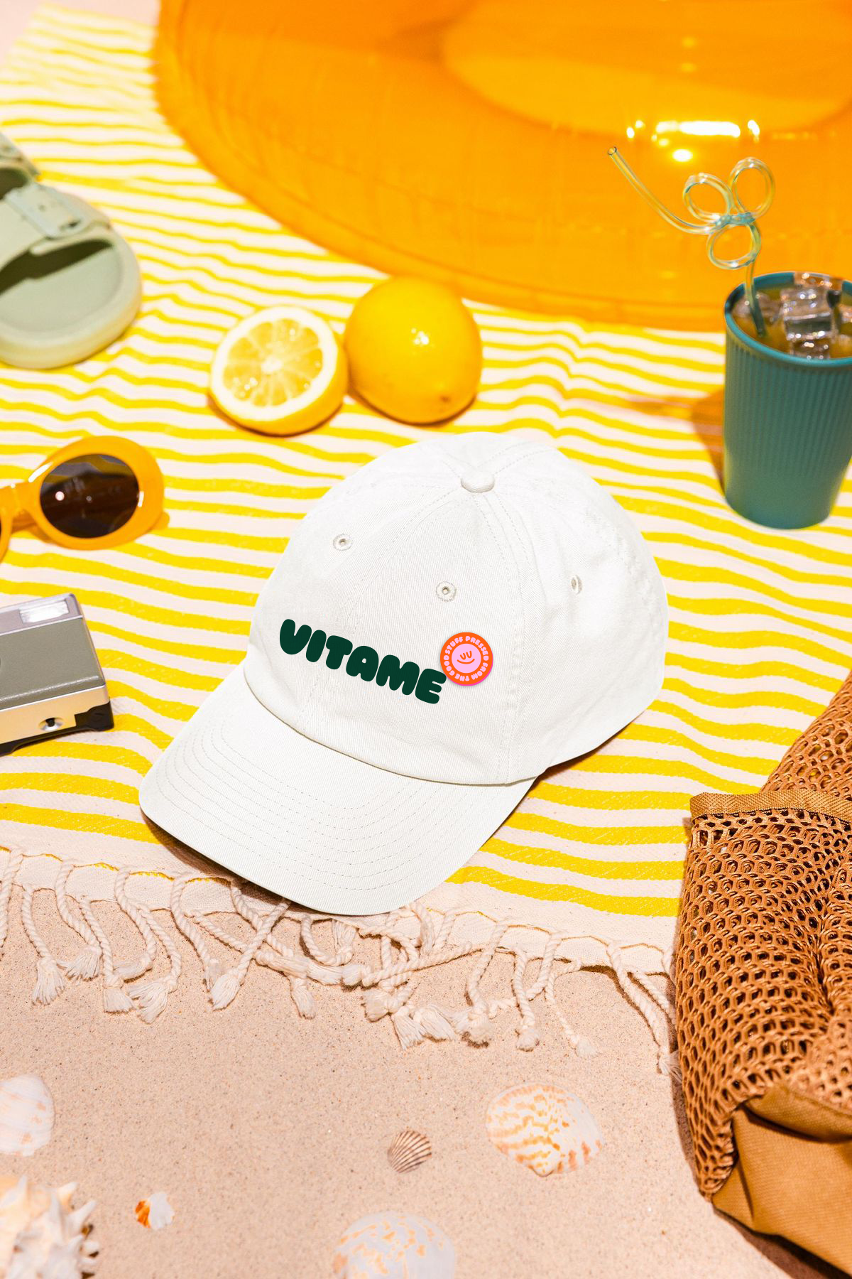
The creative direction landed on "nature, but make it alive". Bold organic shapes and a palette pulled straight from the produce itself, not the muted wellness beige the category defaults to. Typography leans hand-lettered with real confidence, slightly imperfect on purpose, because a brand this loud can't also look machine-produced. The goal was a brand that feels like the friend who actually does pilates but also sends you memes, credible about health, never precious about it.
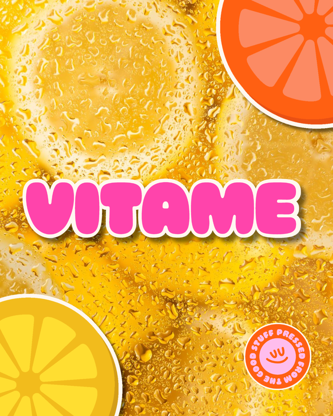
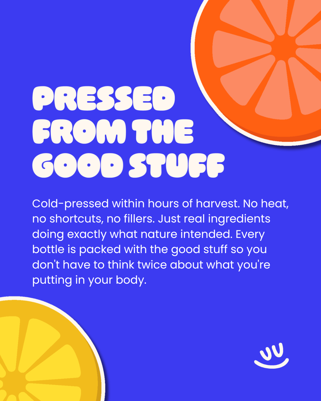
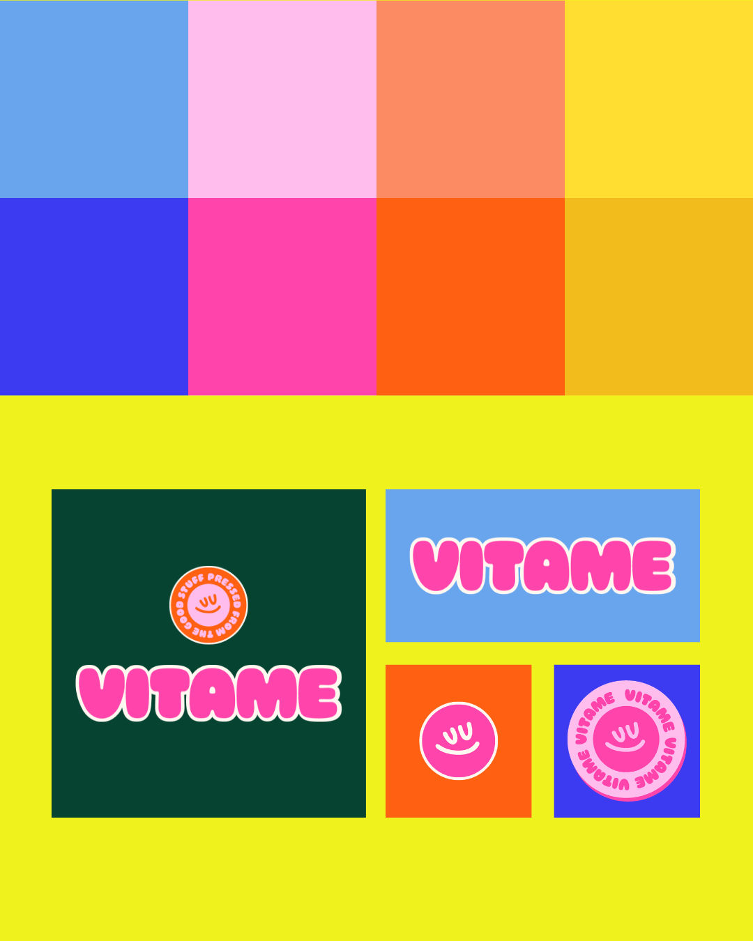
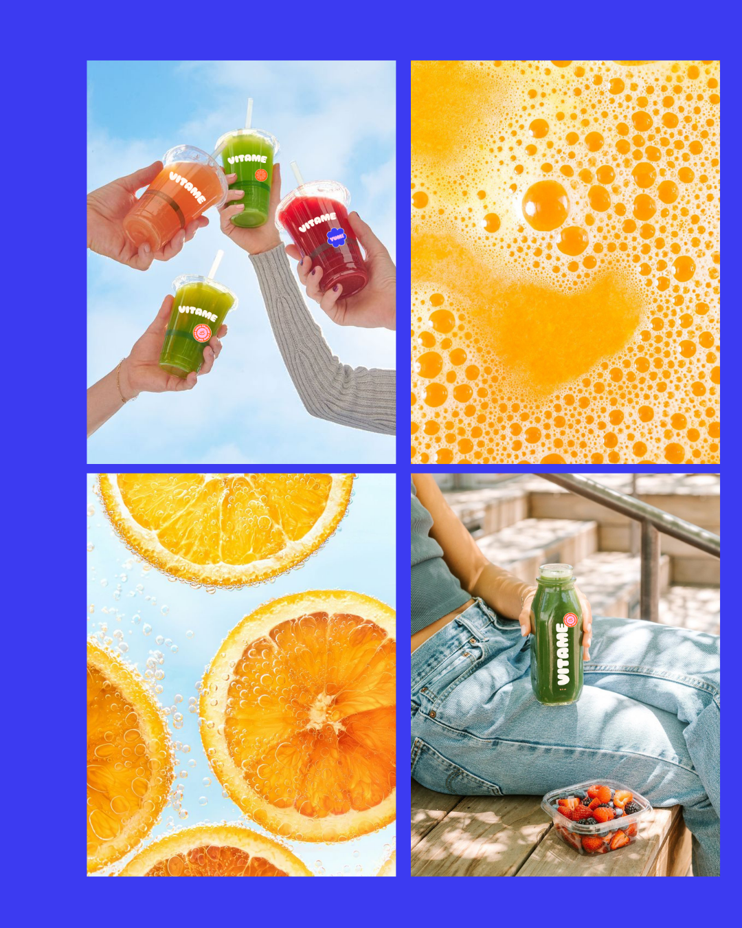
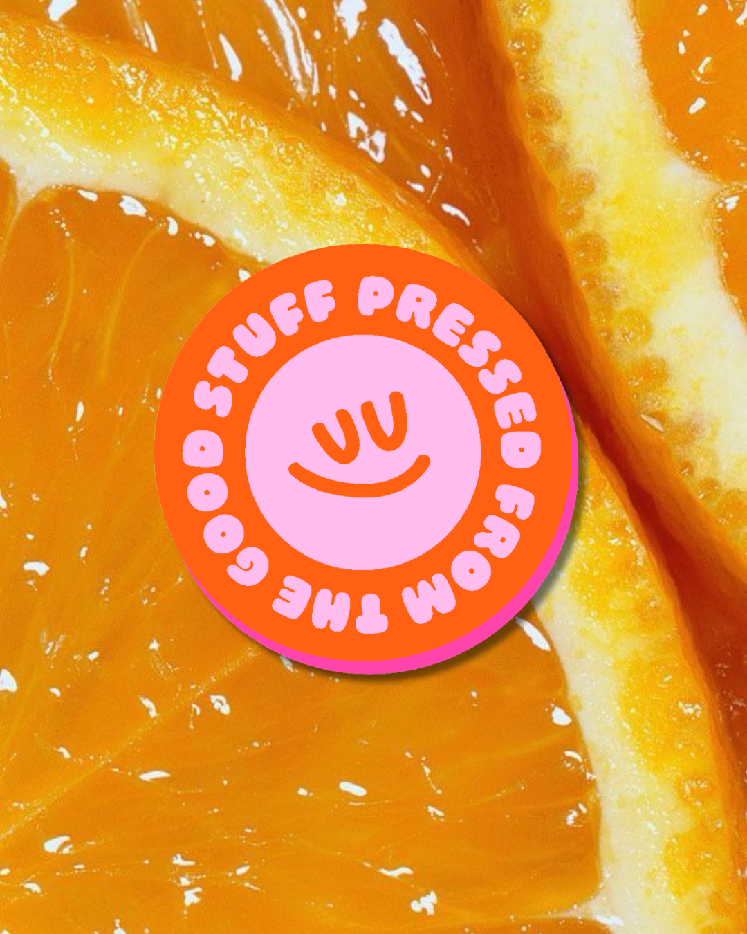
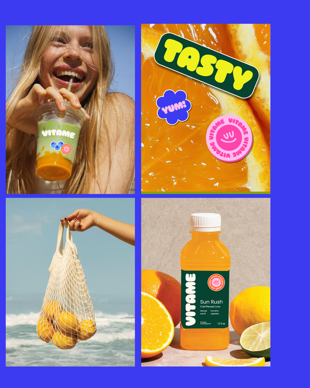
The easy version of this brand plays it safe, the same muted palette every wellness brand reaches for, because it reads as "credible" by default. Vitame does the opposite on purpose: bright, saturated color pulled from the fruit itself, betting that a brand can be loud and still be trusted. That tension, fun without losing credibility, was the whole creative bet.