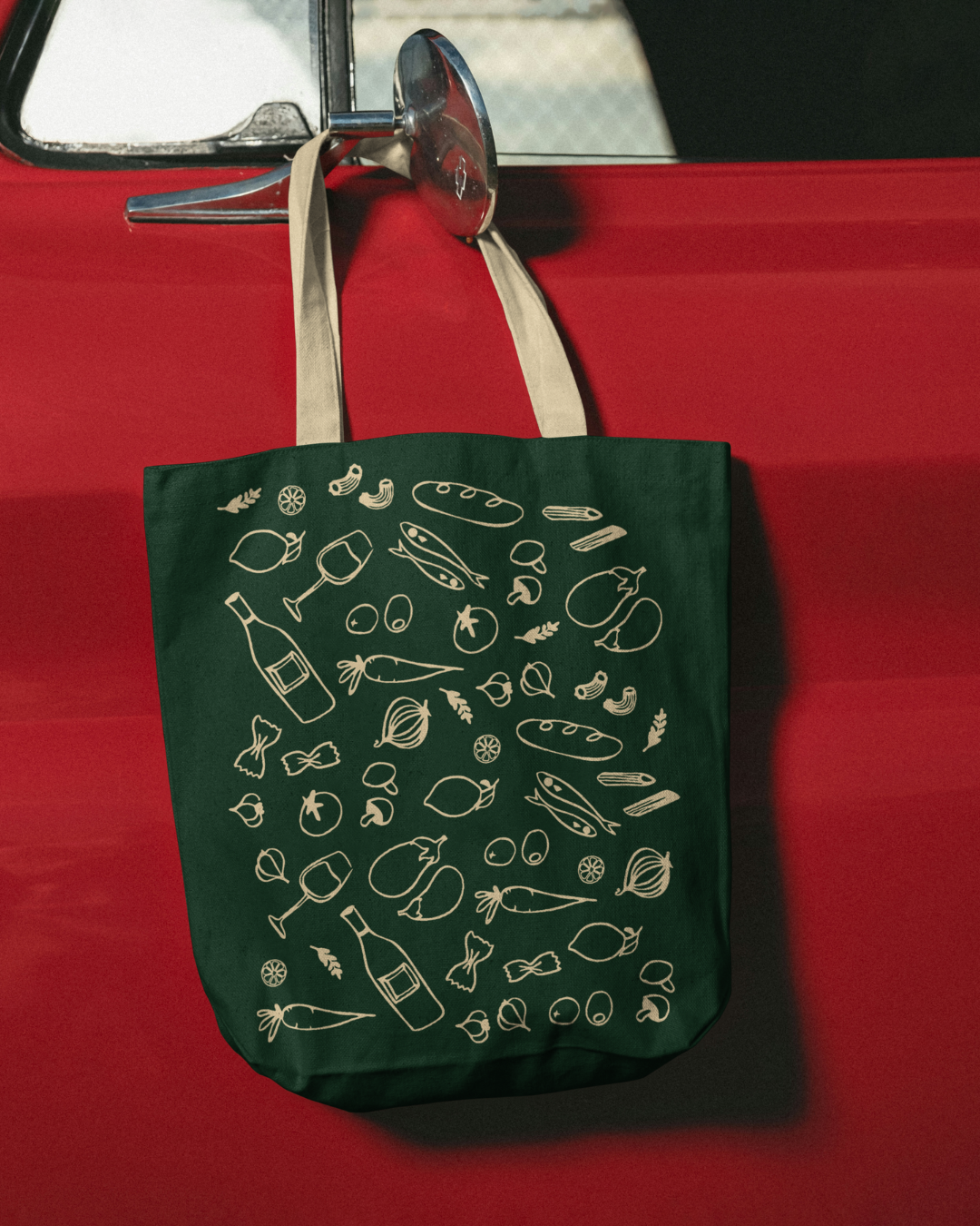
❋
Week 3 • Cantina Italian Ristorante • Brand Identity, Menu, Merch, Social ContentHeritage, Without
the Wine Crest.
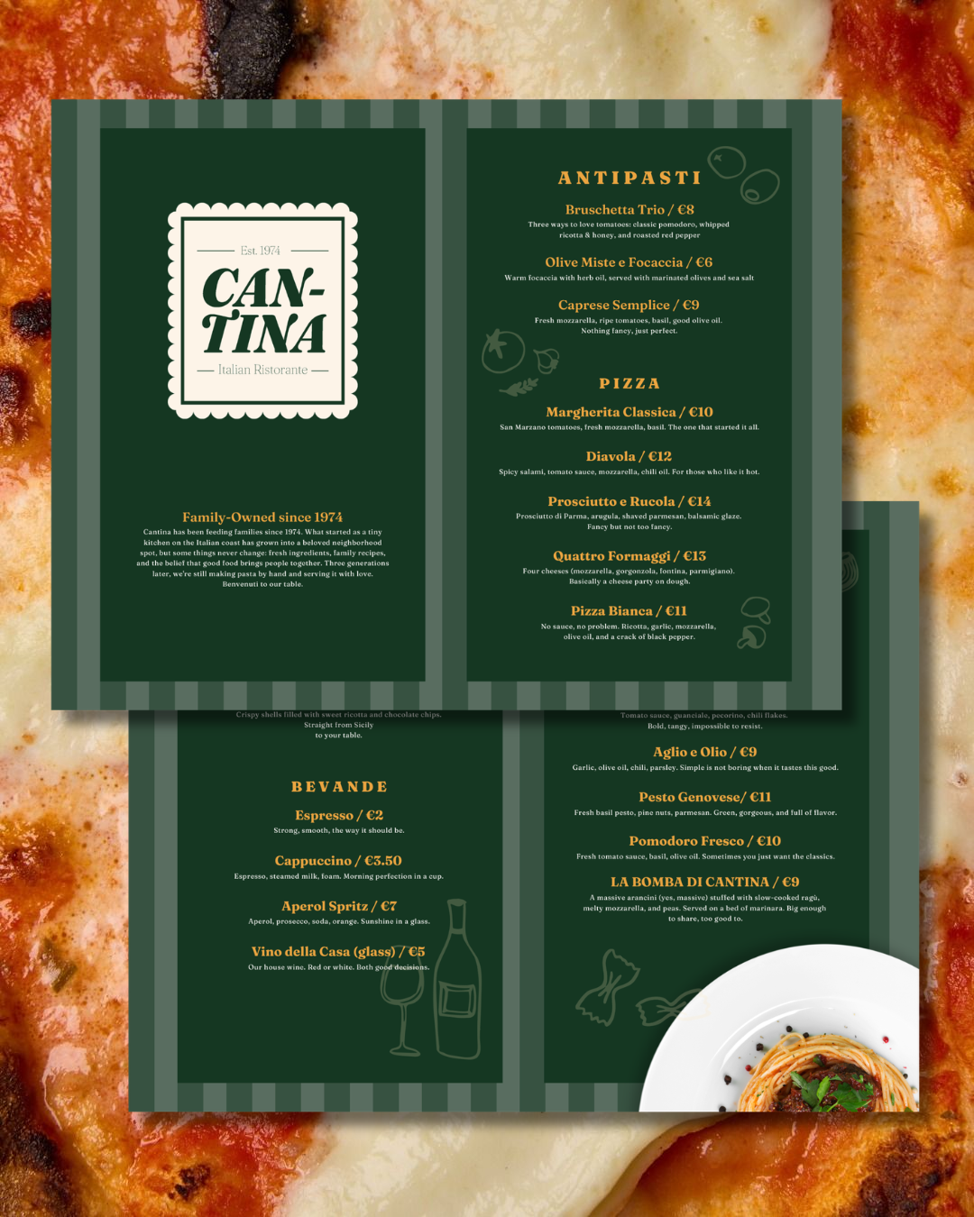
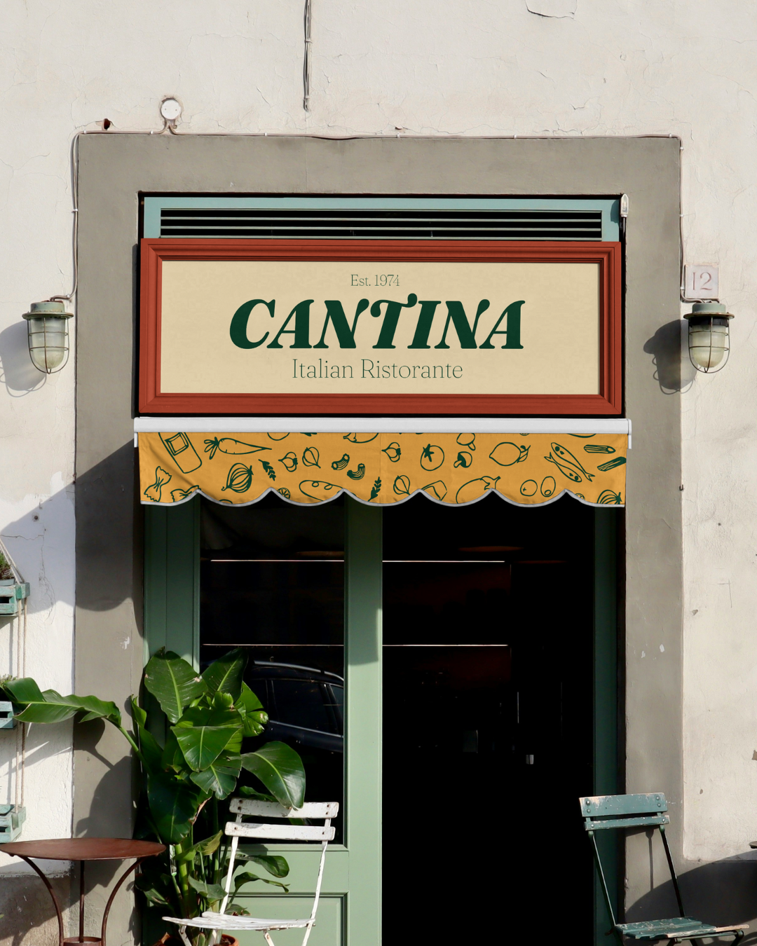
Italian restaurant branding tends to go one of two ways: overly refined with wine crests and muted palettes, or generic red-checkered-tablecloth cliché. Cantina, a family-owned coastal spot serving pizza and pasta since 1974, needed to live somewhere else entirely: approachable but not cheap, energetic but rooted in real tradition. A brand that works for a 25-year-old grabbing a quick slice and a family celebrating three generations at the same table.
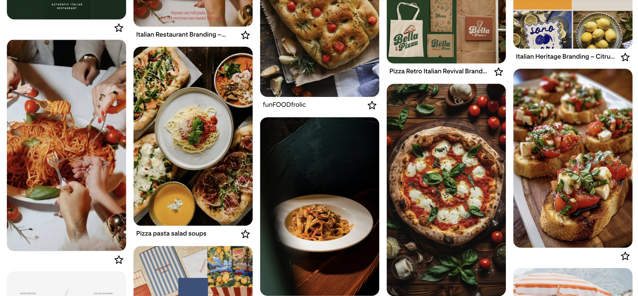
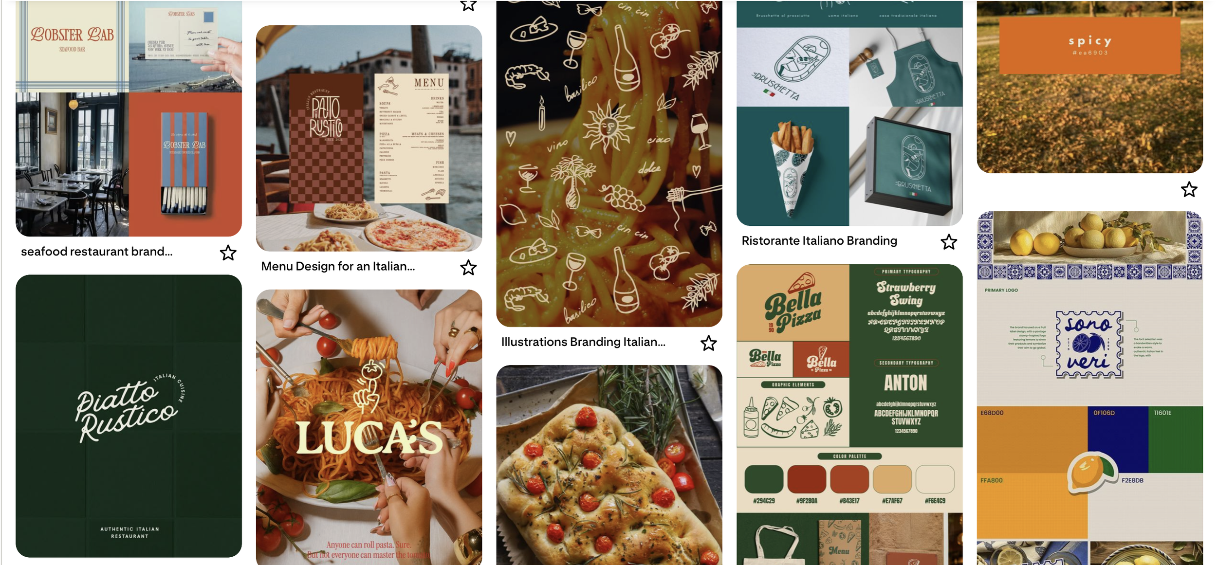
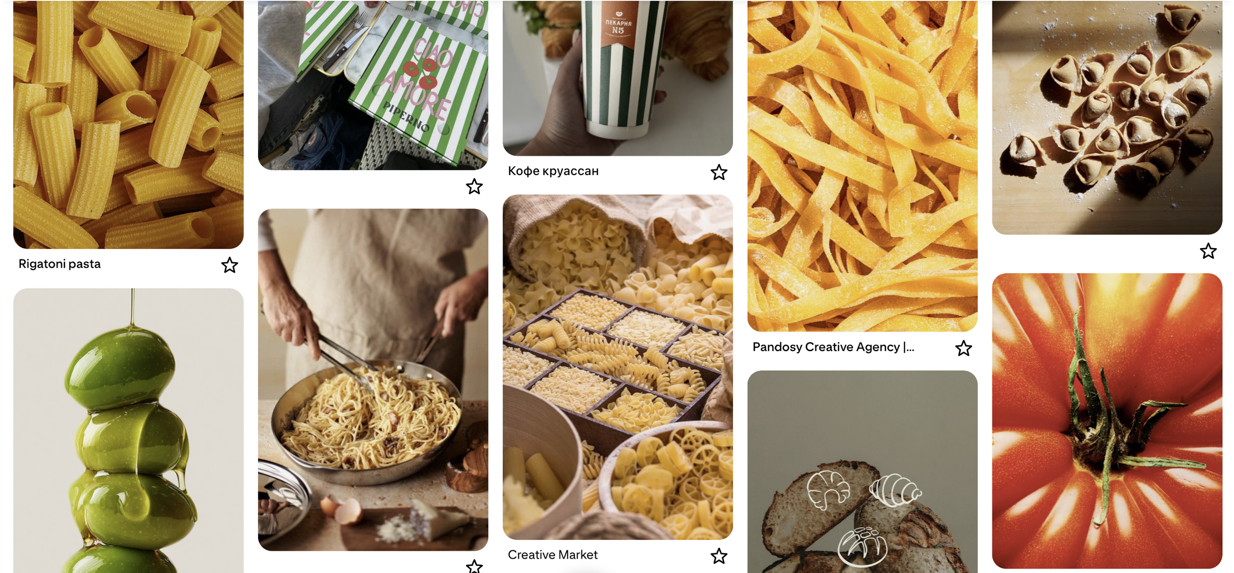
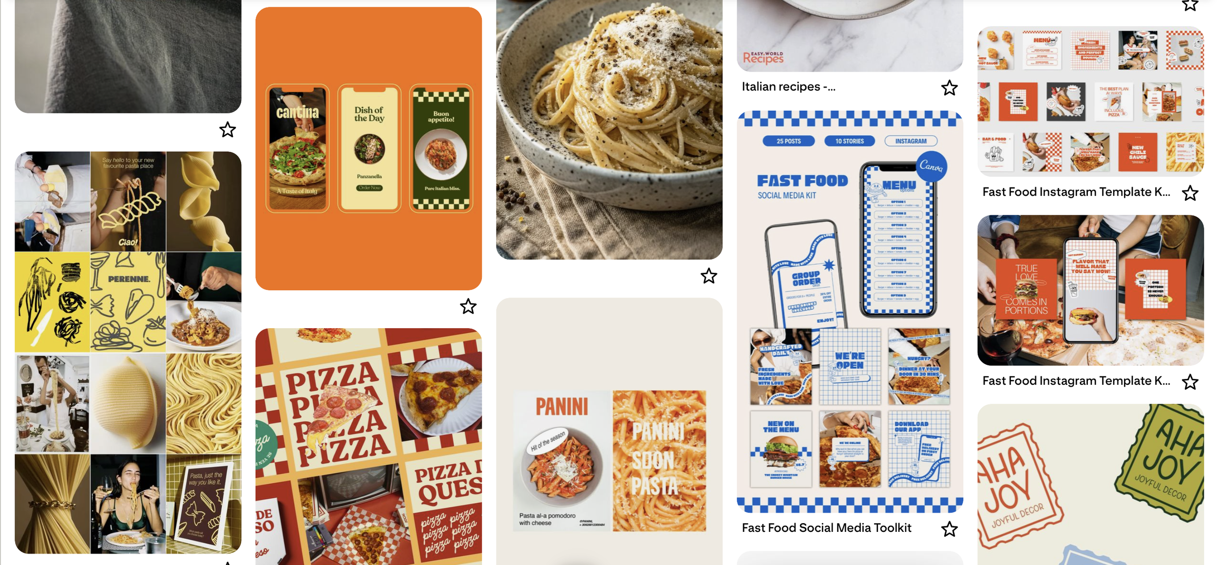
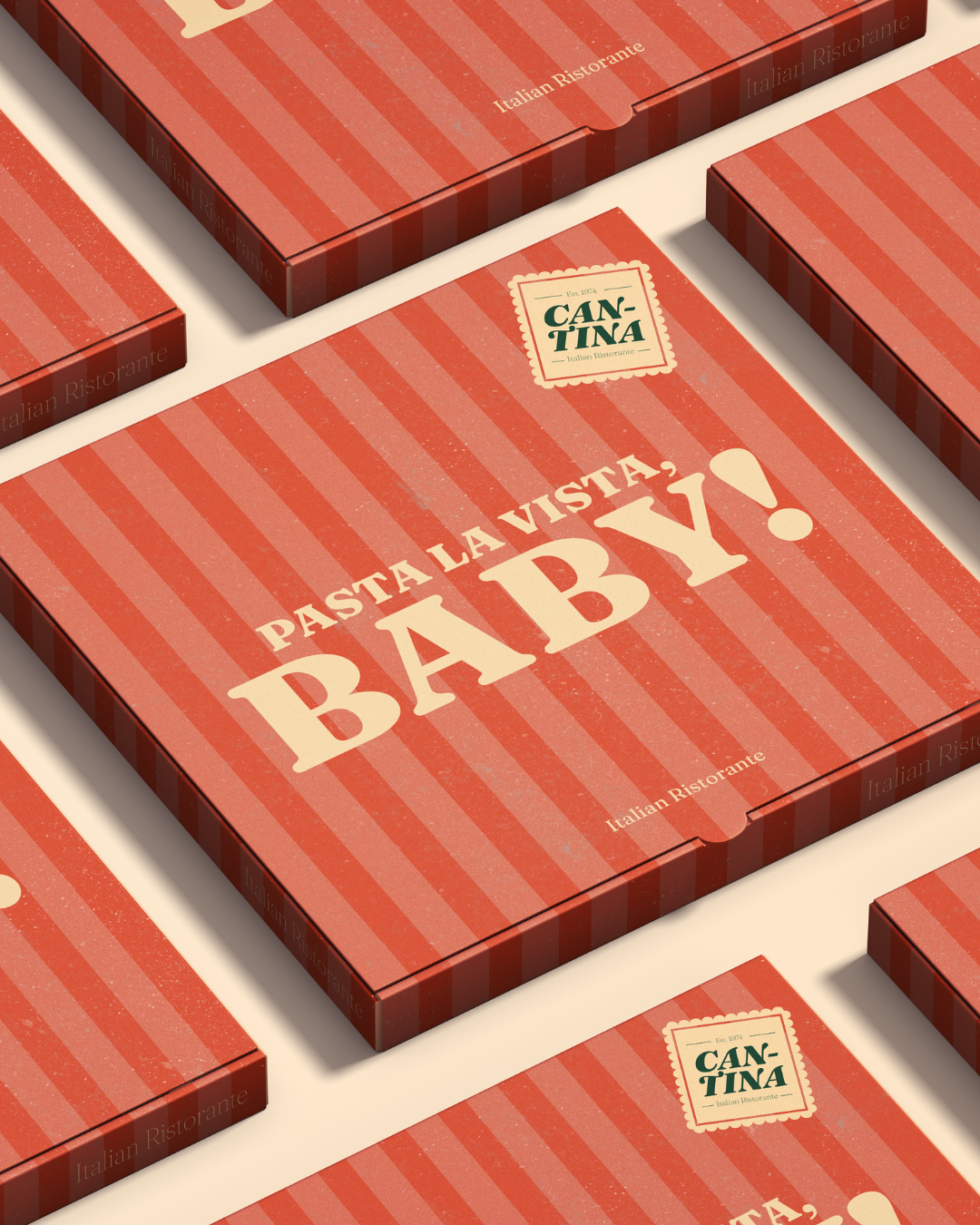
The expected palette here is Italian-flag red, white, and green. The fastest way to signal "Italian" and the fastest way to look like every other spot doing the same thing. Cantina swaps that for terracotta and sun-soaked yellow, pulled from actual coastal architecture rather than a flag. Warm, sun-baked, appetite-triggering without leaning on cliché. Green stays, but as a deep, grounded shade rather than the bright flag-green everyone defaults to, and cream holds it all together so nothing reads as loud for its own sake. It still feels unmistakably Italian. It just got there without the checkered tablecloth.
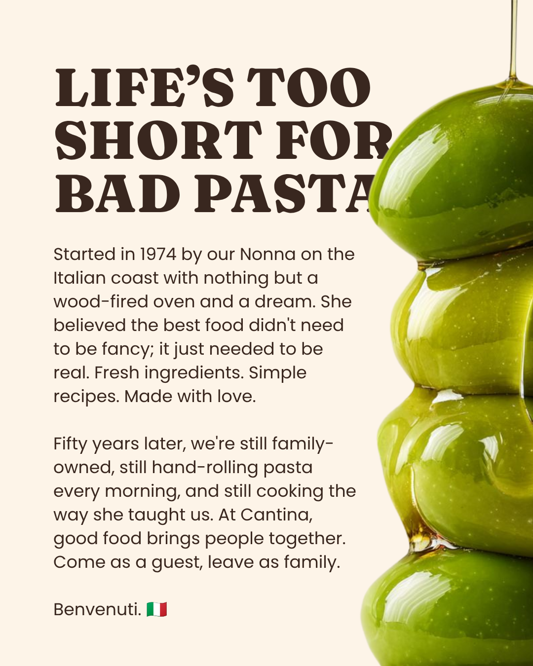
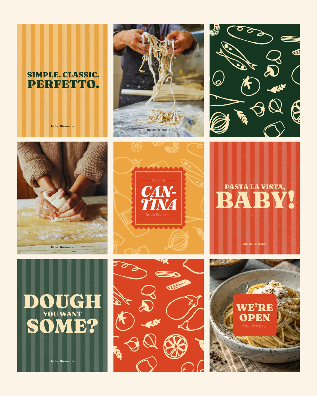

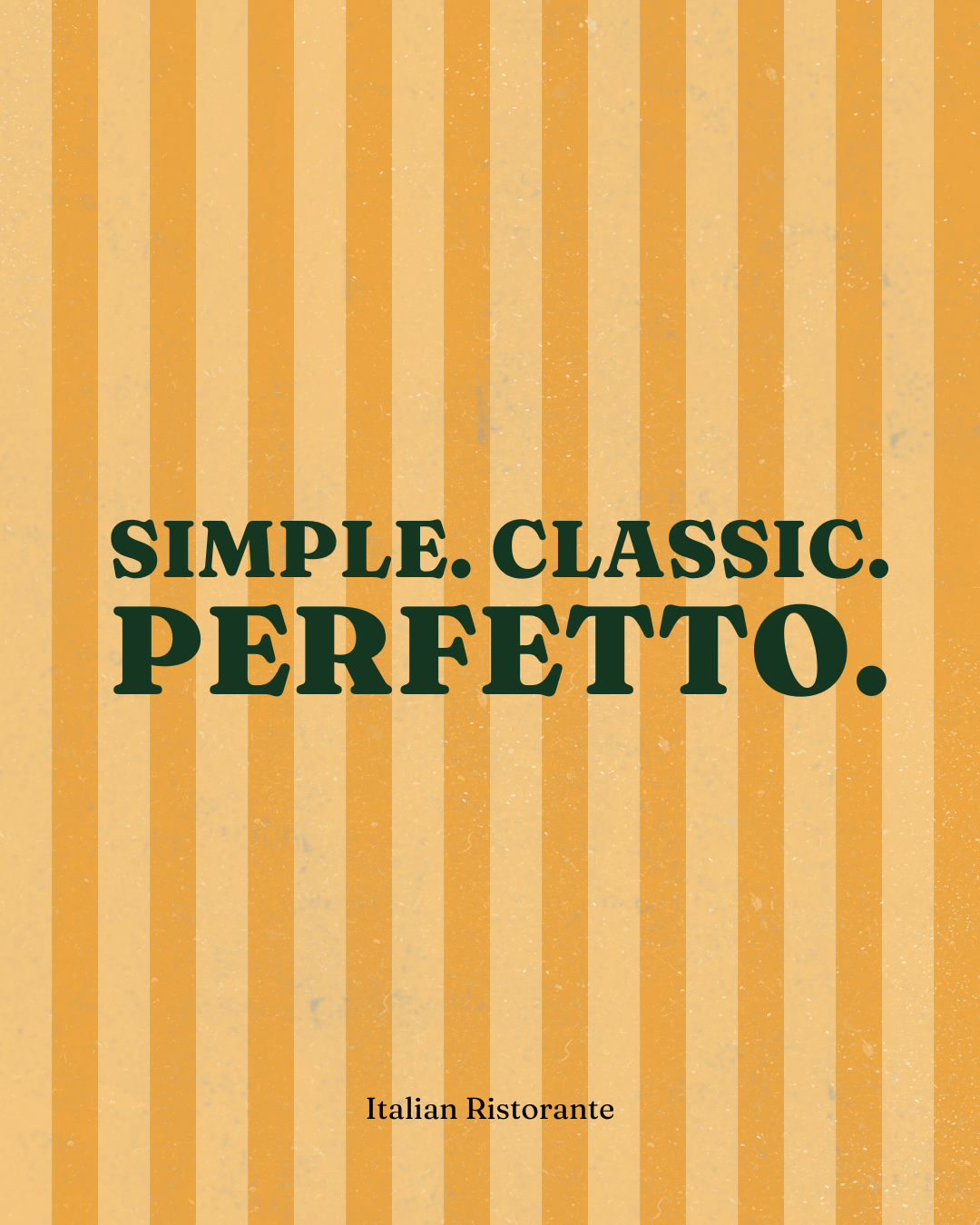

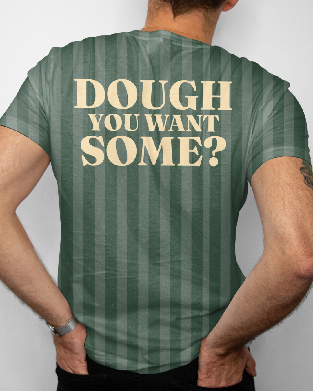
The tone needed real discipline to hold. Playful, yes, but never at the expense of craft. It would have been easy to let the "fun" keyword tip into gimmick. Every piece of copy, from the menu descriptions to t-shirt slogans like "Eat Pasta, Run Fasta," had to reinforce the same idea: a place that takes the food seriously and itself a lot less so.