❋
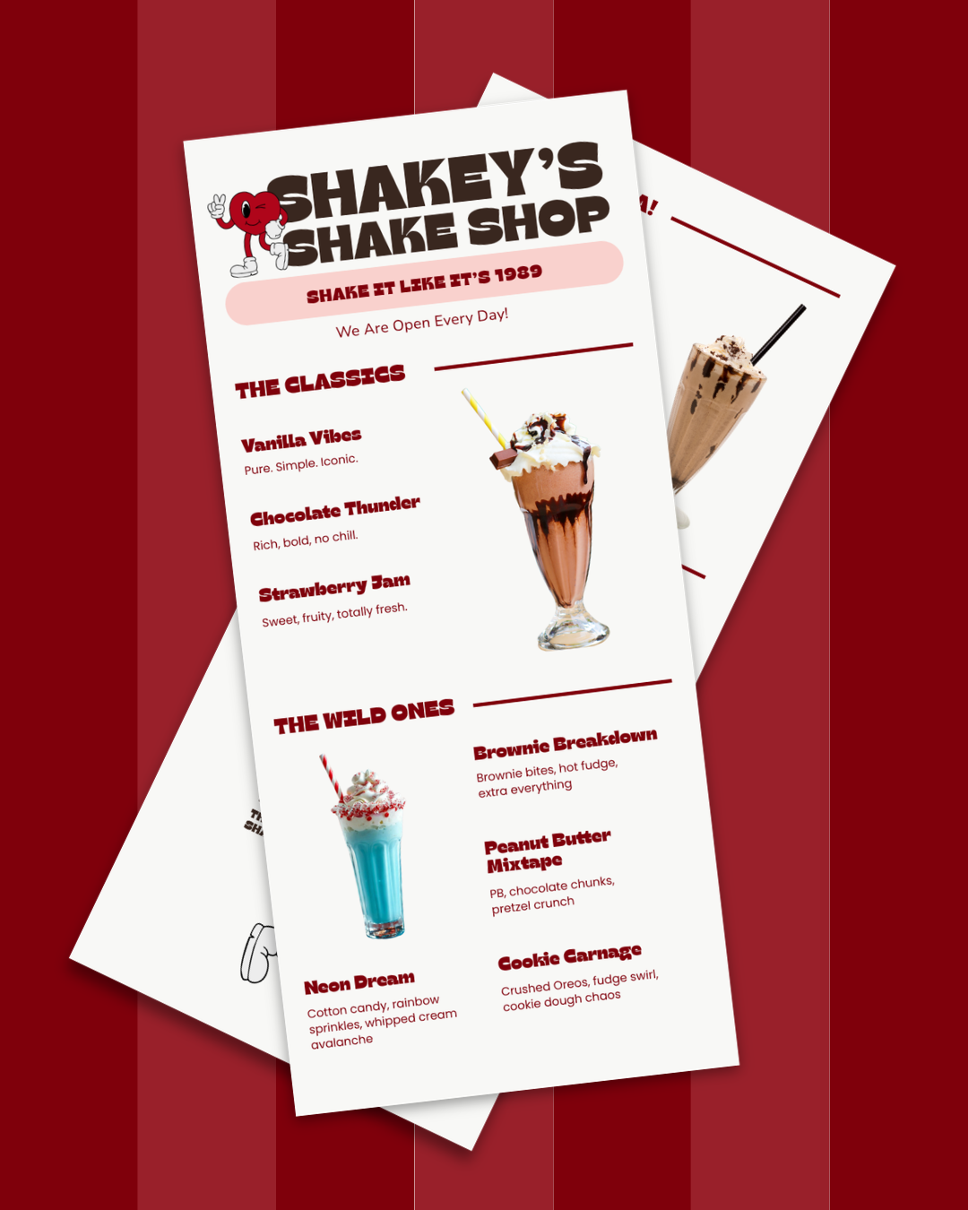
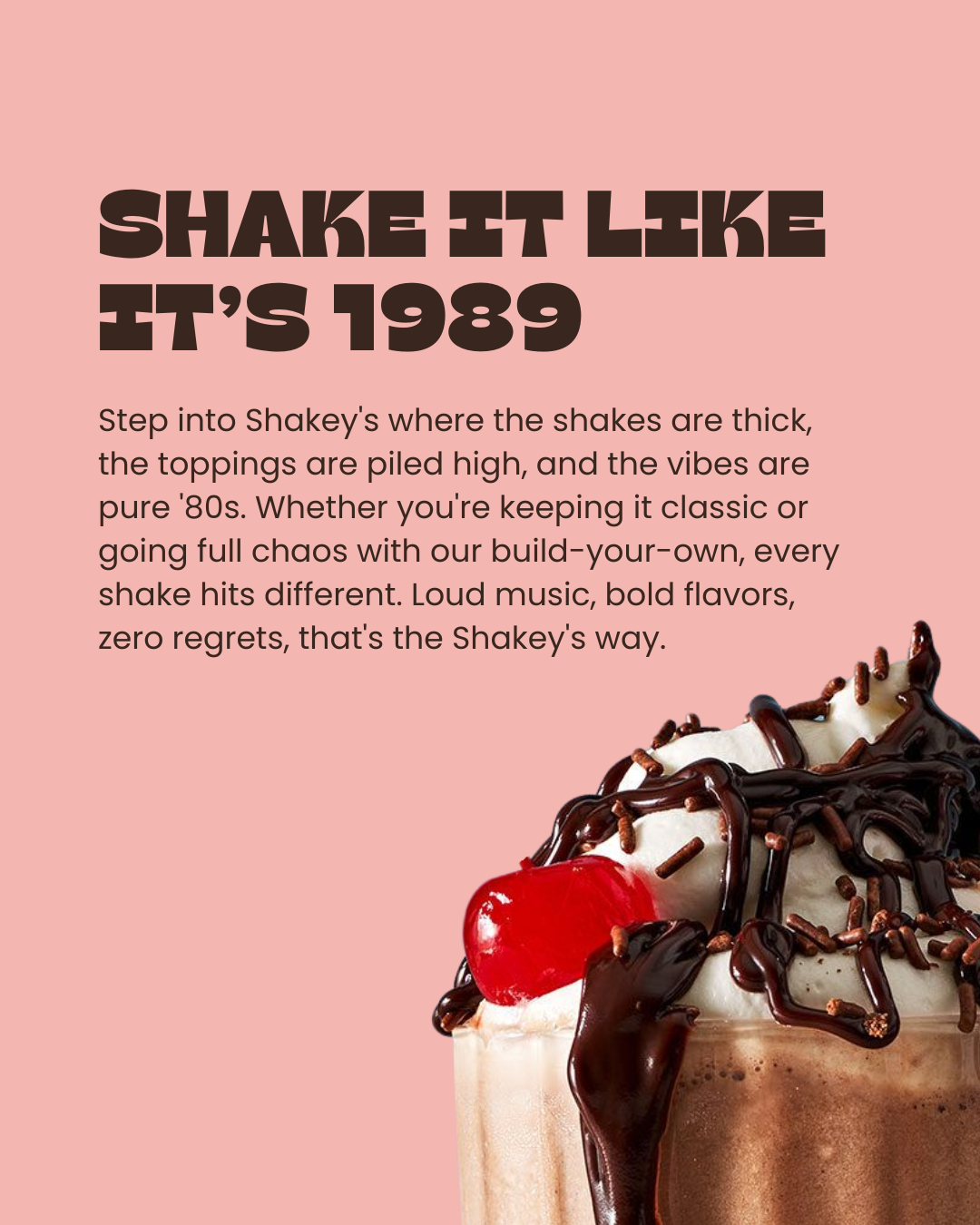
Week 2 • Shakey's Shake Shop • Brand Identity, Menu DesignShake It Like It's 1989.
Retro milkshake branding has one default mode: '50s diner. Checkered floors, red vinyl, a font that's been on a hundred other menus. The brief called for retro energy without landing in that exact cliché, a brand that felt nostalgic without being predictable.
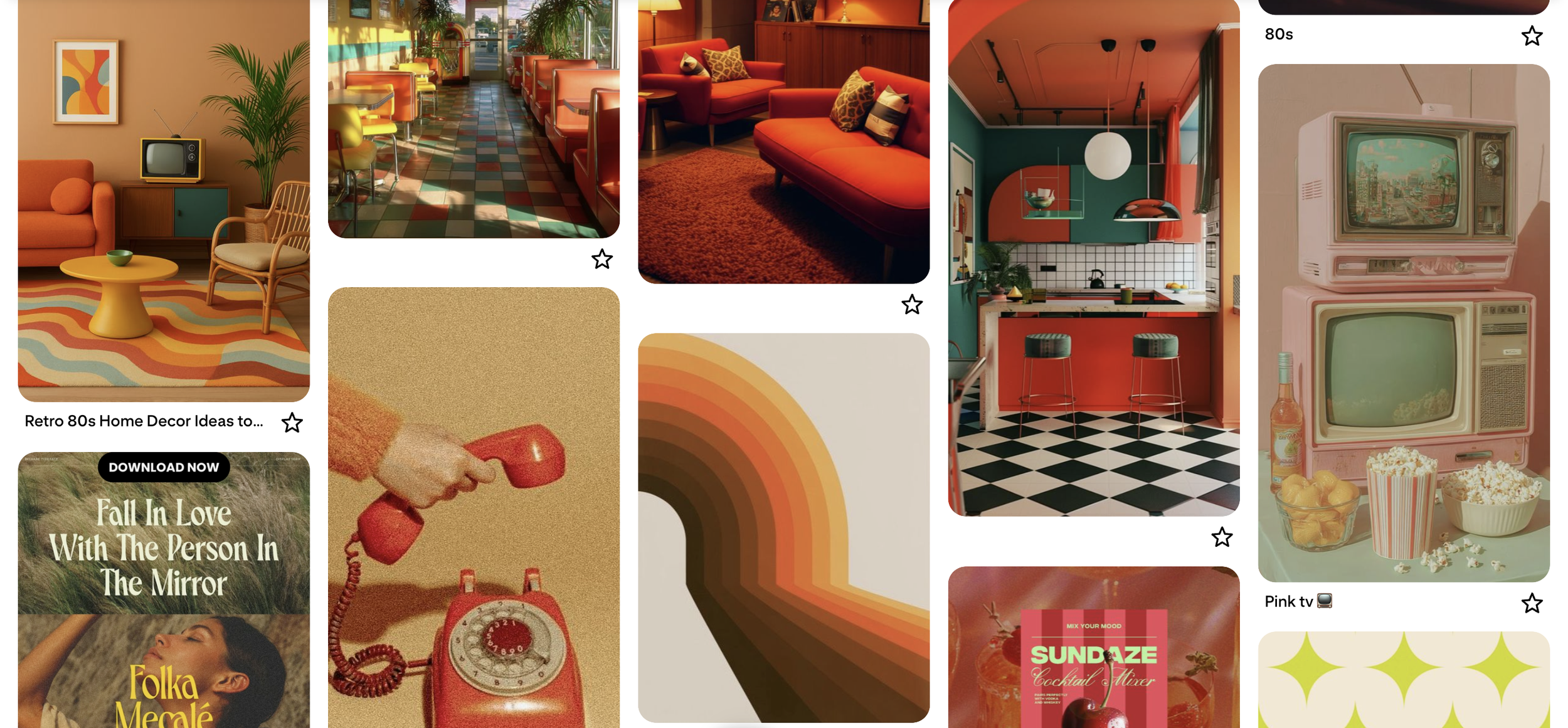
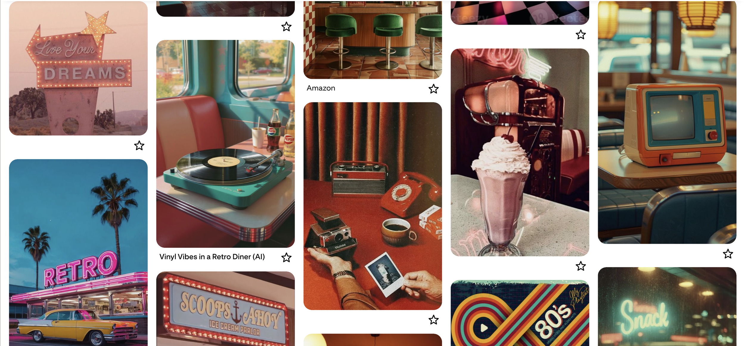
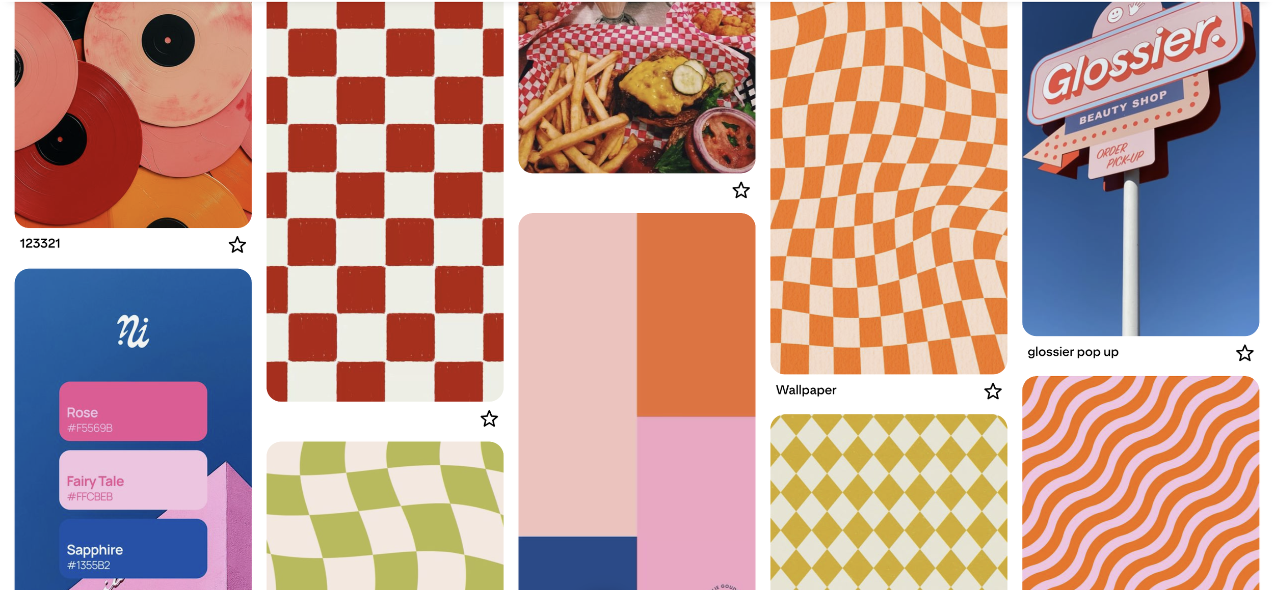
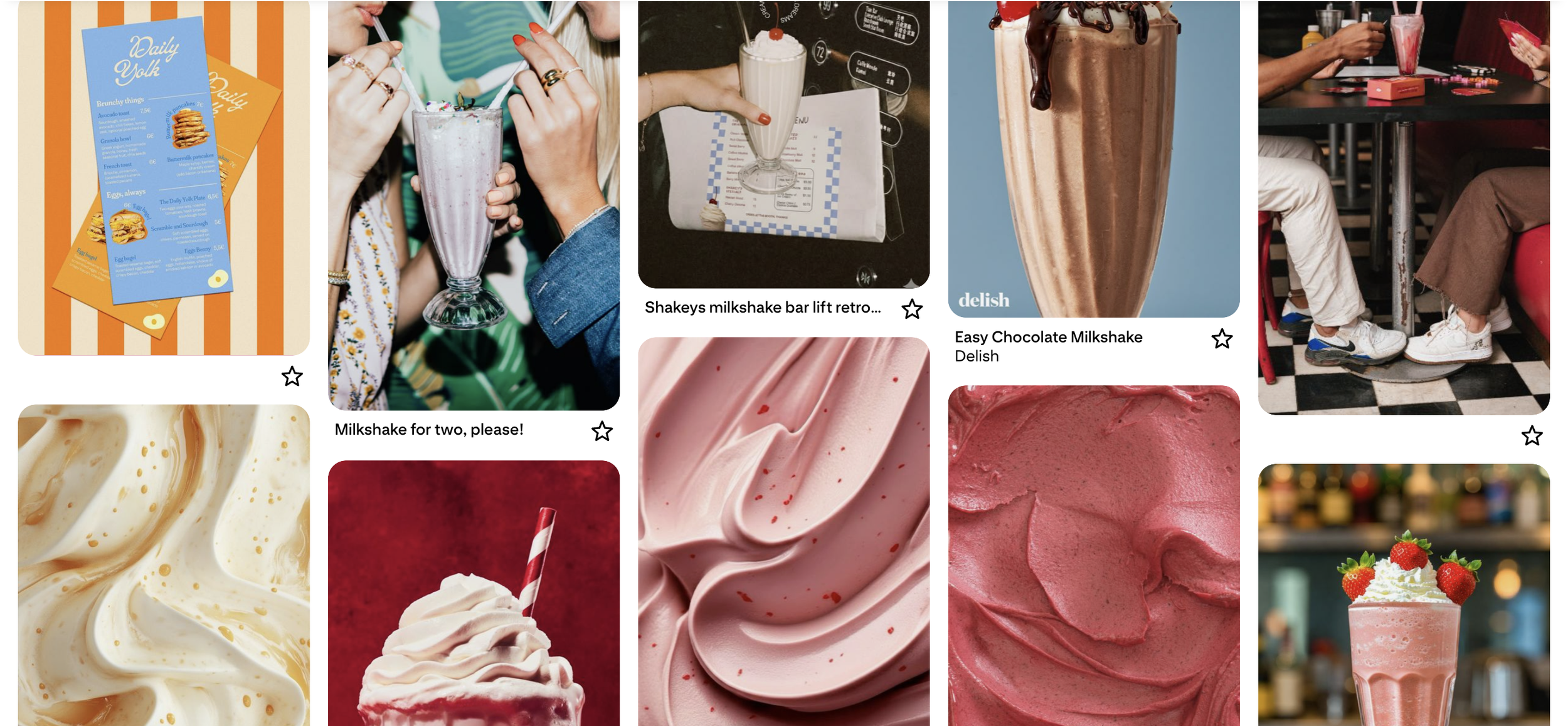
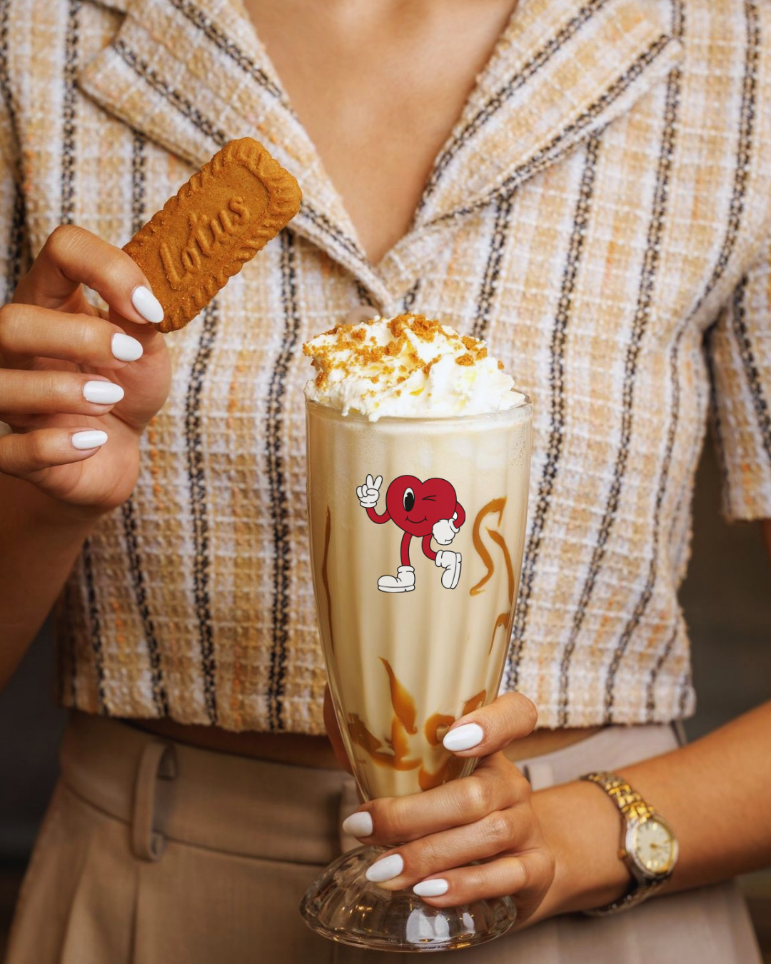
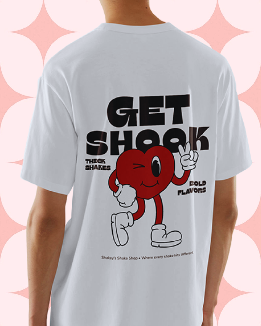
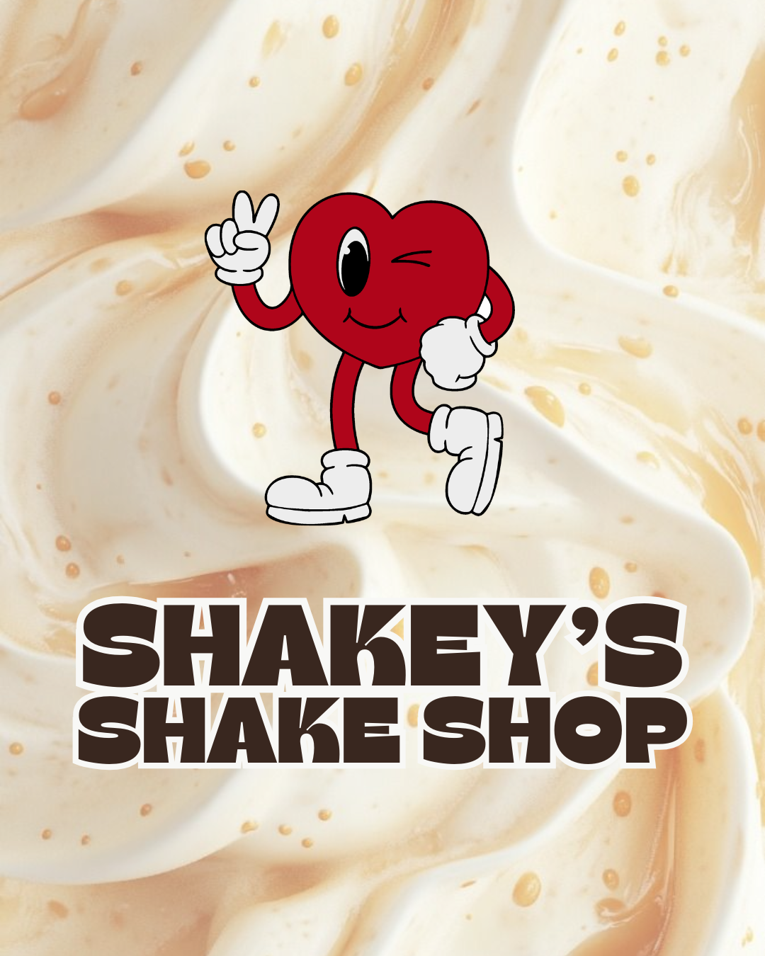
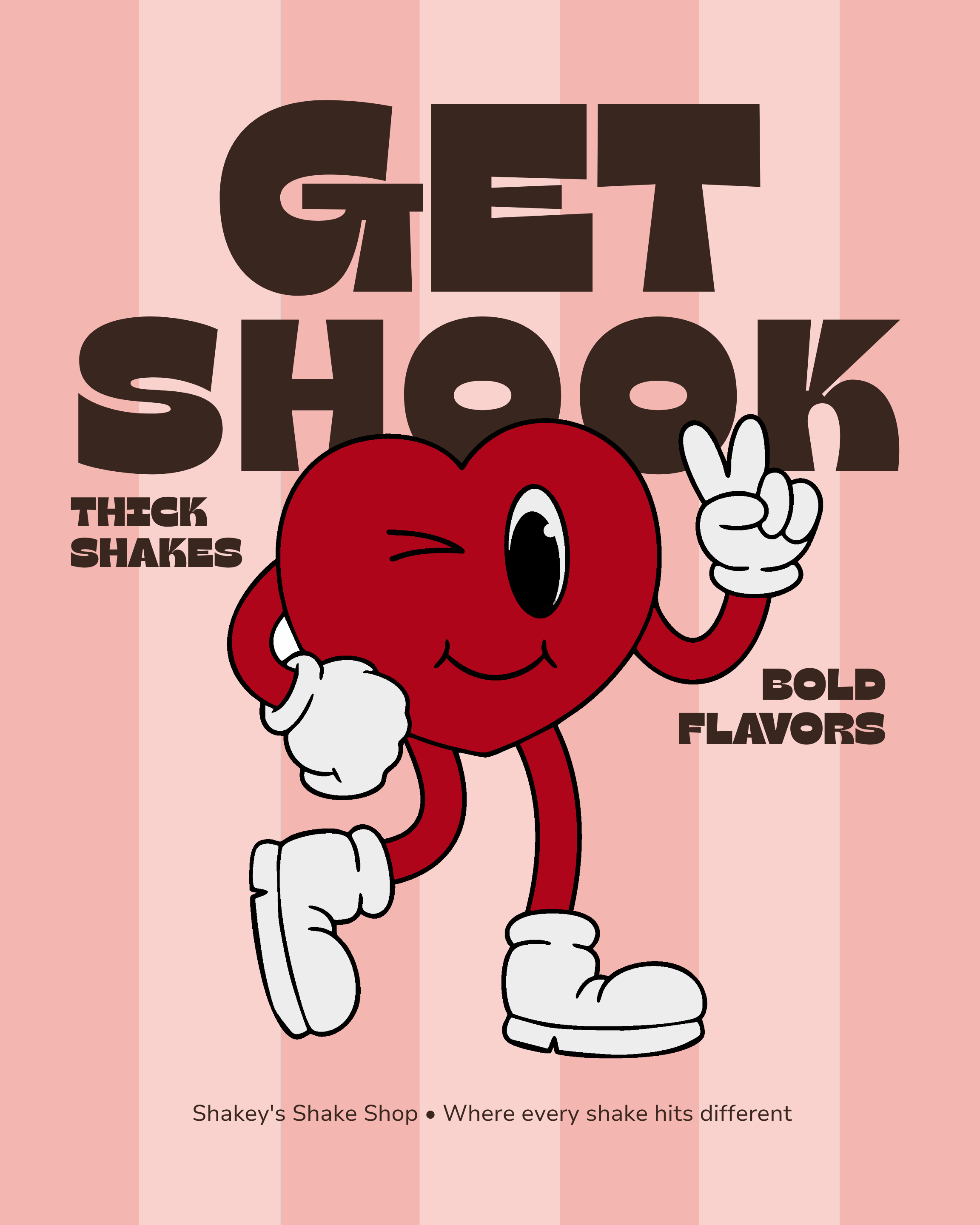
Shakey's personality had to carry the whole brand, since the product itself, a milkshake, isn't exactly novel. So the mascot became the anchor: a winking, exaggerated character with real Saturday-morning-cartoon energy, built to feel like a friend who's a little too much in the best way. Loud, a little chaotic, zero self-seriousness. Everything else, the color, the type, the copy, takes its cue from that one character rather than the other way around.
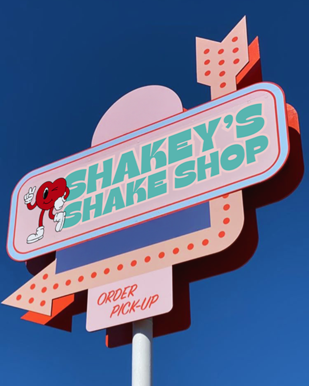
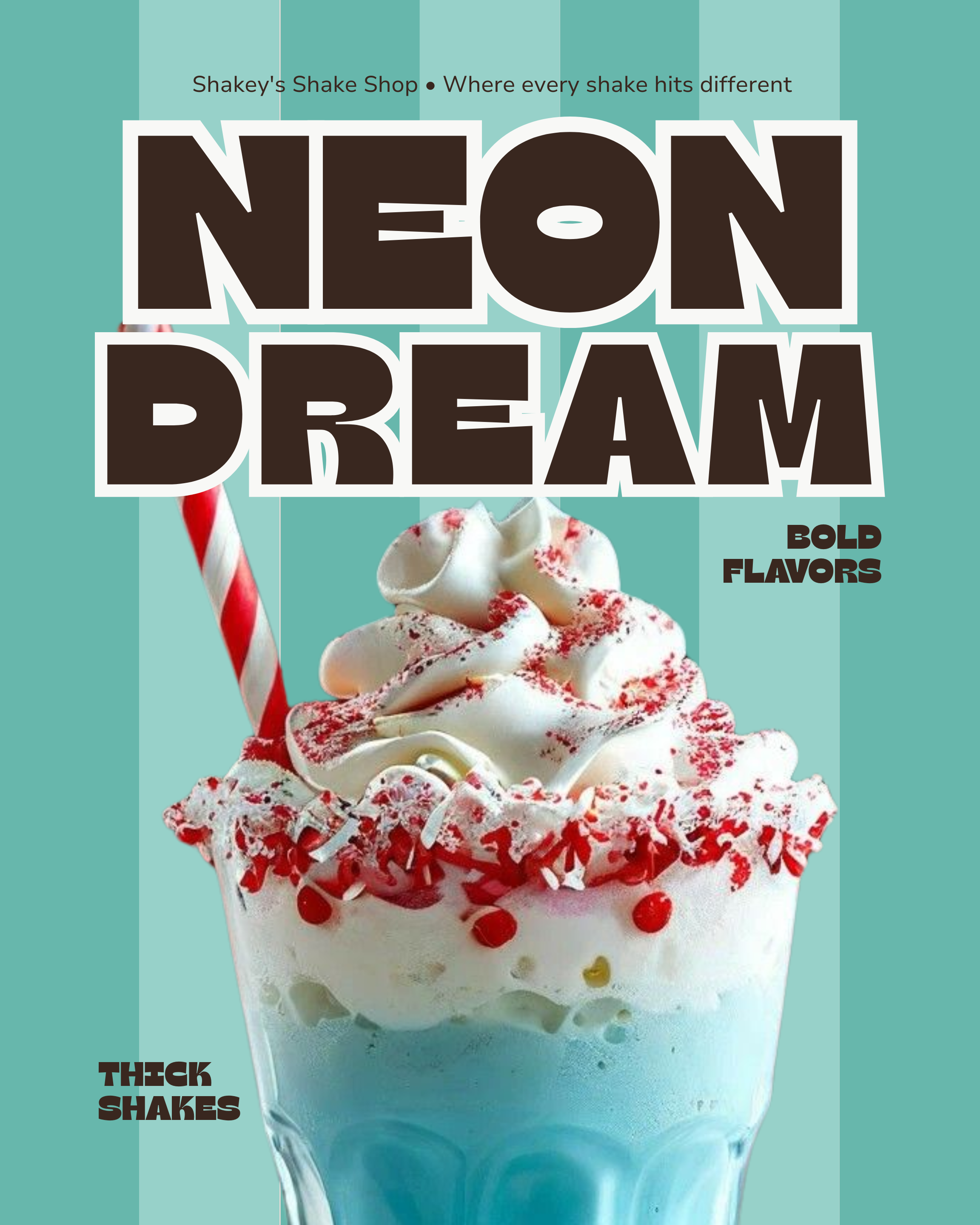
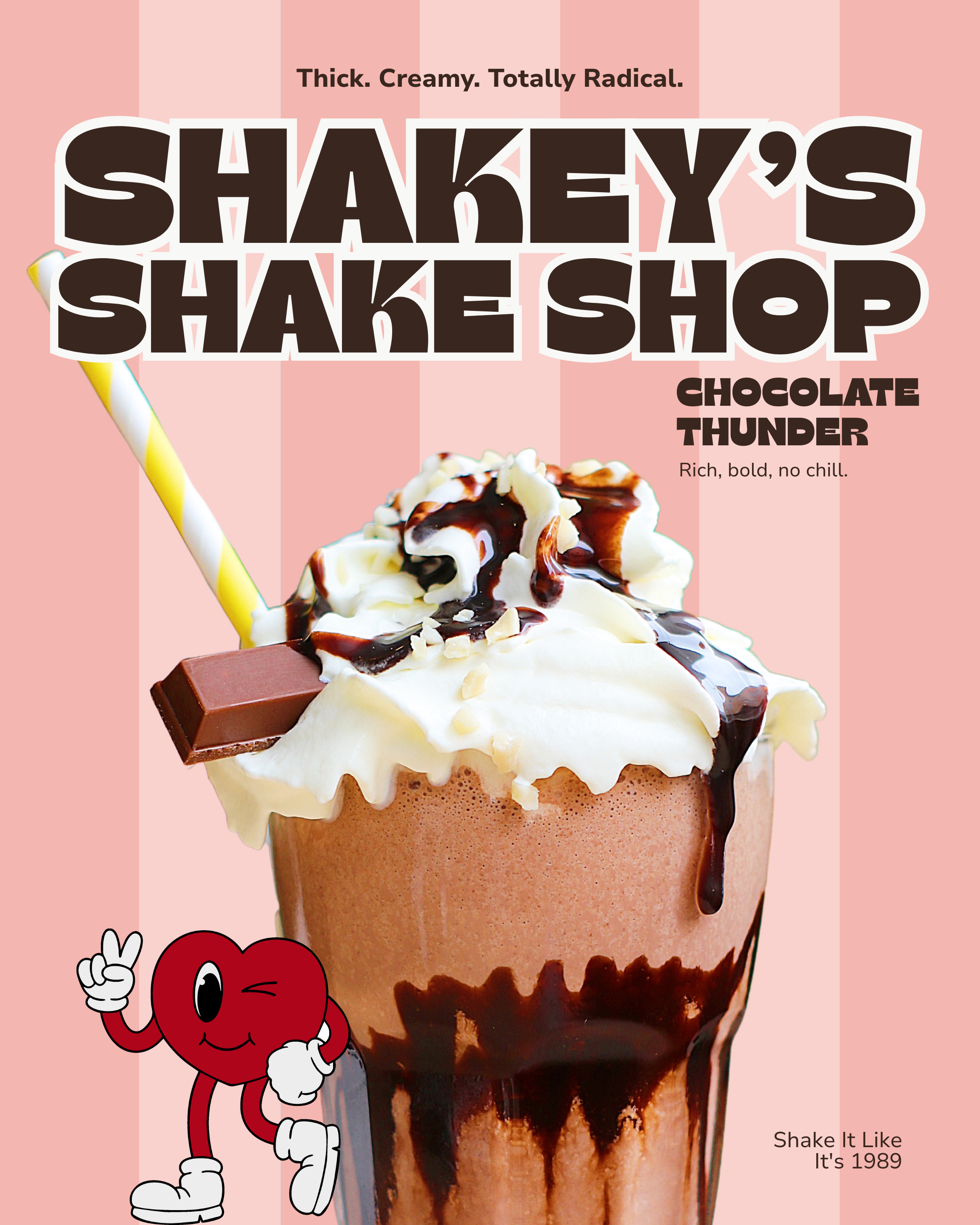
"More is more" could easily have meant "no editing." The discipline was making every loud choice, the color, the mascot, the type weight, work together as one coherent system instead of just piling on chaos. Loud doesn't have to mean messy. It just means every element has to earn its volume.